Question 16 · Work & Jobs
Can the world create enough jobs?
The largest generation of young people in history is reaching working age, almost all of it in the countries least able to employ it. The same fact is the century’s brightest opportunity and its heaviest risk, and nobody yet knows which one it becomes.
Demography is the rare force you can see coming. The people who will be looking for work in 2035 have already been born; the only open questions are how many find it, where, and doing what. Read those questions one way and this is the most hopeful decade in the history of development. Read them another and it is a slow-motion emergency in the places least able to absorb it. Both readings use the same numbers.
The scale is genuinely without precedent. Over the decade to 2035, around 1.2 billion young people in the developing world reach working age — more than in any previous decade and more than is projected for any decade for the rest of the century. They are healthier and far more schooled than their parents. The optimistic case is not naive: a wave of young workers this size, given something to do, is exactly what powered the East Asian miracle, the fastest mass escape from poverty ever recorded.
The pessimistic case is not alarmist either. The wave is arriving just as the global economy slows, and it is concentrating in the countries with the least money, the heaviest debts and the thinnest institutions to meet it. On an unchanged path, the World Bank’s own arithmetic suggests roughly 300 million of those 1.2 billion will be neither working nor in school in 2035. This piece walks down from the size of the wave to where it breaks hardest, through why the job got harder, to the one lever that still works — and ends where the report does, on the fact that none of it is yet decided.
you read
- This is a question about the future, and the future is the one thing data cannot observe. Every population number here is a projection from the UN, solid for the next decade because the people in question are already born, but the jobs numbers are extrapolations whose answer swings by hundreds of millions depending on the assumptions. The honest version of this piece is a range, not a forecast, and the article says so wherever the range is wide.
- The whole story rides on a regional handoff, so the global total is the least useful number on the page. A world figure averages a Sub-Saharan Africa whose workforce is doubling with an East Asia whose workforce has started to shrink, and the average describes neither. Wherever it can, the piece drops from the world to the region to the single country, because the challenge is not global — it is intensely local, and it has an address.
- The numbers come from the World Bank’s Global Jobs Challenge report and its own published figures. Where a chart rests on UN population data, ILO employment data or World Bank income data it is re-hosted in full; where it rests on a proprietary index — the IMF’s measure of readiness for AI, for instance — the chart is shown but the underlying series is the original authors’, not ours.
- EMDE means emerging market and developing economies — the roughly 150 countries the World Bank groups outside the rich world, where essentially all of the coming workforce growth happens. NEET means a young person not in employment, education or training: not working, not studying, not learning a trade. It is the closest single measure of a generation idling.
How big is the generation now arriving at working age?
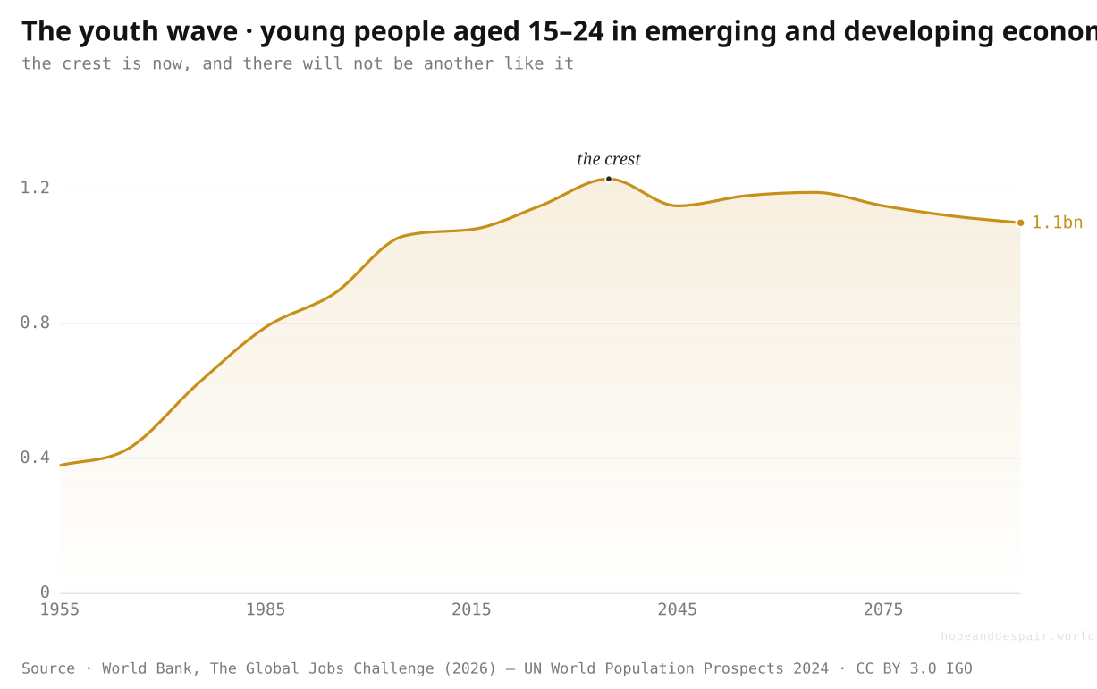
Bigger than any before it: about 1.2 billion young people in the developing world turn working age in the decade to 2035, the largest youth cohort the world will ever see.
Count the fifteen-to-twenty-four-year-olds alive in the developing world and the line climbs for seventy years, from under 400 million in the mid-1950s to a crest of roughly 1.23 billion around 2035 — and then, for the first time in the series, it turns down and never returns to that height this century. That single arc holds the whole argument. The number is enormous because of past success: children who once died now survive to adulthood, and families that once had eight children now have three or four, so the cohorts already born are the biggest the species will produce. It is also a deadline. Each of those young people reaches the age of wanting work within a fixed, knowable window, and the window for the largest cohort of them is closing now. After 2035 the pressure eases on its own; the test is the next ten years, and it cannot be deferred, because the people sitting it are already here.
How this number was made
What it measures. Number of young people aged 15–24 living in emerging market and developing economies, by year; the cohort crests in the decade to 2035 and is not projected to be matched again this century.
Calculation. Figure ES.1.A, EMDE youth 15–24, billions.
The displayed line is monotone-cubic smoothed for legibility only — it never moves a data point.
A youth wave this size is potential energy on a historic scale — the same raw material that, put to work, drove the fastest development the world has ever seen.
It is also the largest number of people who have ever needed work at once, arriving on a fixed deadline that no policy can postpone.
Whether a billion young people are a windfall or a crisis is not a fact about the people; it is a fact about what is waiting for them.
Is the wave spread across the world, or moving somewhere in particular?
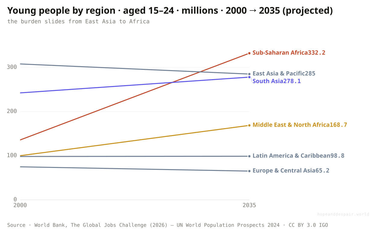
It is moving sharply toward Africa: Sub-Saharan Africa’s youth more than doubled since 2000 and overtakes every other region by 2035, even as East Asia’s shrinks.
The global crest hides a migration of the problem across the map. Sort the young by region and they are leaving some and pooling in others. East Asia and the Pacific, the region that turned its own youth surge into a miracle, now has fewer young people than it did in 2000 and the number is still falling; Europe and Central Asia is shrinking too. Latin America has flattened. Meanwhile Sub-Saharan Africa’s youth population has gone from about 136 million in 2000 to a projected 332 million in 2035 — it has not grown, it has multiplied, roughly two-and-a-half times — and the Middle East and North Africa is up by two-thirds. By 2035 Africa alone has more young people than any other developing region, having had fewer than half as many as East Asia a generation ago. The work of employing the world’s youth has not gotten smaller. It has moved, decisively, to the places that have done it least before.
How this number was made
What it measures. Young people aged 15–24 living in Sub-Saharan Africa in 2000 and (projected) 2035.
Calculation. Figure 1.2.B, SSA youth 2000 & 2035, thousands→millions.
The displayed line is monotone-cubic smoothed for legibility only — it never moves a data point.
Most of the world has already passed through this; the knowledge of how to absorb a youth wave exists and can be lent to the regions now facing theirs.
The wave is concentrating exactly where incomes are lowest and institutions weakest — the hardest version of the problem, in the least-prepared place.
There is no single global jobs challenge to solve; there are a few regional ones moving in opposite directions at once.
How many new working-age people does each region actually have to absorb?
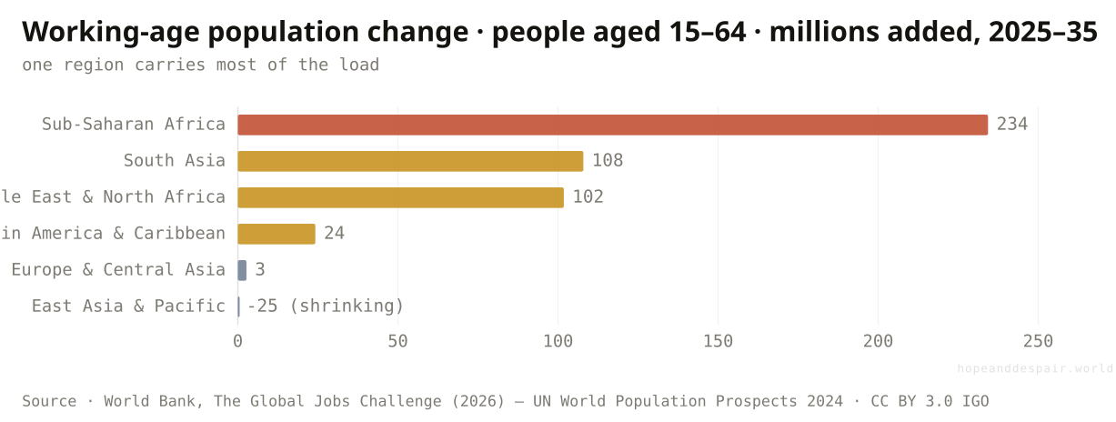
Sub-Saharan Africa must find work for an extra 234 million working-age people in this decade alone — more than the next two regions combined — while East Asia’s workforce starts to contract.
Youth is only the leading edge; the figure that sets the size of the task is the whole working-age population, everyone from fifteen to sixty-four, growing as the young arrive faster than the old retire. Over 2025 to 2035 that population grows by about 234 million in Sub-Saharan Africa, 108 million in South Asia and 102 million in the Middle East and North Africa — and falls by 25 million in East Asia and the Pacific, the arithmetic of a region that has aged past its surge. Look further out and the gap widens: between now and 2050 the developing world adds roughly 800 million working-age people, and around three-quarters of them are African. Each one is a person who will, in the normal course of a life, want to earn a living. The number is not a forecast of joblessness. It is the size of the order book — the count of livelihoods that have to be built from nothing, region by region, just to stand still.
How this number was made
What it measures. Net change in the working-age population (aged 15–64) by EMDE region over 2025–35: new entrants minus those ageing out. Sub-Saharan Africa adds the most by far; East Asia & Pacific has begun to shrink.
Calculation. Figure 1.2.D, working-age change 2025–35, thousands→millions.
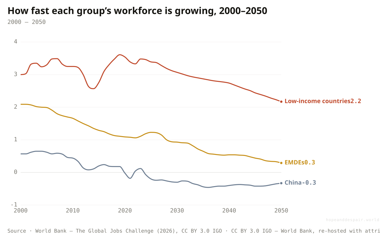
The world’s workforce growth is fading toward zero and China’s has turned negative — but in low-income countries it holds near 3% a year for decades. The deceleration everywhere else is exactly why the burden concentrates at the bottom.
A growing workforce is the engine of growth, not its enemy: more workers, productively employed, is how economies get bigger and richer.
Standing still requires hundreds of millions of new jobs in the poorest region on earth, and standing still is not the goal.
The same demographic that is a shrinking-workforce crisis in East Asia is a job-creation crisis in Africa — one word, two opposite emergencies.
Has a youth wave this size ever been turned into prosperity?
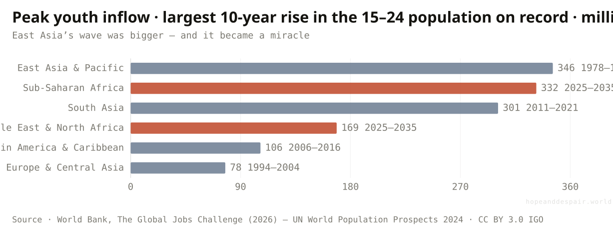
Yes, once, spectacularly: East Asia absorbed an even larger surge in the decade to 1988 and converted it into the fastest escape from poverty in history.
The case for hope is not a hypothetical; it is a region. Every region gets one demographic peak — a decade when the inflow of young people is larger than ever before or after — and East Asia and the Pacific hit theirs in the ten years to 1988, when nearly 346 million young people poured into working age. That is more than Sub-Saharan Africa’s peak now. East Asia did not drown in it. It built factories and ports and schools fast enough to put the wave to work, and the result was the growth miracle that pulled hundreds of millions out of poverty within a single working life. South Asia passed its own peak around 2011 and grew through it. The chart’s quiet message is that the two bars still rising, Africa and the Middle East, are not facing something new under the sun. They are facing something that has been survived, and better than survived. What East Asia also had, and they may not, is the next few movements.
How this number was made
What it measures. Each EMDE region's largest increase in the youth population (aged 15–24) over any 10-year period, and when it fell. East Asia & Pacific's peak (to 1988) powered its growth miracle; Sub-Saharan Africa and the Middle East & North Africa reach their largest-ever peaks only now.
Calculation. Figure 2.2.F, peak youth cohort by region, millions + period.
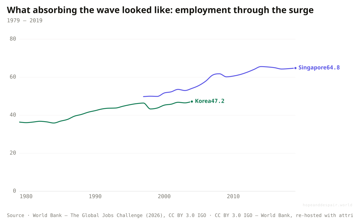
As their youth waves crested, Korea and Singapore put a rising share of their whole populations to work — the employment ratio climbing for two decades. This is the dividend in motion: the wave becoming workers rather than idlers.
It has been done, at greater scale, in living memory — the youth wave is a precondition for a miracle, not a barrier to one.
East Asia met its wave with rising investment, open export markets and strong states; the regions facing it now have weaker versions of all three.
The same demographic produced South Korea and produced the Arab Spring; the wave decides nothing on its own.
Is the economy that has to create these jobs as strong as the one that created the last batch?
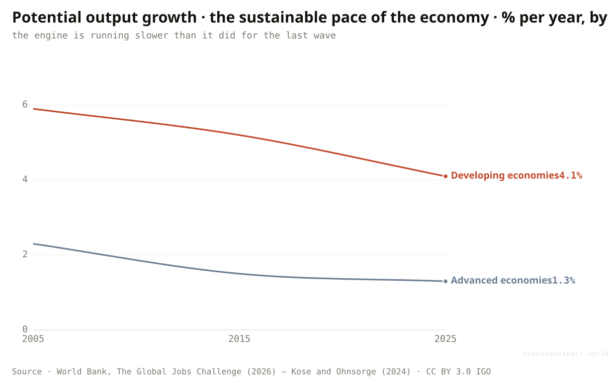
No: the developing world’s underlying growth rate is about a third lower this decade than in the 2000s, so the tailwind that lifted earlier youth waves has weakened.
Timing is the cruelty of it. The wave is largest just as the economy meant to absorb it has slowed. Potential growth — the speed an economy can sustain when it uses its people and capital fully — has fallen across the developing world from about 5.9 percent a year in the 2000s to 4.1 percent now, a drop of roughly a third, with weaker investment, thinner trade and more debt behind it. The rich world has slowed too, but it is not the rich world that has a billion young people to employ. The decline matters because jobs are downstream of growth: factories hire when they are expanding, and they expand when capital is cheap and markets are opening, both of which were truer for East Asia in 1985 than for Africa in 2025. A youth wave riding a fast economy is a dividend. The same wave riding a slow one is just a queue. Africa drew the larger wave and the slower decade at the same time.
How this number was made
What it measures. GDP-weighted potential output growth for EMDEs, by decade (production-function estimates from Kose and Ohnsorge 2024). The tailwind that lifted earlier youth-bulge economies has weakened.
Calculation. Figure ES.1.D, emde potential growth by decade.
The displayed line is monotone-cubic smoothed for legibility only — it never moves a data point.
Growth rates are not fixed: the same report shows that investment and reform can lift them back toward the pace of the 2000s.
On the current path the economy is decelerating exactly as the demand for jobs peaks, the worst possible alignment.
A slowdown that is mild for a rich, ageing country is severe for a poor, young one — the same number means opposite things.
Are the regions facing the wave now as ready as the ones that faced it before?
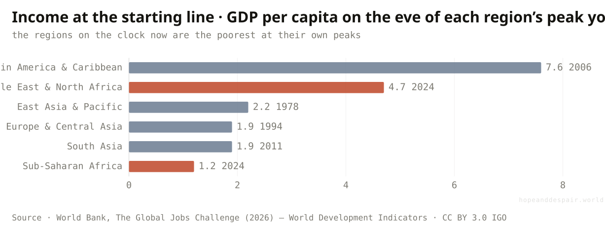
No: Sub-Saharan Africa meets its peak with incomes a fraction of what East Asia had at its own, and with far heavier debt.
Readiness is the difference between a wave you ride and one that knocks you down, and on readiness the newest entrants start furthest back. Measure each region’s income at the moment its youth surge crested. When East Asia hit its peak it was poor — but Sub-Saharan Africa, hitting its peak now, is poorer still, at little over a thousand dollars a head, below what East Asia, South Asia or Europe had at their own peaks and a fraction of Latin America’s. Income is only half of it. The same regions also carry heavier debts: median government debt in Sub-Saharan Africa sits near 57 percent of output as its wave arrives, more than double East Asia’s 24 percent on the eve of its own. The same gap runs through human capital: the regions facing the largest waves average barely four-and-a-half years of schooling, against more than twelve in the rich world, so a generation better educated than its parents still arrives far behind the workforces it will compete with. Low income means little to invest in the roads, grids and classrooms that turn young people into productive workers; high debt means much of what little there is goes to creditors instead. The regions that proved the youth wave can be a blessing met it with money and stability. The regions facing it now are being asked to do the same thing with less of both.
How this number was made
What it measures. Median GDP per capita in each EMDE region at the start of the decade when its largest youth inflow was (or is) recorded. Sub-Saharan Africa and the Middle East & North Africa reach their peaks now, at far lower incomes than East Asia or Europe & Central Asia had at theirs.
Calculation. Figure 3.3.B, median GDP per capita at peak, US$000.
Starting poor is not destiny — East Asia started poor too; what mattered was the direction it then moved, and that direction is a choice.
Low income and high debt are exactly the conditions that starve the investment a youth wave needs, and they cluster in the regions facing the largest waves.
The same low starting income reads as 'room to grow’ or 'too far behind to catch up’ depending only on what happens next.
Is the ground at least holding still while the wave builds?
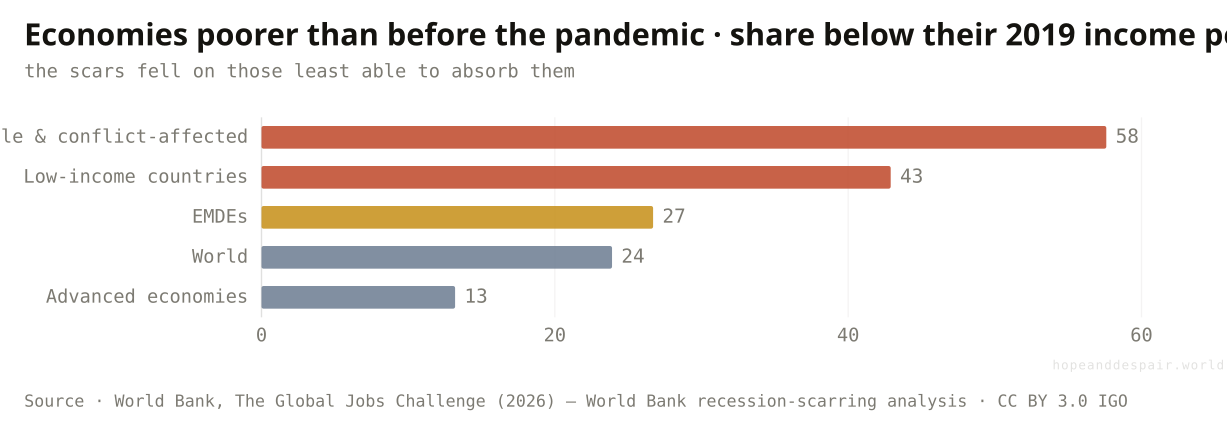
No, and the damage has flipped to the poorest: more than half of fragile states, and two in five low-income countries, are poorer per head than they were before the pandemic.
Recoveries are never shared evenly, and the last one was shared perversely. Five years after a global downturn, some economies have clawed back the ground they lost and some have not, and the report counts which. After the 2008 financial crisis it was the rich world that lagged — nearly two in five advanced economies were still poorer in 2014 than before the crash, while most developing economies powered straight through. The pandemic inverted that. By 2025 only about one advanced economy in eight remained below its 2019 income, but more than a quarter of developing economies did, two in five low-income countries, and well over half of fragile and conflict-affected states. The shock that was meant to be universal landed hardest on the places with the least cushion to absorb it — no savings to draw down, little room to borrow, no safety net to spread the blow. So the youth wave is not breaking over a steady economy that simply needs to grow faster. Across much of the affected world it is arriving on top of ground that has already given way, in the very years before the largest cohort in history shows up to look for work.
How this number was made
What it measures. Share of economies in each group whose GDP per capita in 2025 remains below its 2019 level. After the 2008 crisis it was advanced economies that lagged (39.5%); after the pandemic the damage flipped to the poorest — most fragile states are poorer than before.
Calculation. Figure 3.2.B, economies poorer 5 years after recession, post-2020.
Lost ground can be regained — most developing economies recovered fully from the 2008 crisis, and the same is possible from this one with growth and relief.
The wave arrives just after the poorest and most fragile economies have gone backwards, with the thinnest means to recover before it lands.
The same global shock helped the poor catch up in one decade and fall further behind in the next; which a downturn does depends entirely on who can cushion it.
Could artificial intelligence change the kind of jobs these workers can hope for?
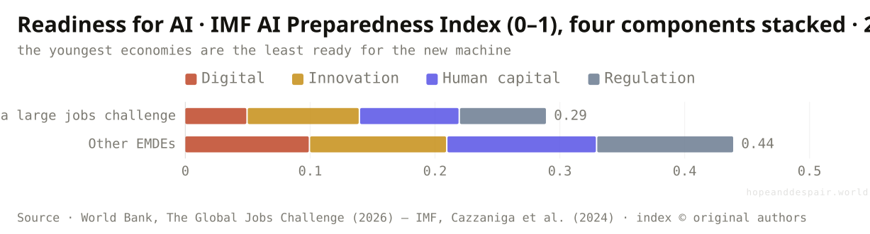
It could pull the ladder up: AI touches an estimated 40 percent of jobs worldwide, and the economies with the most young workers are the least ready to turn it to their advantage.
Hanging over the whole calculation is a technology that did not exist at the last youth wave. The classic path out of poverty ran through labour-intensive factories: cheap young workers making clothes and electronics for export, the rungs East Asia climbed. Automation and AI threaten to make that ladder shorter just as the largest cohort reaches for it. By one IMF estimate, some 40 percent of jobs worldwide are exposed to AI, and around 60 percent in rich countries. Exposure is not the same as loss; AI can make a worker more productive as easily as it can replace one. But capturing the upside takes digital infrastructure, skills and capital, and on a composite index of readiness the economies with the biggest youth waves score lowest, behind their peers on every part of it. So the danger is not that robots take African jobs. It is that AI lets rich, capital-heavy economies make cheaply what poor, labour-heavy ones were counting on selling. The countries with the most workers to put to use are the worst placed to use the tool that is changing the terms.
How this number was made
What it measures. Average score on the IMF AI Preparedness Index (Cazzaniga et al. 2024), as published by the World Bank, split into its four components. "EMDEs with a large jobs challenge" are those where young people are at least 30% of the 15+ population in 2035.
Calculation. Figure 3.4.A, AI Preparedness Index components.
A young workforce adopts new tools fastest; if AI raises productivity broadly, it could lift the very growth rate that the jobs wave needs.
AI may erode the export-factory path to development just as the largest-ever cohort lines up to climb it, and the youngest economies are least able to adapt.
The same technology is a productivity windfall and a development threat, and which one it becomes for any country depends on a readiness most of them lack.
Can the places that most need AI’s upside even get online to capture it?
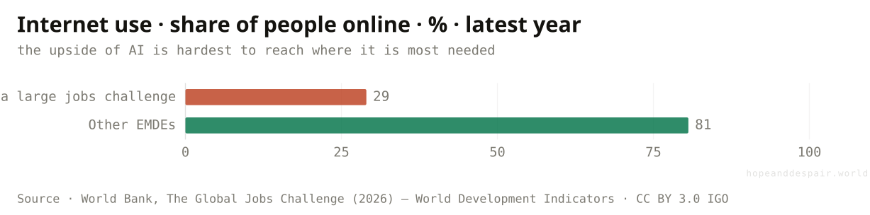
Mostly not yet: where the jobs challenge is largest, fewer than three in ten people use the internet, against four in five elsewhere — and 2.7 billion people remain entirely offline.
Before a country can lose jobs to AI or gain them from it, its people have to be able to reach the thing at all, and that is where the gap is widest. In the developing economies with the largest youth waves, a median of just 29 percent of people use the internet; in other developing economies it is over 80. The raw foundations are even more lopsided: low-income countries hold under a tenth of a percent of the world’s data-centre capacity and account for under one percent of global ChatGPT use, and some 2.7 billion people have never been online. Read pessimistically, that is a moat: the productivity gains of AI accrue to the already-connected, and the unconnected fall further behind. Read hopefully, it is the cheapest problem on this page to fix. Laying connectivity is a known, financeable task, unlike mending a debt crisis or a slow decade of growth. And the gap is so wide that closing even part of it is pure upside. The same chart shows a wall and a door.
How this number was made
What it measures. Median share of individuals using the internet across EMDEs, latest available year. Where the jobs challenge is largest, most people are still offline — so the productivity upside of AI is hardest to capture there.
Calculation. Figure 3.4.B, internet use, %.
Connectivity is the most tractable gap here — a buildable, financeable thing — and the distance to close is so large that any progress pays off.
A workforce that cannot get online cannot capture the one force that might raise its productivity, and most of the youth-wave world is still offline.
The connectivity gap is both the clearest evidence of being left behind and the clearest opportunity to catch up.
Is the shortfall still hypothetical, or is it visible now?
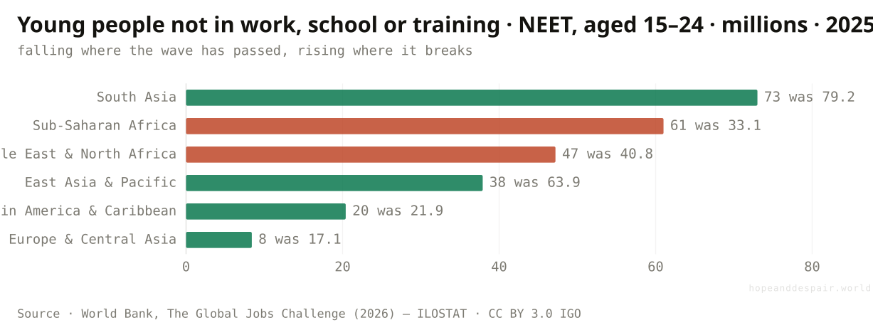
It is already here: across the developing world some 240 million young people are neither working nor in school, and in Africa their number has nearly doubled in twenty years.
None of this is a warning about 2035; the early version is measurable today. Count the young people who are not in employment, education or training — idle not by choice but for want of any of the three — and the developing world holds around 240 million of them. The regional split rhymes with everything above. Where the youth wave has passed, the count is falling: East Asia’s young NEETs dropped from 64 million in 2005 to 38 million now. Where the wave is breaking, it is climbing: Sub-Saharan Africa’s nearly doubled, from 33 million to 61 million, and the Middle East’s rose too. Each of those is a young person who finished what schooling they had and found nothing on the other side — the precise outcome the projections warn will multiply. A NEET rate is also the number that turns economic into political: large cohorts of idle young men are the raw material of unrest, which is why the report frames the stakes as stability, not just income. The shortfall is not a forecast waiting to arrive. It is a trend already running, and pointed the wrong way exactly where the wave is largest.
How this number was made
What it measures. Number of young people (aged 15–24) not in employment, education or training (NEET) by EMDE region, 2005 and 2025 (2025 projected). Falling where the youth wave has passed; rising in Sub-Saharan Africa and the Middle East & North Africa.
Calculation. Figure 1.2.C, young NEET counts, thousands→millions.
The same measure that is rising in Africa has fallen sharply in East Asia and South Asia — proof the trend bends down once jobs arrive.
A quarter of a billion young people are already idle, and in the regions facing the wave the number is climbing, not falling.
The NEET count is at once the strongest evidence the problem is real and the strongest evidence it is solvable, depending on which region you read.
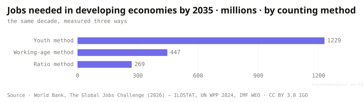
So how many jobs does the world actually need to create?
Anywhere from 270 million to 1.2 billion this decade — the same challenge looks four times larger or smaller depending purely on how you count it.
Pin down the headline number and it refuses to be pinned. The report offers three honest ways to count the jobs needed in the developing world by 2035, and they disagree by a factor of four. Count every young person reaching working age and you get 1.2 billion. Count only the net change in the working-age population, new entrants minus retirements, and it falls to about 447 million. Scale that net change by how many people each country actually tends to employ, rather than assuming everyone wants a formal job, and it drops again to around 269 million. None of the three is wrong; they answer slightly different questions, and the distance between them is not noise but meaning. It is the difference between treating every young person as a worker who must be placed and accepting that many — students, carers, the self-sufficient — were never going to be in the count. The single most honest thing the report does is refuse to pick one. The challenge is real at any of these sizes; that it ranges this widely is the truest fact about it.
How this number was made
What it measures. Size of the EMDE jobs challenge over 2025–35 under three methods. Youth method: all new entrants to the working-age population. Working-age method: the net change in the working-age population. Ratio method: that net change scaled by each country’s 2010–19 employment ratio. The same decade looks four times larger or smaller depending on the lens.
Calculation. Figure 2.7.A, jobs-challenge estimates, thousands→millions.
The lower, more realistic counts are large but not unimaginable — they are within reach of an economy that invests and reforms.
Even the smallest estimate, 269 million jobs, is most of a continent’s workforce, and it has to be built where building is hardest.
A challenge whose size swings by nearly a billion people depending on the method is one we cannot even agree how to measure — let alone forecast.
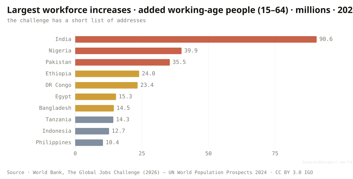
If the challenge has an address, what is it?
A short list of countries: India alone must absorb over 90 million new working-age people this decade, with Nigeria, Pakistan and Ethiopia close behind.
The regional abstractions resolve, in the end, into a handful of named places carrying most of the weight. The countries adding the most working-age people between now and 2035 are led by India, which must find room for more than 90 million in a decade: a whole large country’s workforce appearing inside a single one. Behind it come Nigeria at 40 million, Pakistan at 35, Ethiopia and the Democratic Republic of Congo near 24 and 23, then Egypt, Bangladesh, Tanzania, Indonesia and the Philippines. The list is not random. It is mostly the largest economies of South Asia and Sub-Saharan Africa, the two regions whose waves are still rising. This is where the global number becomes a national to-do list, and where the spread hides. India enters its surge with a fast-growing, increasingly digital economy; several of the others enter theirs with conflict, weak power grids and thin tax bases. And about a fifth of the whole wave, some 270 million young people, will come of age in countries the World Bank classes as fragile or conflict-affected, where the jobs to meet them are least likely to exist. The same line on a spreadsheet lands on a country ready to use it and a country struggling to feed it. That is the whole argument, compressed into a ranking.
How this number was made
What it measures. The ten EMDEs whose working-age population (aged 15–64) grows most in absolute terms over 2025–35. India alone must absorb more than 90 million new working-age people.
Calculation. Figure 2.8.C, working-age increase by country, thousands→millions.
A challenge with a short list of addresses is a challenge that can be targeted — a dozen national plans, not a vague global hope.
Several of the countries carrying the most weight are also among the least stable, where the gap between people and jobs is most likely to turn dangerous.
The same entry on the list — tens of millions of new workers — is an asset in India and a liability in a fragile state, and the number alone cannot tell you which.
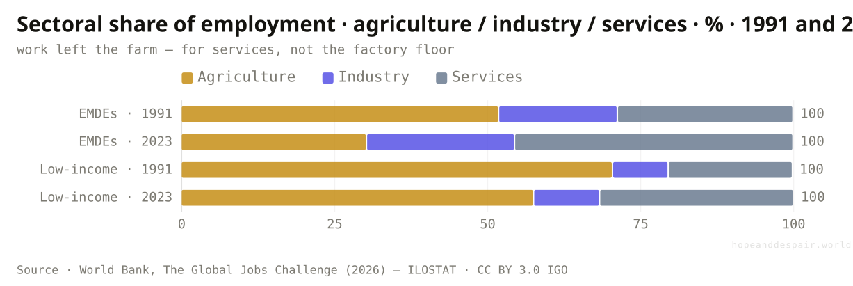
The jobs that do exist — what kind of work are they?
Less and less farming: agriculture’s share of work in the developing world fell from about half to a third since 1991 — but the workers moved into services, not the factories that once led the way out.
What the developing world does for a living has changed more than the headcount alone reveals. In 1991 farming was still the largest employer across emerging economies, and more than two-thirds of all work in the lowest-income ones. By 2023 agriculture’s share across the broad developing world had fallen to under a third, the slow unwinding of a way of life that had lasted ten thousand years. The natural question is where those workers went, and the intuitive answer — into factories — is mostly wrong. Industry’s share barely shifted, from about a fifth to a quarter; the great absorber was services, which climbed from under thirty percent to nearly half. That distinction carries weight, because the historical ladder out of poverty, the one East Asia climbed, ran through manufacturing: factory work is tradable, lifts productivity quickly, and tends to pay more than the work it replaces. The move into services is more ambiguous. Some of it is the high-rung kind — finance, logistics, telecoms. Much of it, especially where farming still dominates, is the survival kind: street vending, domestic work, the informal day-labour that absorbs the people industry never hired. The wave is coming of age into an economy that is leaving the land but has not, for the most part, found the factory.
How this number was made
What it measures. Share of total employment in agriculture, industry and services for EMDEs and low-income countries, 1991 and 2023. Work is leaving the farm — but moving mostly to services, while industry, the classic ladder out of poverty, barely grows.
Calculation. Figure 2.5.E, sectoral employment shares.
Diversifying off subsistence farming is real progress, and services — from mobile money to logistics — hold genuine, fast-growing, better-paid work.
The high-productivity factory ladder that turned earlier youth waves into miracles is being skipped, leaving much of the shift to be absorbed by informal service work.
A job leaving the farm for the city is either a step up or sideways into the informal economy, and the sector label alone cannot tell you which.
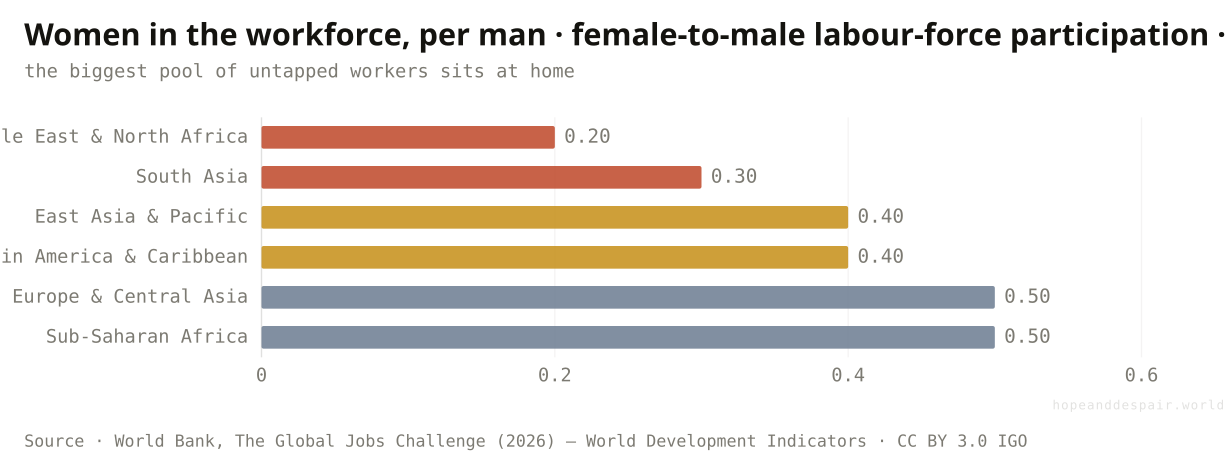
Is there a reserve of workers the wave numbers leave out entirely?
An enormous one: across the Middle East and South Asia most working-age women are not in the labour force, and bringing them in could raise income per head by 20 to 50 percent.
Every count so far has treated the workforce as whatever the population gives it, but in much of the youth-wave world a large part of it is sitting out by custom and law rather than choice. Set women’s labour-force participation against men’s and the ratio falls off a cliff in exactly the regions facing the largest waves. In the Middle East and North Africa only about one woman is economically active for every five men; in South Asia it is closer to one in three. Even at the developing world’s best, the figure is one woman for every two men — half the potential workforce, on average, not counted as working. The arithmetic of fixing it is the most optimistic number in the report: bringing women’s employment up to men’s could lift output per person by somewhere between a fifth and a half, a gain that would more than offset the slower growth and heavier debt of the preceding movements. That is the hope. The catch is that participation this low is held down by law, by the burden of unpaid care, and by norms that no jobs programme shifts quickly. The largest reserve of workers on earth is already here, already of working age — and the hardest of all to put to work.
How this number was made
What it measures. Median ratio of female to male labour-force participation by EMDE region, 2023. Where the ratio is lowest — the Middle East & North Africa and South Asia — a large share of working-age women are outside the labour force, the single largest untapped source of workers.
Calculation. Figure 2.4.B, female-to-male LFP ratio by region.
Closing the participation gap is the single largest growth lever in the report — a fifth to a half of GDP per head, sitting unused in plain sight.
The gap is widest exactly where the youth wave is largest, and it is anchored by law and custom that move on the timescale of generations, not budgets.
The same low number is either the easiest reserve of workers to tap or the most stubborn, and which it is depends on things outside any labour market.
Is there anything that reliably turns the wave into work?
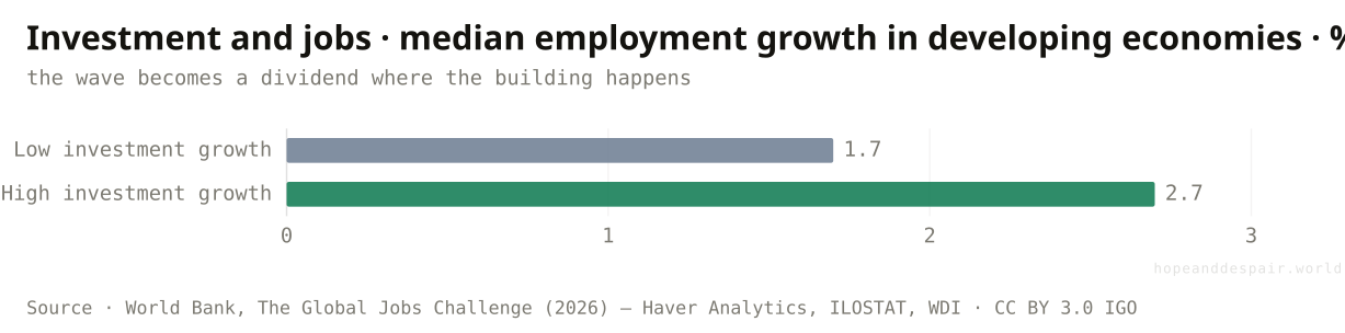
One thing shows up again and again: developing economies that invest more create markedly more jobs — the difference between a wasted wave and a dividend is largely a choice to build.
After the demographics and the headwinds, the report lands on something almost hopeful in its plainness. Sort developing economies by how fast their investment grew and the high-investment group created jobs far faster than the low — median employment growth of 2.7 percent a year against 1.7, a gap statistically firm and economically enormous when compounded across a decade. Investment is the bridge between a growing population and a growing payroll: the roads, ports, power and factories that turn a young person into a productive worker are all someone’s investment first. The report builds its whole prescription on this — three foundations of infrastructure, a workable business environment, and private capital, plus five industries from agribusiness to tourism with room to employ at scale. The lever is not exotic and not new; it is the same one East Asia pulled. What this chart says, against all the gloom of the preceding ones, is that the outcome is not fixed by demography. Population sets the stage. Investment, and the policy that draws it, writes the script.
How this number was made
What it measures. Median annual employment growth in EMDEs in the bottom third versus the top third of investment growth, 2000–23 (difference significant at the 1% level). Investment is the closest thing to a lever on jobs.
Calculation. Figure ES.1.F, employment growth by investment tercile.
The single biggest driver of jobs is a policy choice, not a fixed fact — which means the dividend is genuinely within reach for any country willing to build.
Investment is exactly what low incomes and high debts make hardest, so the lever is stiffest in the places that most need to pull it.
Knowing the lever exists is not the same as being able to pull it, and the gap between the two is where the next decade will be decided.
Population sets the stage, but policy writes the script.— The Global Jobs Challenge, World Bank (2026)
One question, read by the fields that actually study it. Each voice is given both its most hopeful and its darkest honest reading — with a note on how settled the evidence underneath is.
the hopeful readA youth wave riding even moderate investment growth is the most reliable engine of development we know — and the report shows the investment lever still works.
the darker readThe wave is largest where potential growth is weakest and debt is heaviest, so the cheap demographic dividend other regions banked may not be available here.
the hopeful readIf connectivity, power and a few labour-intensive sectors can be financed from outside, a young, cheap, willing workforce is the best asset I have.
the darker readI am told to invest my way out of this, but half my revenue services debt and my tax base is tiny — the lever exists and I cannot reach it.
the hopeful readI have more schooling than my parents, a phone, and a market of 200 million people growing up around me.
the darker readI finished school two years ago and there is no job, no training place, and no sign of either — I am one of the 61 million the chart counts.
the hopeful readWages are low, the workforce is young, and demand is growing — on paper this is where the next manufacturing boom should be.
the darker readUnreliable power, weak courts, thin logistics and now AI making automation cheaper at home all push me to build somewhere else, or build with fewer people.
Strongest case for hope
Read the wave as potential and the decade ahead is the best opportunity development has ever had. The largest, healthiest, best-schooled generation in history is arriving at working age, and the world has already watched exactly this become a miracle once: East Asia met an even bigger surge and turned it into the fastest mass escape from poverty ever recorded. The ingredients are known and repeatable — investment in infrastructure, a workable environment for firms, capital to build at scale — and the report shows the single clearest pattern in its data is that economies which invest more create far more jobs. The hardest-hit regions are young, and young populations adopt new tools fastest; if AI lifts productivity broadly it could restore the very growth the wave needs. Even the connectivity gap, damning as it looks, is the cheapest problem here to fix. None of the obstacles is a law of nature. Pull the lever that already exists and a billion young people become the century’s growth story rather than its tragedy.
Strongest case for despair
Read the wave as pressure and the alignment is about as bad as it gets. The largest cohort ever is breaking over Sub-Saharan Africa, the region that meets it poorest, most indebted and least institutionally able — worse-placed than any region that faced its own peak before. It arrives as the developing world’s growth rate falls by a third, as trade fragments, and as AI threatens to shorten the export-factory ladder that every previous success climbed. The damage is not hypothetical: a quarter of a billion young people are already idle, and in the regions facing the wave that number is rising. On an unchanged path roughly 300 million of the 1.2 billion will be out of work and out of school in 2035, a reservoir of wasted potential that the report itself links to unrest, fragility and migration. The lever that works, investment, is precisely what low incomes and heavy debts make hardest to pull. The knowledge of what to do exists; the money, stability and time to do it, in the places that most need to, may not.
Watch investment in the youth-wave countries above all — it is the one number that reliably turns demography into jobs, and if it rises in Africa and South Asia the way it once did in East Asia, the hope case is winning. Watch women’s participation in the Middle East and South Asia, the largest unused reserve of workers on the page: if it climbs, it would offset much of the slower growth and heavier debt at once. Watch the African NEET count: if it bends down the way East Asia’s did, the wave is being absorbed; if it keeps climbing, the shortfall is hardening into a lost generation. Watch whether AI raises developing-world productivity or simply lets rich economies automate away the factory path — the next few years of evidence will tip that decisively one way or the other. Watch debt, because a wave of restructurings that freed money for roads and grids would change the arithmetic of readiness overnight. And watch connectivity, the cheapest lever, for the fastest signal of intent. Fast investment, falling idleness and broadening access, and a billion young people become a dividend. A slow decade, rising idleness and a widening digital moat, and the same billion become the defining development failure of the century.
Everything done to the numbers between the source and the chart, disclosed in full. Where a choice is editorial rather than measured, we say so.
- A question about the future, answered with projections
- Unlike most articles on this site, this one is largely forward-looking. The population figures come from the UN’s World Population Prospects 2024, medium variant — reliable for the next decade because the people in question are already alive, less so further out. The jobs figures are extrapolations from the World Bank, and the piece treats them as ranges, not forecasts, especially the headline 270-million-to-1.2-billion span.
- Three ways to count the same challenge
- The report sizes the jobs challenge three ways and the article shows all three. The youth method counts every new entrant to the working-age population; the working-age method counts the net change after retirements; the ratio method scales that net change by each country’s recent employment ratio, recognising that not everyone seeks a formal job. They differ by a factor of four, and the article does not collapse them into one false certainty.
- What 'EMDE’ and the regions mean
- Emerging market and developing economies are the roughly 150 countries the World Bank groups outside the high-income world, divided into six regions: East Asia & Pacific, Europe & Central Asia, Latin America & Caribbean, the Middle East & North Africa (here including Afghanistan and Pakistan), South Asia, and Sub-Saharan Africa. The regional groupings are the World Bank’s own, which is why the figures match the report exactly rather than a generic regional cut.
- Re-hosted data and cited indices
- The report is published under a Creative Commons licence (CC BY 3.0 IGO), so its figures are re-used here with attribution, traced back to the underlying open sources — UN population data, ILO employment data, World Bank income data — wherever a chart is re-hosted in full. Two charts rest on proprietary series the World Bank itself only licenses from others: the IMF’s AI Preparedness Index and the investment–employment comparison drawing on Haver Analytics. Those are shown as the report published them and credited to their original authors.
- Why the working-age population, not just youth
- Several charts use the whole working-age population (everyone aged 15–64) rather than just the young (15–24). The youth count shows where the pressure is sharpest and most political; the working-age count shows the true size of the task, because a labour market has to find room for everyone of working age, not only the newest arrivals. The article uses whichever the specific claim requires and labels which is which.
- Prose and number audit
- Explanatory text was drafted with the help of a large language model and then checked line by line against the report’s own figures, transcribed into the project’s derived data series; every quantitative claim traces to a number the World Bank published. No outside figures were introduced, and where the underlying number is itself a projection or a wide range, the writing says so.
- World Bank — The Global Jobs Challenge (2026) — www.worldbank.org/en/research/publication/global-jobs-challenge ↗ · CC BY 3.0 IGO · vintage 2026Chrimes, T., M. A. Kose, and K. Stamm, eds. The Global Jobs Challenge. Washington, DC: World Bank. Every chart is transcribed from the report’s published figure workbooks; data cutoff September 28, 2025.
- UN World Population Prospects 2024 — population.un.org/wpp ↗ · CC BY 3.0 IGO · vintage 2024The demographic backbone — youth and working-age population by region and country, history and medium-variant projection. Underlies the wave, the handoff, the workforce-change, peak-cohort and country charts (report figures ES.1.A, 1.2.B, 1.2.D, 2.2.F, 2.8.C), and the peak-year timing in the income chart.
- World Bank — World Development Indicators — databank.worldbank.org/source/world-development-indicators ↗ · CC BY 4.0 · vintage 2025Income, internet use, women’s labour-force participation and years of schooling — behind the least-equipped, AI-divide and other-half charts (figures 3.3.B, 3.4.B, 2.4.B, 4.3.B).
- ILOSTAT — International Labour Organization — ilostat.ilo.org ↗ · CC BY 4.0 · vintage 2025Employment and young-NEET figures behind the gap-already-showing and jobs-estimate charts (report figures 1.2.C, 2.7.A).
- Kose & Ohnsorge (2024) — Falling Long-Term Growth Prospects, via World Bank — www.worldbank.org/en/research/publication/global-jobs-challenge ↗ · CC BY 3.0 IGO · vintage 2024Potential-growth estimates by decade (report figure ES.1.D / 3.1).
- IMF — AI Preparedness Index (Cazzaniga et al. 2024) — www.imf.org/en/Publications/Staff-Discussion-Notes/Issues/2024/01/14/Gen-AI-Artificial-Intelligence-and-the-Future-of-Work-542379 ↗ · © original authors — shown as published by the World Bank · vintage 2024The four-component AI-readiness index behind the new-uncertainty chart (report figure 3.4.A). A proprietary index; shown as the World Bank republished it, not re-hosted as data.
Cite this page
Reference
Hope & Despair. “Can the world create enough jobs?.” Hope & Despair, 2026. https://hopeanddespair.world/questions/can-the-world-create-enough-jobs.
BibTeX
@misc{hopeanddespair:can-the-world-create-enough-jobs,
  author       = {{Hope & Despair}},
  title        = {{Can the world create enough jobs?}},
  year         = {2026},
  howpublished = {\url{https://hopeanddespair.world/questions/can-the-world-create-enough-jobs}},
  note         = {hopeanddespair.world, updated 2026-06-27}
}
Original prose, code, and chart designs are released under CC BY 4.0 ↗ — reuse freely with attribution. Source datasets keep their own licences, listed above. Add your access date when citing.
- Ship: Can the world create enough jobs? (Q16) + air-pollution and literacy articles View diff →
Generated from the commit history — every edit to a number, a word, or a chart is tracked in the open. Browse the full history & diffs on GitHub →
in plain words