Question 14 · Human Development
Is human progress slowing down?
For seventy-five years almost every measure of human well-being improved. The world average is now rising slower than it has in generations. But the average is a fiction: progress did not fade evenly, it split apart.
Ask whether the world is still getting better and the data answers yes, then quietly adds a second word: slower. The lines that defined the last three-quarters of a century — longer lives, fewer poor, more children surviving — almost all still bend the right way. The rate at which they bend has dropped to a third or a quarter of what it was a decade ago.
But a single world line is the wrong place to read this story, because the slowdown is not something happening to everyone at once. It is the sum of two opposite motions. The regions that powered the great surge, above all East and South Asia, drove their numbers so close to the finish that there is little distance left to cover. The region that still has the furthest to go, Sub-Saharan Africa, has barely moved. Average those together and you get a gentle global fade that nobody actually lives in.
So the honest version of the question is not whether progress is slowing, but where it stopped and where it never really started. This piece follows it down from the world to the region to the country, because that is the only altitude where the word means anything. Along the way two gains have not merely slowed but reversed, and one, the internet, is moving faster than ever. The picture is not a fade. It is a map.
you read
- World totals hide more than they show here, which is the point. Wherever the data allows, this piece drops from the global line to regions and to individual countries, because the average is the least honest number on the page.
- We borrow the question from the World Bank’s Atlas of Global Development 2026, but not its method. The Atlas uses a stage-conditional, country-level model; we use a simpler world-and-region trend comparison we can show in full. The direction agrees, and so does the shape: the Atlas, by its own route, finds the slowdown pooling in Sub-Saharan Africa and a cluster of stalled countries, the same divergence this piece draws. Our magnitudes are our own; the few forward figures we quote are the Atlas’s, marked as theirs.
- Pace is measured against 2000–2013, an extraordinary period. Some of what reads as a slowdown is the end of an exceptional sprint, not the onset of decline. The piece keeps that distinction in view.
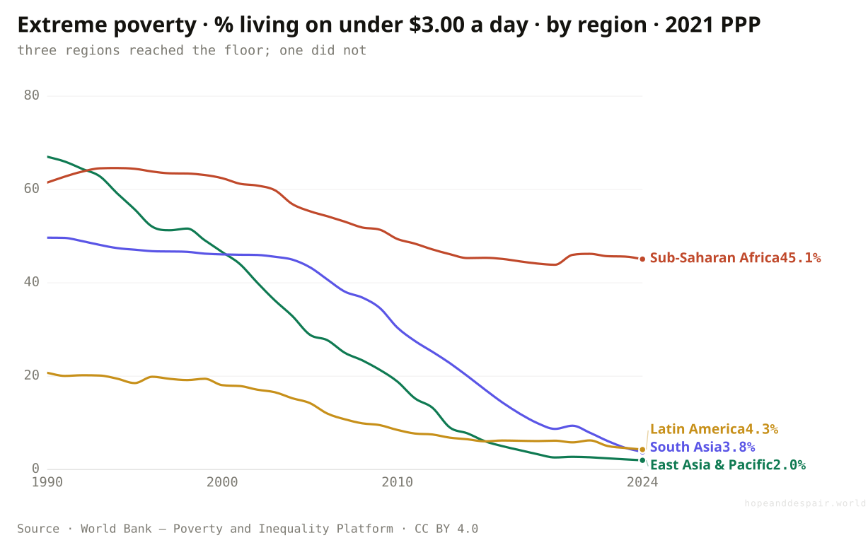
Is the world’s progress really slowing for everyone?
No: East Asia drove extreme poverty from two in three people to one in fifty, while Sub-Saharan Africa is still near one in two.
Four regions, the same line, opposite endings. In 1990 about two-thirds of East Asians and half of South Asians lived in extreme poverty. By 2024 East Asia was near one in fifty and South Asia under one in twenty-five. They did not slow down so much as run out of poverty to cut. Latin America made the same trip from a lower start. Sub-Saharan Africa is the line that refuses to fall: more than six in ten in 1990, still about four and a half in ten today. The world average drops because three of these lines reached the floor, and it flattens because the fourth never left the ceiling. There is no single global pace here. There are regions that finished and a region that has scarcely begun.
How this number was made
What it measures. Percentage of population living in households with an income or consumption below $3 per day.
Calculation. Selected entity East Asia and Pacific (WB).
The displayed line is monotone-cubic smoothed for legibility only — it never moves a data point.
Two of the most populous regions on earth all but eliminated extreme poverty inside a single generation.
The poverty that remains has pooled almost entirely in the one region least able to grow its way out.
The global slowdown is mostly an arithmetic illusion: it is what you get from averaging a finished race with one that has barely started.
Where does the world’s remaining poverty actually live?
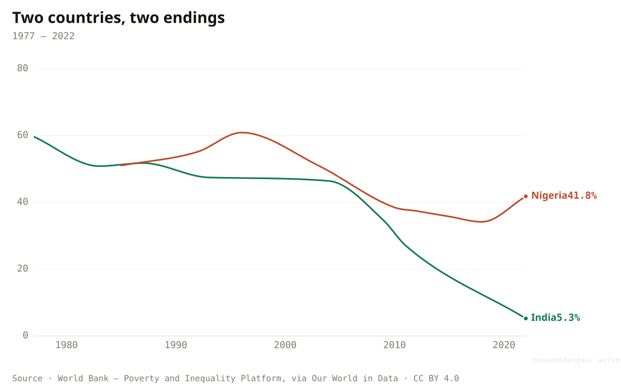
Sub-Saharan Africa now carries an extreme-poverty rate ten times any other region’s, and the gap shows up country by country.
Stand the regions side by side at their latest reading and the divergence becomes a cliff. East Asia, South Asia and Latin America all sit between two and four percent. Sub-Saharan Africa sits near forty-five. The same split runs underneath, between countries that look alike from a distance until you check the numbers. India cut its extreme-poverty rate from about sixty percent in the late 1970s to around five percent by 2022, one of the great escapes in economic history. Nigeria started from a similar height and has barely moved, still above forty percent. Both get named in the same breath as giant developing economies, yet on this measure they live in different worlds. Where you are born inside the average decides everything: whether the escape already happened, or never came.
How this number was made
What it measures. Share of each region living on under $3.00 a day (2021 PPP), latest available year. The world average fell because Asia and Latin America all but eliminated extreme poverty; Sub-Saharan Africa did not.
Calculation. Latest-year extreme-poverty rate per region.
India and Nigeria began at similar heights; only one made the escape.
Most of the developing world has pushed extreme poverty down to a few percent, which once seemed impossible.
A billion-person region has been left holding nearly all of the problem, and its largest economy is stuck near where it started.
Two countries called peers can sit forty points apart, so the category 'developing’ hides as much as it explains.
If the rate fell almost everywhere, did the problem shrink?
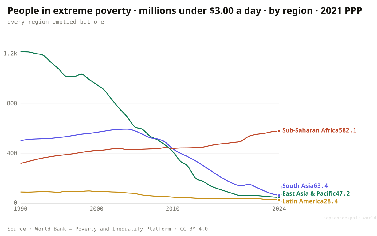
In headcount the world’s poor fell from 2.3 billion to about 850 million, but Sub-Saharan Africa’s nearly doubled, and it now holds seven in ten of all the extreme poor.
A falling rate and a falling number are not the same thing, and the space between them is where this story turns. Counted in people rather than percentages, the world’s retreat from poverty is staggering: about 2.3 billion lived in extreme poverty in 1990 and roughly 850 million do today, even as the planet added more than two and a half billion people. Almost all of that drop happened in Asia. East Asia went from 1.2 billion poor to under fifty million; South Asia from about 500 million to some sixty. Sub-Saharan Africa moved the opposite way. It counted 321 million poor in 1990 and about 582 million now, close to double, because its poverty rate eased only slowly while its population grew fast enough to outrun the decline. That reorders the whole map. In 1990 roughly one in seven of the world’s extreme poor lived in Sub-Saharan Africa; today it is nearly seven in ten. Subtract that one region and global poverty looks all but finished. Add it back and most of what remains sits in a single place. The World Bank’s own Atlas reaches the same place from the other direction: more than half the world’s poor now live in countries where poverty is no longer falling, and it counts forty-three where progress has stalled or gone into reverse.
How this number was made
What it measures. Number of people in extreme poverty (below $3.00/day, 2021 PPP), East Asia & Pacific
There are about 1.4 billion fewer people in extreme poverty than in 1990, the steepest fall ever recorded.
Sub-Saharan Africa now holds nearly seven in ten of the world’s extreme poor, up from one in seven, and its count is still rising.
A rate that falls while the headcount climbs is one region read two ways, and only the flattering reading fits on a poster.
Why did some regions finish while others stalled?
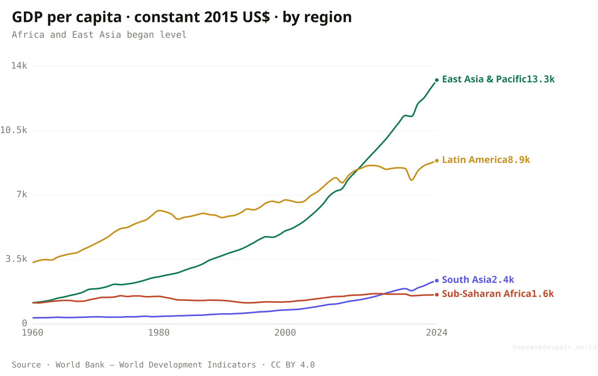
Growth. In 1960 Sub-Saharan Africa was richer per person than East Asia; today East Asia is eight times richer.
Behind every poverty line on this page sits one machine: economic growth. In 1960 the average East Asian and the average sub-Saharan African earned almost the same, a little over a thousand of today’s dollars a year. Then East Asia’s income multiplied more than tenfold, past thirteen thousand. South Asia’s grew sevenfold. Sub-Saharan Africa’s barely moved, from about 1,160 dollars to 1,590 in sixty-four years. A region that began the era slightly ahead of East Asia ended it eight times poorer. This is the engine under all the other charts. Where incomes climbed, poverty fell, lives lengthened and schools filled. Where they stalled, so did everything else.
How this number was made
What it measures. GDP per capita (constant 2015 US$)
Calculation. Selected entity EAS.
The displayed line is monotone-cubic smoothed for legibility only — it never moves a data point.
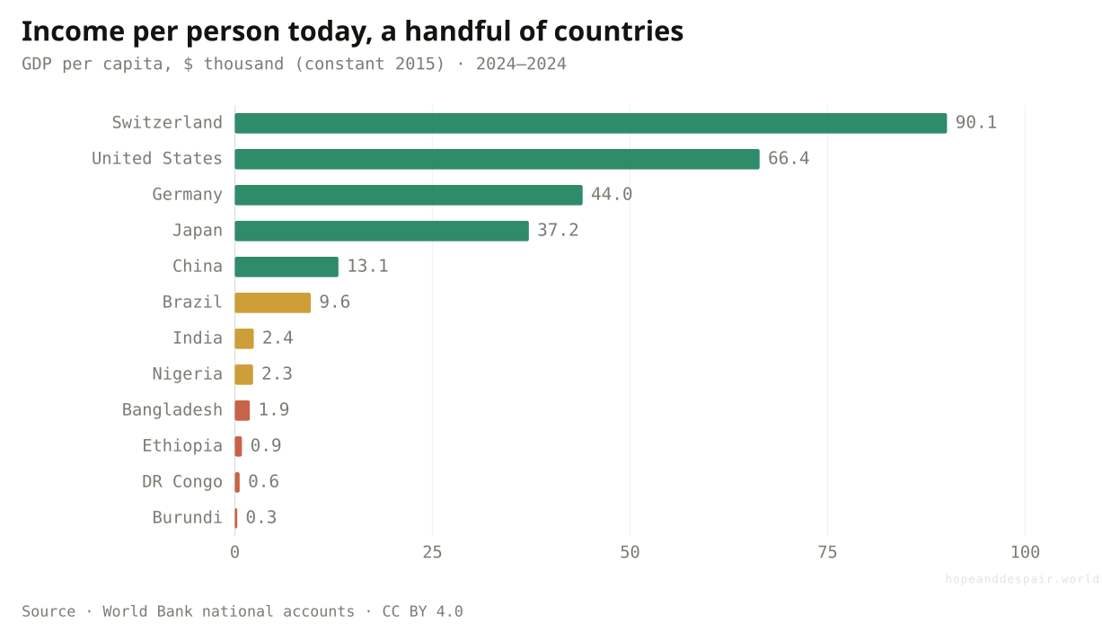
From Switzerland to Burundi, a three-hundred-fold spread.
Two regions turned themselves from poor to middle-income in two generations, the engine that drove every other gain.
An entire region’s average income is essentially where it was sixty years ago, and the growth gap is still widening.
The same starting line led to a tenfold gap, so 'development’ describes an outcome far more than a shared path.
Does the slowdown show up in how long we live?
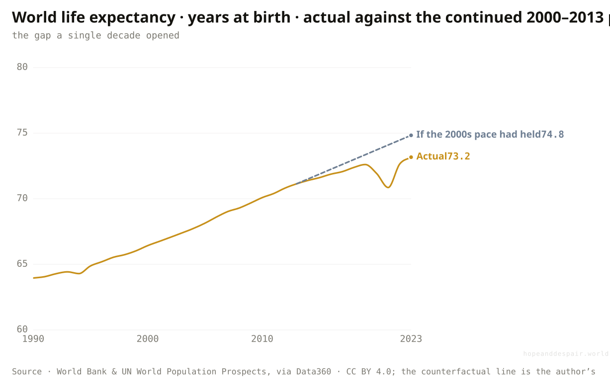
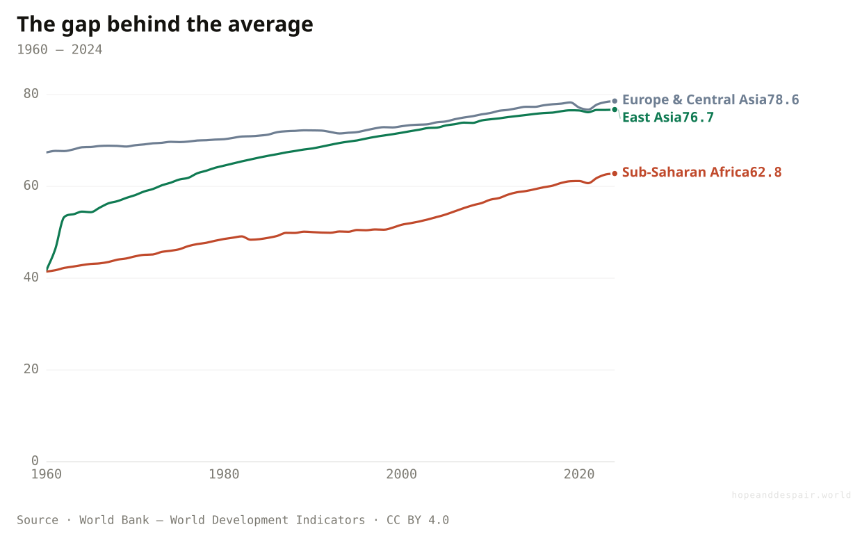
World life expectancy is about 73 years, roughly two short of where the old trend pointed — and the gap behind the average is wider still.
Through the 2000s, world life expectancy rose by a little over a third of a year, every year. Had that pace held, a person born in 2023 could expect almost 75 years. The real figure is about 73. Part of the shortfall is the pandemic, which erased years of gains and has not been fully repaid; part is the harder, dearer grind against the diseases of middle and old age. The regional lines tell the deeper story. Europe and Central Asia, already near 79, has little room left to climb. East Asia has all but caught the rich world. Sub-Saharan Africa rose from 41 years in 1960 to about 63, a vast gain, and still sits more than fifteen years behind. The average slows because the leaders are near the ceiling, not because humanity has stopped reaching.
How this number was made
What it measures. World life expectancy at birth.
Rich regions near the ceiling; Africa still fifteen years behind, still climbing.
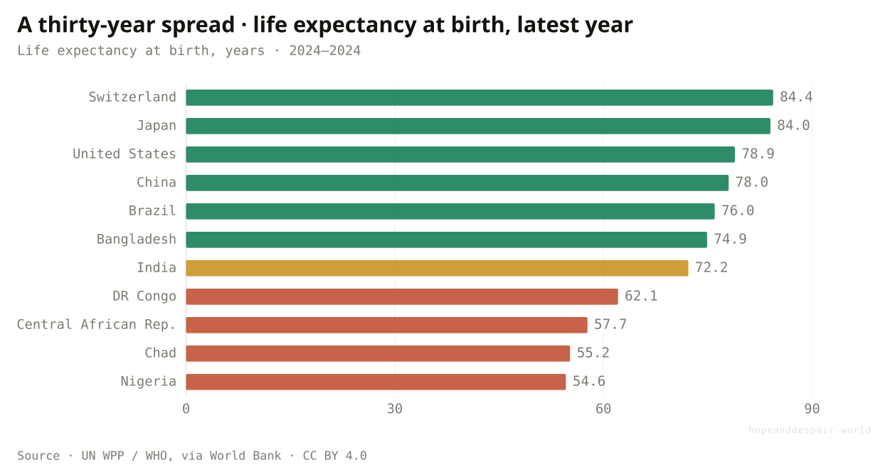
Life expectancy in 2024: Switzerland 84, Nigeria 55 — a thirty-year gap.
Seventy-three years is the longest average life humans have ever lived, and Africa’s climb has not stopped.
Two years of expected life were lost against trend in a decade, and a fifteen-year regional gap remains.
A flattening world line can mean a problem solved at the top or one untouched at the bottom, and here it means both.
What about the thing humanity has fought longest?
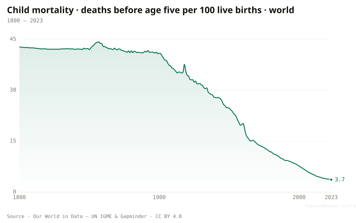
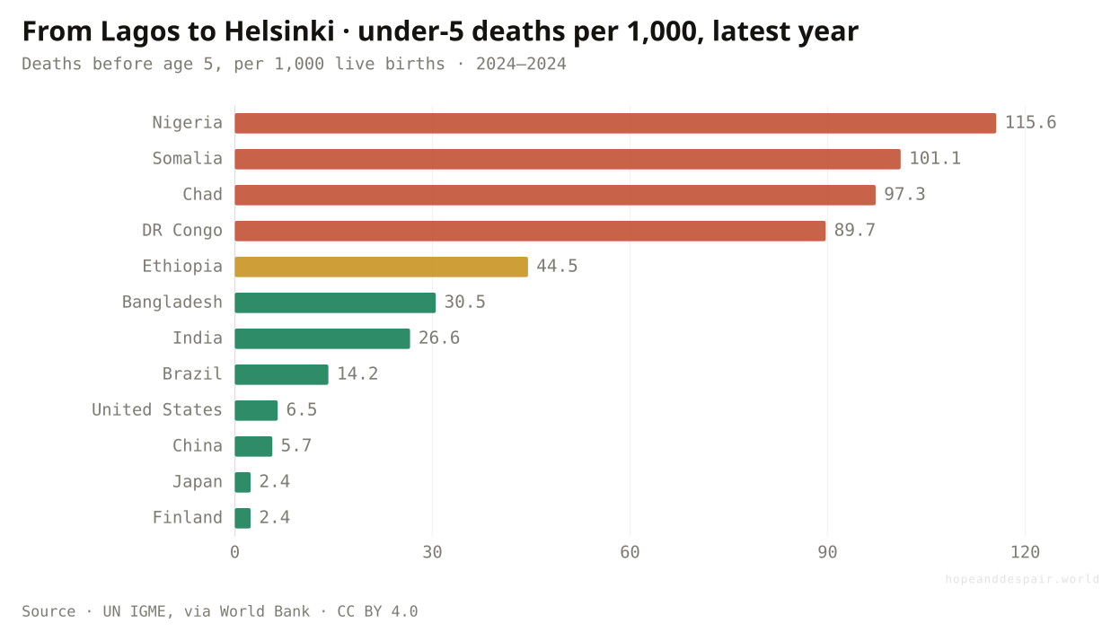
Child death still falls almost everywhere, but at under two-fifths of its 2000s pace.
Of every hundred children born in 1800, more than forty died before their fifth birthday. By 2023 the figure was under four. No statistic on earth bends more steeply toward mercy, and unlike the others on this page it is still falling in nearly every country. But even this line has eased: child mortality fell in the last decade at under two-fifths of its 2000s speed. That is the shape of the whole question in one measure. The direction is still toward survival, almost everywhere. The speed is no longer what it was. A slowdown in the greatest thing the species has ever done is still not the same as it stopping.
How this number was made
What it measures. The long-run estimated share of newborns who die before reaching the age of five.
Calculation. Selected entity World.
The displayed line is monotone-cubic smoothed for legibility only — it never moves a data point.
Deaths before age five per 1,000 births: Nigeria 116, Finland 2.
The single greatest achievement in human history is still advancing, even at a gentler grade.
If the world’s most unstoppable line can lose this much speed, the more fragile gains have further to fall.
Slowing and falling at once is the honest state of nearly every line here, and neither word alone is the answer.
Where is the divergence most extreme of all?
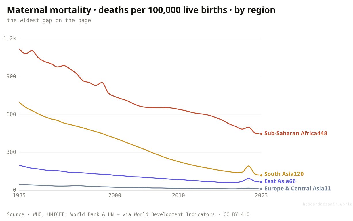
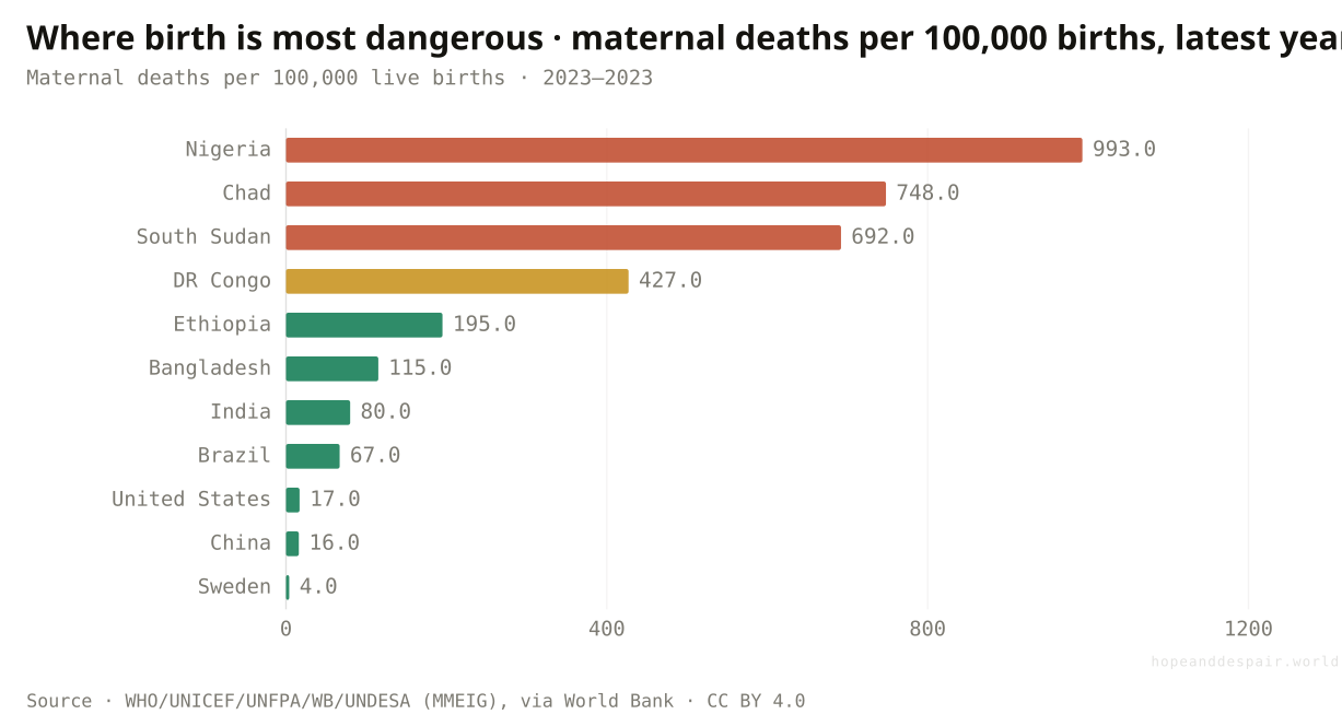
In childbirth: the world halved maternal deaths, yet a Nigerian mother’s risk runs over 200 times a Swedish mother’s.
If the divergence has a sharpest edge, it is here. Worldwide, deaths in childbirth fell from about 460 per hundred thousand births in the mid-1980s to under 200 today, a fall of more than half. But the regional spread is the widest on this page. Europe and Central Asia sits near eleven. Sub-Saharan Africa, after its own steep drop from over a thousand, still sits near 450. The country figures are starker still: about 990 maternal deaths per hundred thousand in Nigeria against four in Sweden. The same act of giving birth carries a two-hundred-fold difference in whether a mother survives it. Almost all of these deaths are preventable with basic care, which is why the gap is really a map of where that care reaches and where it does not.
How this number was made
What it measures. Maternal mortality ratio (modeled estimate, per 100,000 live births)
Calculation. Selected entity SSF.
The displayed line is monotone-cubic smoothed for legibility only — it never moves a data point.
Maternal deaths per 100,000 births: Nigeria 993, Sweden 4 — a 250-fold gap.
Even Sub-Saharan Africa cut maternal death by more than half, and the rich world has nearly eliminated it.
A two-hundred-fold gap in surviving childbirth is the single most unequal number on this page.
A huge global gain and a brutal remaining gap are the same fact read at two different altitudes.
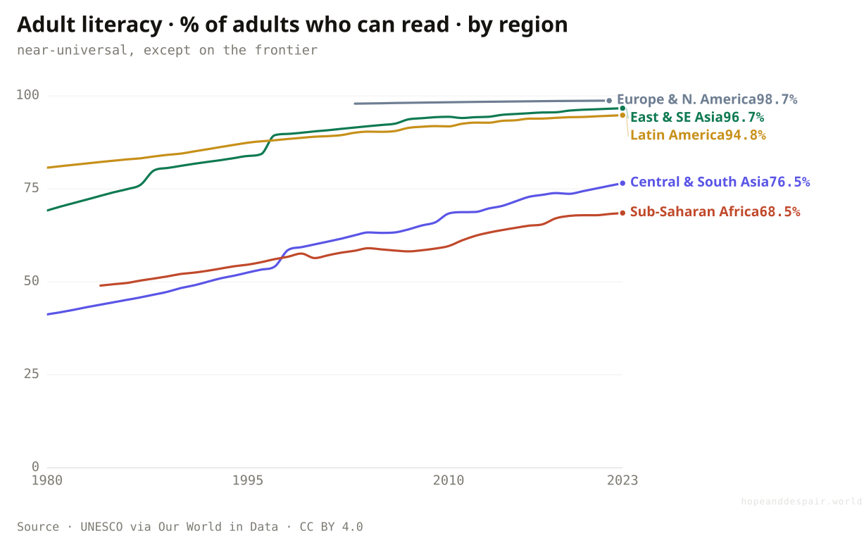
Did the ability to read spread evenly?
Adult literacy passed 95 percent across Asia and Latin America, but still sits near 69 percent in Sub-Saharan Africa.
The same map turns up in who can read. Latin America and East Asia have pulled adult literacy up to ninety-five percent and above. South Asia climbed from under forty percent in the 1970s to about three-quarters today, a huge gain from a low base. Sub-Saharan Africa rose too, from roughly half in the mid-1980s to near seventy percent, but it stays the one region where almost a third of adults still cannot read. Across most of the world the fight for basic literacy is essentially won. On the frontier it is still being fought, two generations after it was settled elsewhere.
How this number was made
What it measures. Share of adults who can read and write a simple statement about their everyday life.
Calculation. Selected entity Europe and Northern America (SDG).
The displayed line is monotone-cubic smoothed for legibility only — it never moves a data point.
Basic literacy is now close to universal across most of humanity, a goal that looked distant a lifetime ago.
One region still leaves nearly a third of its adults unable to read, the same region that lags on income and life.
A near-flat line at the top and a still-climbing one at the bottom are both 'progress’, measured from opposite ends.
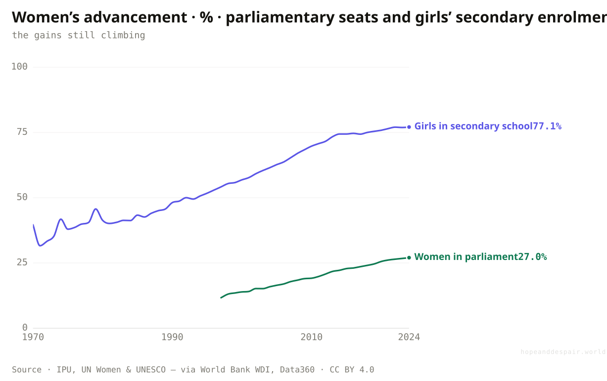
Did women’s gains slow with the rest?
Less than most: women’s share of parliamentary seats more than doubled since 1997, and girls’ secondary enrolment nearly doubled since 1970.
Two measures of women’s lives barely flinched. In 1997 women held under twelve percent of the world’s parliamentary seats; by 2025 they held more than twenty-seven. Girls’ secondary-school enrolment rose from about forty percent in 1970 to over seventy-five today. Neither has reached parity, and a seat in a chamber is not the same as power inside it. But both kept climbing through the decade that slowed almost everything else, for the same reason connectivity did: they started far from finished, with a long way still to run. The pattern of the whole piece holds even here. Where the gap is widest, the movement stays fast; it is the gains nearest completion that stall. The furthest-from-finished part of women’s lives, paid work, shows it plainly: the World Bank’s Atlas reckons that at the current pace the world is still more than three centuries from parity there.
How this number was made
What it measures. School enrollment, secondary, female (% gross)
Calculation. Selected entity WLD.
The displayed line is monotone-cubic smoothed for legibility only — it never moves a data point.
On two fronts where women had the furthest to go, progress hardly broke stride.
A quarter of the seats and three-quarters of the desks is still well short of equal.
Presence and enrolment are easier to count than power and learning, so the cleanest lines measure the thinnest things.
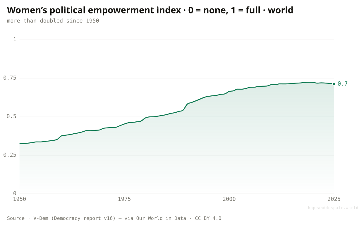
And when you measure power, not just seats?
Measured broadly, women’s political empowerment more than doubled since 1950, and its regional map is unlike any other here: income does not decide it.
Seats and school desks are the parts of women’s lives that are simplest to count. The harder thing, whether women hold civil liberties, can organise, and reach real political power, is what V-Dem’s political empowerment index tries to capture on a scale from zero to one. By that fuller measure the global figure climbed from about 0.33 in 1950 to 0.71 today, more than doubling, though it edged down a little after a peak in 2019 as democratic backsliding spread. What sets this measure apart is its map. Everywhere else in this piece the frontier is Sub-Saharan Africa and the rich regions lead. Here the order scrambles. Africa began in 1950 far below everyone, near 0.13, and has climbed the furthest of any region to about 0.67, passing Asia on the way. Asia, richer on average, now sits lowest at about 0.62, held down by populous states where women’s political voice stays tightly constrained. Europe and South America lead, both above 0.80. Income built the schools and the clinics, but it did not buy women a political voice. That followed a different and more uneven path, and it is the one domain here where the poorest region is not the one left behind.
How this number was made
What it measures. Central estimate of the extent to which women enjoy civil liberties, can participate in civil society, and are represented in politics.
Calculation. Selected entity World.
The displayed line is monotone-cubic smoothed for legibility only — it never moves a data point.
Africa climbed from lowest to mid; Asia, richer, now trails. The poorest region is not last here.
On the broadest measure of women’s political standing, the world more than doubled since 1950, and the region that started last has climbed the most.
Even this gain stalled after 2019 as democratic backsliding spread, and the most populous region still ranks lowest.
Women’s political power is the one domain here where wealth doesn’t set the order, so the usual frontier map simply does not apply.
Has anything actually gone backwards?
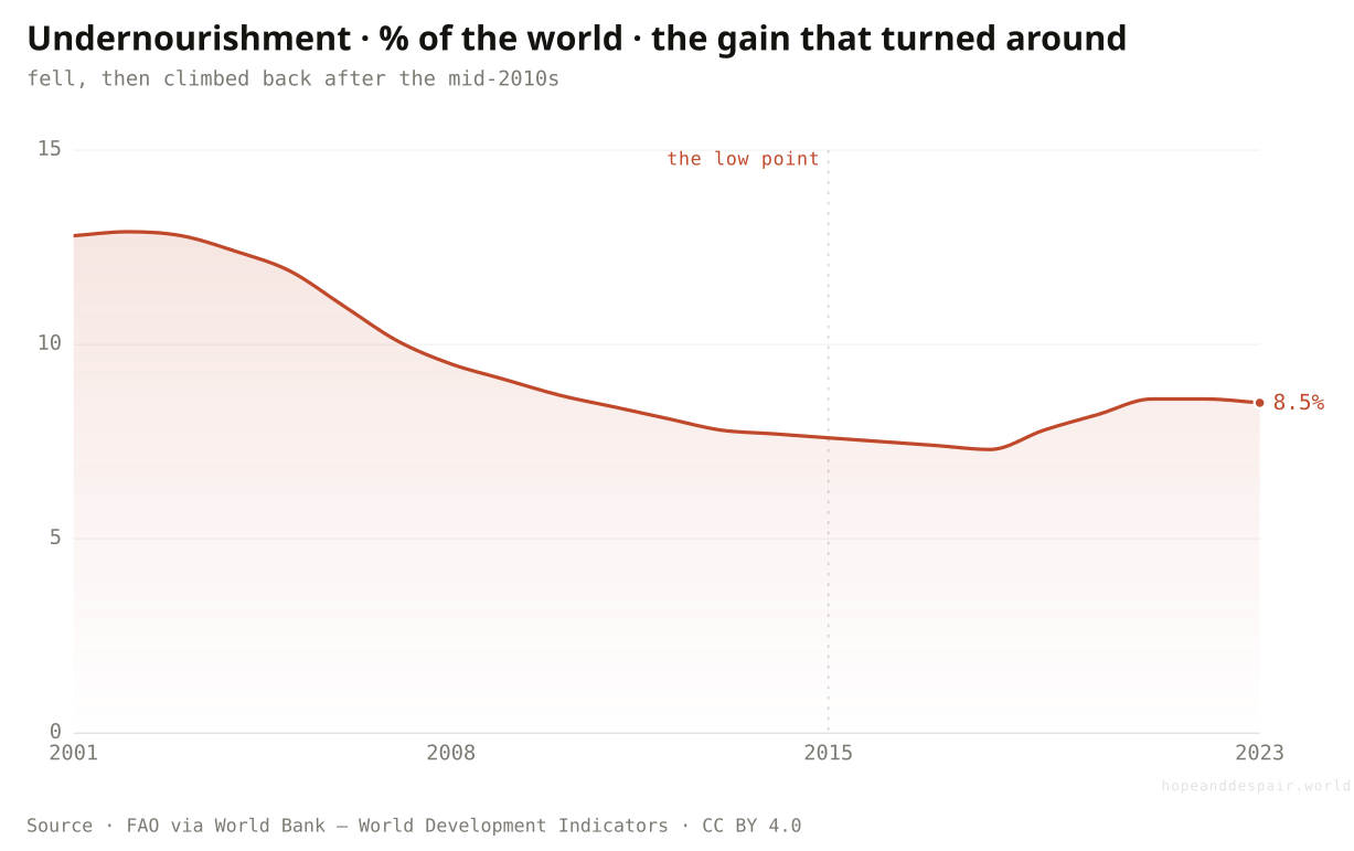
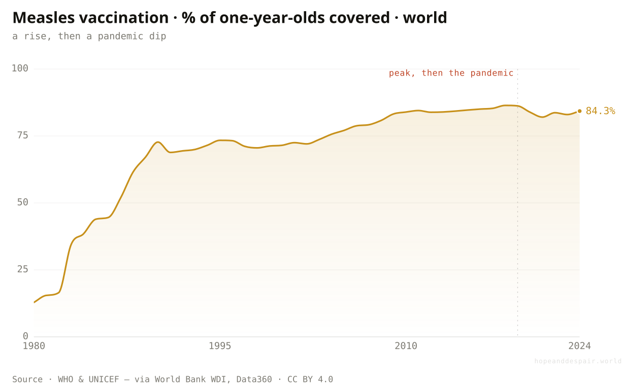
Yes: world hunger fell to about 8 percent by the mid-2010s, then climbed back — and measles vaccination has slipped since the pandemic.
Two gains did not merely slow. They turned. The share of the world that is undernourished fell through the 2000s to a low around the mid-2010s, then began rising again as conflict, climate shocks, food-price spikes and the pandemic stacked up. By 2023 it sat near eight and a half percent, back where it had been years earlier. Measles vaccination tells a sharper version: coverage that had climbed into the mid-eighties dropped during the pandemic and has not fully recovered, leaving more children exposed than a decade ago. These are small numbers against the long sweep of the page, but they are the only lines pointing the wrong way, and they sit on exactly the gains, food and disease, that the world thought it had locked in.
How this number was made
What it measures. Prevalence of undernourishment (% of population)
Calculation. Selected entity WLD.
The displayed line is monotone-cubic smoothed for legibility only — it never moves a data point.
Even after the rise, far less of the world goes hungry than at the century’s start.
Hunger and vaccination both moving the wrong way means some of the most basic gains are not locked in at all.
A line that falls for fifteen years and then climbs is neither victory nor defeat, but a warning that progress can spend itself.
And the second reversal?
Measles vaccination climbed for decades, then slipped after the pandemic, leaving more children exposed than ten years ago.
The second line that turned is a needle. Measles vaccination coverage rose from the low double digits in 1980 to the mid-eighties by the late 2010s, one of the quiet triumphs of global health. Then the pandemic broke routine immunisation, and coverage fell, recovering only partly to about eighty-four percent by 2024. That leaves a larger share of children unprotected than a decade earlier. Measles is unforgiving of gaps: it spreads so easily that coverage has to stay very high to hold it back, so even a small slip reopens the door to outbreaks. Like hunger, it is a gain the world had nearly secured and then allowed to slacken, and the cost of that is paid by children too young to have chosen it.
How this number was made
What it measures. Measles immunization coverage
Five in six of the world’s children are still vaccinated against measles, up from almost none in 1980.
Coverage going backwards at all means a disease the world had cornered is being handed back room to spread.
A line near its all-time high that has just ticked down is both a triumph and an early warning.
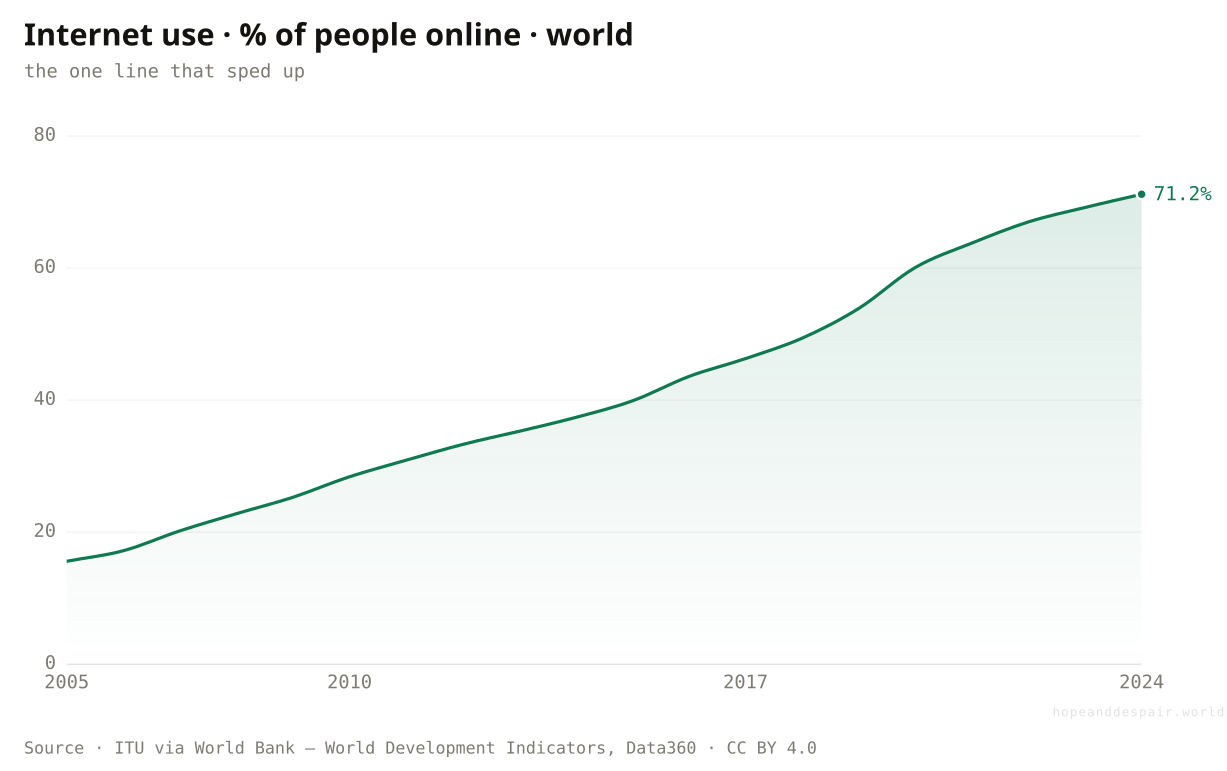
Is anything moving faster than before?
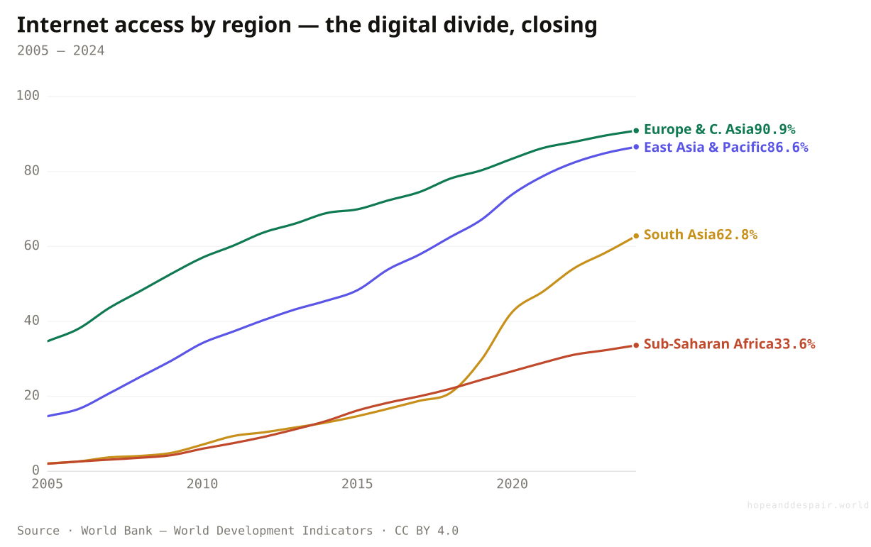
One thing is: internet use spread faster after 2013 than before it, the standout accelerator on a page of slowdowns.
Against the broad slowdown, the internet ran the other way. In 2005 about one person in six was online; by 2024 it was roughly seven in ten, and the climb was steeper in the last decade than the one before. It is the clearest accelerator on this page. But even here the map matters more than the line. Europe and East Asia are above eighty and ninety percent, near saturation. Sub-Saharan Africa, starting from almost nothing in 2005, has reached only about a third. The frontier that lags on poverty and lifespan lags online too. Mobile phones, by contrast, have hit their ceiling: with more than one subscription per person worldwide, their once-explosive growth has slowed to a fifth of its old pace, not because the spread failed but because it finished.
How this number was made
What it measures. Share of the population who used the Internet in the last three months.
Calculation. Selected entity World.
The displayed line is monotone-cubic smoothed for legibility only — it never moves a data point.
Near-saturation in the rich world and East Asia; about a third in Sub-Saharan Africa.
Connectivity is the one measure here still gaining speed, and it is reaching the poor world fast.
The same regional gap that defines poverty and lifespan has opened online, a generation late for Africa.
Faster growth and a widening gap describe the same line, depending on whether you read the rate or the distance.
Across every economy, did poorer countries grow faster?
Only the giant ones. Count people and the poor caught up; count countries equally and they did not.
Here is the whole divergence in one frame. Each bubble is a country, placed by how rich it was in 2000 and how fast it grew afterward, sized by population. If poverty were a starting line everyone left at the same speed, the cloud would slope down: the poorer you began, the faster you would grow. Weighted by people, it does slope down, because China and India were enormous, poor and fast, and they bend the entire world toward catch-up. But weight every country equally and the slope nearly flattens. The typical poor country did not grow toward the rich. A handful of giant ones did, and pulled the global average along with them. 'The world is converging’ and 'most poor countries are not’ are both true at once, and the only difference between them is whether you are counting people or countries.
How this number was made
What it measures. Annualized growth of GDP per capita (PPP, constant 2021 international $) 2000–2024 vs initial level, 183 countries; OLS fits of growth on ln(initial level), population-weighted and unweighted.
Calculation. Per-country growth 2000–2024 vs ln(initial); weighted slope -1.204, unweighted slope -0.423.
The displayed line is monotone-cubic smoothed for legibility only — it never moves a data point.
Weighted by humanity, the poor world really did grow faster and close the gap on the rich.
Strip out a few giant winners and the typical poor country made no ground at all on the rich in a quarter-century.
The same scatter shows convergence and its absence, depending only on whether a country or a person is the unit.
So is human progress slowing down?
Across twelve measures, most improved at a fraction of their 2000s pace; a few held or sped up; the answer is divergence, not decline.
Set each measure’s recent pace against its own pace a decade earlier, where a hundred percent would mean no change in speed. Most sit well below it. The deepest gains, against poverty, early death and child mortality, run at a quarter to two-fifths of their old rate. The access measures, sanitation, electricity and the internet, held their pace or beat it. The pattern is not a uniform fade. It is the signature of a world where the easiest and most concentrated wins were banked first, by the regions that could move fastest, while the unfinished work, online access, the African frontier, the slow diseases, is what remains. Progress did not stop. It arrived in some places, reversed in a couple, and still has not reached others. Whether the global line turns back up depends almost entirely on whether the frontier that has barely moved finally gets its own decade of speed.
How this number was made
What it measures. For each world series, the least-squares annual rate of improvement over 2013–2024 divided by the rate over 2000–2013 (signed so improving is positive). Below 100% = the gain slowed; above = it sped up. Two measures whose rate turned negative (undernourishment, measles coverage) are shown separately as lines. A transparent world-aggregate measure — not the Atlas’s stage-conditional country model.
Calculation. Slope(2013..latest)/slope(2000..2013) per indicator; sign flipped for lower-is-better; reversals excluded.
Almost every line is at or near its best level ever, and the worst news is that good things improved more slowly.
A pace cut to a quarter, sustained, is the difference between finishing a job in a generation and abandoning it.
The single word 'slowing’ hides a divergence — finished, reversed, accelerating and stalled, all at once.
If progress has an address, where is it?
On all seven measures this piece tracks, Sub-Saharan Africa is the region doing worst, and no other region is worst on even one.
The introduction promised a map, and here it is. Each row is one of the seven measures the piece has followed; each column is a world region, placed left to right from the poorest to the richest. A cell turns red where that region does worst on its row and green where it does best, with every row scored on its own scale, so the colours rank the regions against each other rather than against a single yardstick that would pretend a year of life and a point of poverty are the same thing. Read across a row and you see the spread on one measure. Read down a column and the argument of the whole piece assembles itself. The Sub-Saharan column is the darkest shade on all seven rows; no other region is worst on a single one. The numbers under the colour are not close. Nine in ten Europeans are online and one in three sub-Saharan Africans; a mother’s risk of dying in childbirth is 448 per 100,000 births there against 11 in Europe. The gradient is not perfectly tidy: South Asia is poorer than Latin America yet vaccinates more of its children against measles, the ordinary texture of real development. The dominant pattern is still unmistakable, and it is the one thing a single world average is built to hide. Progress has an address. On most of these measures it has reached nearly everywhere except the place that needed it most.
How this number was made
What it measures. Latest available value for each world region on each measure, shaded within each row from the worst region (red) to the best (green). The scaling is independent per row — there is no cross-measure composite. Columns are ordered by GDP per person, poorest to richest.
Calculation. Per-row min–max of the latest regional values; the better end (lower for poverty/mortality, higher for life expectancy/coverage/access) maps to green.
The displayed line is monotone-cubic smoothed for legibility only — it never moves a data point.
Outside one region, most of these seven measures have reached nearly the whole world, which no earlier generation could say.
One region places last on every one of these measures at once, the divergence compressed into a single dark column.
Income predicts most of the shading but not every cell, so even the clearest map keeps an argument inside it.
So is the slowdown simply the end of the story?
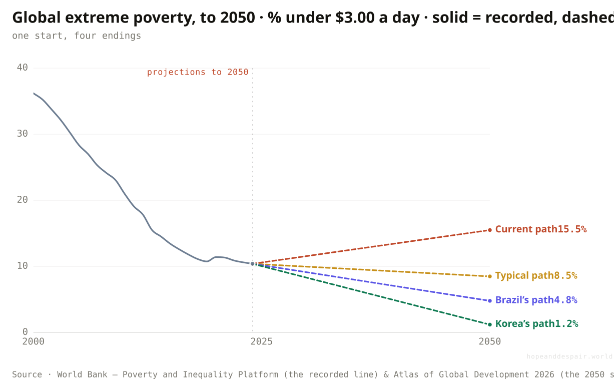
No: the same point in 2025 fans into four futures — stay on the current path and poverty climbs to 15.5% by 2050; move the way Korea once did and it falls to 1.2%.
Every chart so far has looked backward. This one looks ahead, and it is the only place the question stops being about measurement and turns into a question about choice. The solid line is the world’s extreme-poverty rate as it actually ran, from about 36 percent in 2000 to roughly 10 percent now, the pandemic bump and all. From the point where that line ends, the World Bank’s Atlas draws four dashed futures, each the world rate in 2050 if the typical poor country moved at a different speed. Stay on the present path and the rate drifts back up to 15.5 percent, the first sustained rise the series has ever shown. Let poor countries grow at the pace a typical developer has managed and it eases to 8.5. Match Brazil’s better decades and it reaches 4.8. Move the way South Korea once did, from among the poorest places on earth to among the richest, and extreme poverty all but vanishes, down to 1.2 percent. The distance between the top dashed line and the bottom one is neither forecast nor fate. It is the price or the reward of pace, the same divergence that split the regions, now aimed at the years ahead. Which line the world lands on turns almost entirely on whether the frontier that stalled finds a fast decade of its own.
How this number was made
What it measures. World extreme-poverty headcount ratio at $3.00/day (2021 PPP).
Calculation. Decline 1.58 pts/yr in 2000–2013, 0.41 pts/yr in 2013–2024.
The displayed line is monotone-cubic smoothed for legibility only — it never moves a data point.
The future is not fixed: a Korea-paced frontier would push extreme poverty close to zero by 2050.
On the path the world is actually on, the poverty rate turns back up for the first time in the series, toward 15.5 percent.
Four numbers branch from a single point, so 'what happens next’ is less a forecast than a question about the pace we choose.
Progress did not fade evenly. It arrived in some places, reversed in a couple, and never quite reached the rest.— the through-line of this piece
One question, read by the fields that actually study it. Each voice is given both its most hopeful and its darkest honest reading — with a note on how settled the evidence underneath is.
the hopeful readLife expectancy recovered most of its pandemic loss within two years, and Africa is still closing the gap.
the darker readThe era of fast, cheap gains from beating childhood infection is over, and what kills us now moves slowly.
the hopeful readTwo of the most populous regions on earth all but eliminated extreme poverty, the fastest broad gain in history.
the darker readThe remaining poverty is concentrated in the region with the weakest growth, so the easy phase is behind us.
the hopeful readThe tools that drove the gains still exist, and the internet is reaching us faster than electricity ever did.
the darker readHunger is rising again and a vaccinated child is no longer a given, after years when both seemed settled.
the hopeful readEvery measure here is at or near its best level ever; the worry is about acceleration, not direction.
the darker readExceptional decades end, and the record is full of climbs that flattened into long, quiet stalls.
Strongest case for hope
Read the levels, not the speeds, and the story is triumphant. People live longer than ever, fewer are poor than ever, fewer children die than ever, more are online than ever. Two of the most populous regions on earth crossed from mass poverty to near-elimination inside a generation. A slowdown from that pace is still forward motion, and much of it is the arithmetic of success: a number near its ceiling is hard to push higher. On the genuinely unfinished frontier, connectivity is still gaining speed, and Sub-Saharan Africa’s lifespan and access are climbing even where its poverty is stuck. The job is not done, but the direction across almost every line is still up.
Strongest case for despair
Read the speeds and the map, and the story darkens. The gains that matter most have been cut to a quarter or a third of their old pace, and the remaining poverty has pooled almost entirely in one region whose largest economies have barely moved. Two basic gains, freedom from hunger and protection from measles, have reversed outright. The surge that set the benchmark was powered by China’s once-in-history rise and an open-trade era now closing, tailwinds that will not return. The World Bank’s Atlas puts a number on the stake: stay on the present path and six hundred million more people could be in extreme poverty by 2050, the global rate climbing back toward fifteen percent instead of falling. If the frontier that has stalled does not find its own decade of speed, the global line does not just slow. It splits permanently into a finished world and a stranded one.
Watch the frontier, not the average. The number that matters is whether Sub-Saharan Africa’s poverty rate finally breaks downward and whether its life expectancy keeps closing the gap, because that single region now holds most of the unfinished work. Watch the two reversals: if undernourishment and vaccination turn back down, the backsliding was a shock, not a trend. And watch whether the world line reattaches to its old pace in even two or three measures, which would argue for a plateau after a sprint rather than a stall. Speed on the frontier is not hypothetical: Singapore and South Korea crossed from among the world’s poorest to among its richest within a lifetime, the Atlas’s own evidence that a stalled place can still find a fast decade. Faster on the frontier and the hope case wins. A widening gap, and the verdict tilts toward a world permanently split.
Everything done to the numbers between the source and the chart, disclosed in full. Where a choice is editorial rather than measured, we say so.
- Divergence, not a single line
- Wherever the data allows, the piece reads world, then region, then country, because the global average is a weighted blend of opposite trends. The regional poverty, life-expectancy and internet series are the same World Bank and Our World in Data measures shown un-averaged; the country pairs (India and Nigeria) are drawn from the same poverty source.
- Pace, not level
- For each world series we fit a straight line by least squares over 2000–2013 and again over 2013 to the latest year, giving an annual rate of change, signed so improvement is always positive. The pace-ratio chart is the recent rate divided by the earlier one; below 100% means the gain slowed. This is a deliberately simple, fully visible measure, not the World Bank Atlas’s stage-conditional country model. Theirs scores each country against how fast comparable countries moved historically, so that a speed of 80 means outpacing eighty percent of past cases; ours divides one decade’s slope by the previous decade’s, in plain units anyone can recompute. That is why our numbers differ from theirs.
- Reversals are shown as lines, not bars
- Two measures, undernourishment and measles coverage, have a recent rate that turned negative — they went backwards. A bar clamped to zero would read as 'barely moved’, so they are pulled out of the pace chart and shown as their own series, where the turn is visible.
- The closing grid is shaded row by row, not as a score
- The final chart colours each region on each measure from the worst region (red) to the best (green), but every row is scaled on its own. There is no overall index, and no cell is comparable to a cell in another row, because a year of life and a point of poverty do not share a scale. The columns are ordered by one stated variable, income per person, so the eye can see whether outcomes track wealth, not by a hidden ranking. The women’s empowerment figure uses the exact V-Dem index the Atlas uses, where elsewhere we lean on World Bank measures.
- Why there is no headline 'cost in people’
- It is tempting to extend the fast 2000s poverty trend forward and count the 'extra’ poor today. We refuse that figure: a poverty rate is bounded at zero, so a straight line from the fast years runs below zero within a decade and manufactures a dramatic but meaningless number. The honest statements are about pace, about the actual headcount today (about 847 million), and about where that poverty now lives. Where the piece does cite a forward number — the climb toward fifteen percent and six hundred million more poor by 2050 — it is the Atlas’s own projection on its own method, quoted and linked rather than recomputed here.
- The closing fork is the Atlas’s projection, drawn on our line
- The final chart’s solid line is our own World Bank poverty series. The four dashed paths to 2050 are the Atlas’s published scenarios, quoted and redrawn from the single point where our data ends, not modelled by us. They are illustrative endpoints rather than forecasts; the spread between them is the argument, that the future of the frontier is a matter of pace and not a fixed line.
- Prose and number audit
- Explanatory text was drafted with AI assistance and then checked line by line against the derived data series; every quantitative claim traces to a figure produced by the project’s pipeline. No outside numbers were introduced.
- World Bank — Poverty and Inequality Platform — pip.worldbank.org ↗ · CC BY 4.0 · vintage 2026Extreme-poverty headcount ratio at $3.00 a day (2021 PPP), world, six regions, and individual countries.
- World Bank — World Development Indicators, via Data360 — data360.worldbank.org ↗ · CC BY 4.0 · vintage 2026Life expectancy, internet use, stunting, measles coverage and more, pulled through the Data360 API.
- Our World in Data — child mortality, life expectancy, literacy — ourworldindata.org ↗ · CC BY 4.0 · vintage 2024Long-run child mortality (UN IGME, Gapminder) and the deep-history lines; regional life-expectancy series.
- FAO — Prevalence of undernourishment (via World Bank WDI) — data.worldbank.org/indicator/SN.ITK.DEFC.ZS ↗ · CC BY 4.0 · vintage 2024Share of the world undernourished; the reversal after the mid-2010s.
- WHO, UNICEF & UN — maternal mortality and immunization (via World Bank WDI) — data.worldbank.org ↗ · CC BY 4.0 · vintage 2024Maternal deaths per 100,000 births by region and country; measles vaccination coverage.
- World Bank & Maddison Project — via Our World in Data — ourworldindata.org/economic-growth ↗ · CC BY 4.0 · vintage 2024GDP per capita levels and growth for 183 economies, 2000–2024; the convergence scatter.
- V-Dem (Democracy report v16) — via Our World in Data — ourworldindata.org/grapher/women-political-empowerment-index ↗ · CC BY 4.0 · vintage 2026The women’s political empowerment index, scored 0 to 1, for the world and each continent. It is the exact measure the Atlas uses.
- World Bank — Atlas of Global Development 2026 — data360.worldbank.org/en/atlas/global-progress ↗ · Cited for the question and framing, not re-hosted · vintage 2026The source of the slowing-progress question. We also quote a few of its figures: about 600 million more poor and a rate near 15 percent by 2050, the 43 stalled countries, and the finding that more than half the world’s poor now live where poverty is not falling. It uses a different, stage-conditional method, so its past magnitudes differ from ours. These forward figures are quoted, not recomputed.
Cite this page
Reference
Hope & Despair. “Is human progress slowing down?.” Hope & Despair, 2026. https://hopeanddespair.world/questions/is-human-progress-slowing-down.
BibTeX
@misc{hopeanddespair:is-human-progress-slowing-down,
  author       = {{Hope & Despair}},
  title        = {{Is human progress slowing down?}},
  year         = {2026},
  howpublished = {\url{https://hopeanddespair.world/questions/is-human-progress-slowing-down}},
  note         = {hopeanddespair.world, updated 2026-06-20}
}
Original prose, code, and chart designs are released under CC BY 4.0 ↗ — reuse freely with attribution. Source datasets keep their own licences, listed above. Add your access date when citing.
- Progress: source-backed pass + FIG. 17 forward fork chart View diff →
- Is human progress slowing down: ship the article View diff →
Generated from the commit history — every edit to a number, a word, or a chart is tracked in the open. Browse the full history & diffs on GitHub →
in plain words
This piece reads one question at three altitudes — world, region, country — because the global average turned out to be the least honest number on the page. The method and its limits, including the one counterfactual we kept and the one we refused, are described in the panels and the methodology note above.
The explanatory text here was written with the help of a large language model, working only from the open data series this project ingests and derives. Every number traces back to a figure in that pipeline, and every change is tracked in the open.