Question 13 · Money & Debt
Is the world drowning in debt?
Government debt has never been larger, yet the size of the pile predicts almost nothing. What a debt is made of, and who holds it, decides whether it is a tool or a trap. And the trap is tightening on the countries least able to escape it.
Ask whether the world is drowning in debt and the honest first answer is a question back: whose debt, and in whose money? The global total is at a record, and that headline is true. It is also nearly useless on its own.
This piece follows the debt down from the planetary number to the country, because that is the only altitude where the word means anything. The thread running through it is simple. The danger in a debt has little to do with its size and almost everything to do with its shape.
And the shape is getting worse for the countries that can least afford it. Three pressures are loading onto the weakest balance sheets at once: the cost of adapting to a changing climate, a green transition that is dearest where capital is scarcest, and a fight against poverty that has stalled across Sub-Saharan Africa. The escalator of ever-more-open trade that earlier developers rode out of debt is slowing at the same time. The divide is not just wide. It is widening.
you read
- Debt figures are reported by governments and compiled by the IMF, World Bank, BIS and UNCTAD. Where a country is in crisis, its own numbers are often the least reliable — a gap this piece treats as part of the story, not a footnote.
- Several gauges here mix sources with different licences. The composite charts are displayed and cited but not offered for download, per UNCTAD and BIS terms.
- A handful of countries stand in for a pattern. The cast is curated to show the spread, not to rank every nation.
- This piece is about public, sovereign debt, what governments owe. Household and corporate debt, which in the rich world dwarfs it, is shown once for scale and then set aside as a separate story for another question.
Does a big debt mean a country is in trouble?
Japan owes more than twice its yearly output and sleeps fine; Sri Lanka defaulted owing far less.
Japan’s government owes about two and a third times everything the country earns in a year, and nobody expects it to miss a payment. It borrows in yen, a currency its own central bank prints, from savers who are mostly Japanese. Sri Lanka stopped paying its foreign creditors in 2022 while owing a little under one year of output. The gap between those two stories is not the size of the debt. It is what the debt is made of: which currency it is written in, who holds it, and whether it can be rolled over when it comes due. Read the bars and the colours together. High debt sits in calm rich economies and in the wreckage of collapse, side by side.
How this number was made
What it measures. General government gross debt, % of GDP, latest available year; a curated spread of calm high-debt advanced economies against the distress tail. Link-only: charted and cited, not re-hosted.
Calculation. Latest-year public-debt %GDP, curated spread, sorted descending; colour = distress status not debt level.
Most of the world’s heaviest debts are owed by countries that can carry them indefinitely.
Owing less than Japan was no protection for Sri Lanka, because its debt was the dangerous kind.
The single number everyone quotes, debt to GDP, is close to meaningless without knowing the currency and the creditor.
And how much of that record pile is governments, anyway?
The world owes about two and a half times its yearly output, and roughly two-thirds of that is private, not government.
Step back from governments for a single chart and look at every dollar of debt on earth, sorted by who borrowed it. The record-breaking pile that fills the headlines is not mainly governments at all. Across the reporting economies, total credit runs to about two and a half times the world’s annual output, and of that, governments owe only around a third. Companies owe roughly as much again, and households about a quarter. The mix has tilted since the 2008 crash: the government slice has swelled, from under a third toward two-fifths, while the household share has thinned. The rest of this piece follows that government third, because that is where a debt can curdle into a sovereign default, a currency collapse, a creditor that can take a country to court. The larger and quieter debt is owed by firms and families, in the rich world most of all.
How this number was made
What it measures. Total credit to governments, non-financial corporations, and households across all BIS-reporting economies, each as a share of the three-sector total, by year. Underlying values are credit as a percentage of GDP at market value, adjusted for breaks; the chart normalises them to borrower shares.
Calculation. BIS credit-to-GDP for government / corporations / households, all reporting countries, Q4 each year, normalised to borrower shares.
The displayed line is monotone-cubic smoothed for legibility only — it never moves a data point.
Most of the world’s debt is owed by companies and households in wealthy economies that can comfortably carry it.
Governments owe only a third of the pile, but that third holds every sovereign default and currency collapse in this piece.
The phrase 'world debt’ bundles a Japanese mortgage with a Zambian dollar bond, two things that behave nothing alike.
Is that government debt piling up evenly across the world?
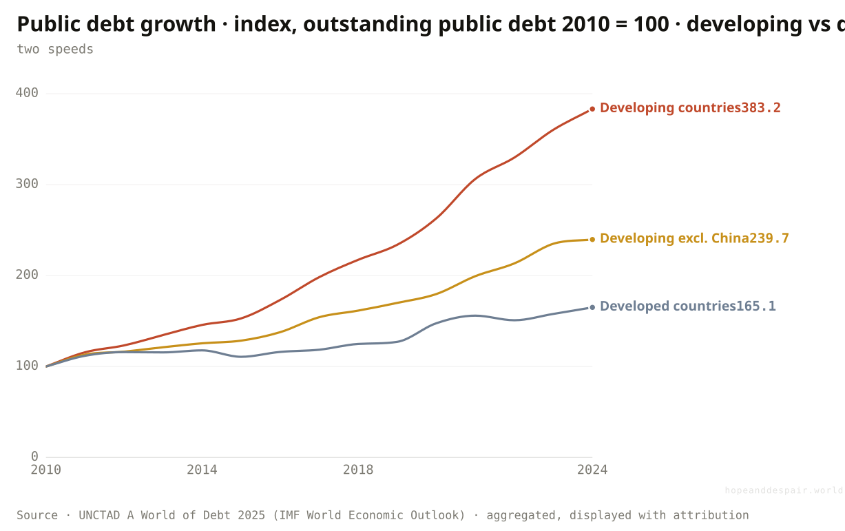
Since 2010 the developing world’s public debt has nearly quadrupled while the rich world’s grew by two-thirds; the poorer countries’ share of the global total has jumped from 16% to 31%.
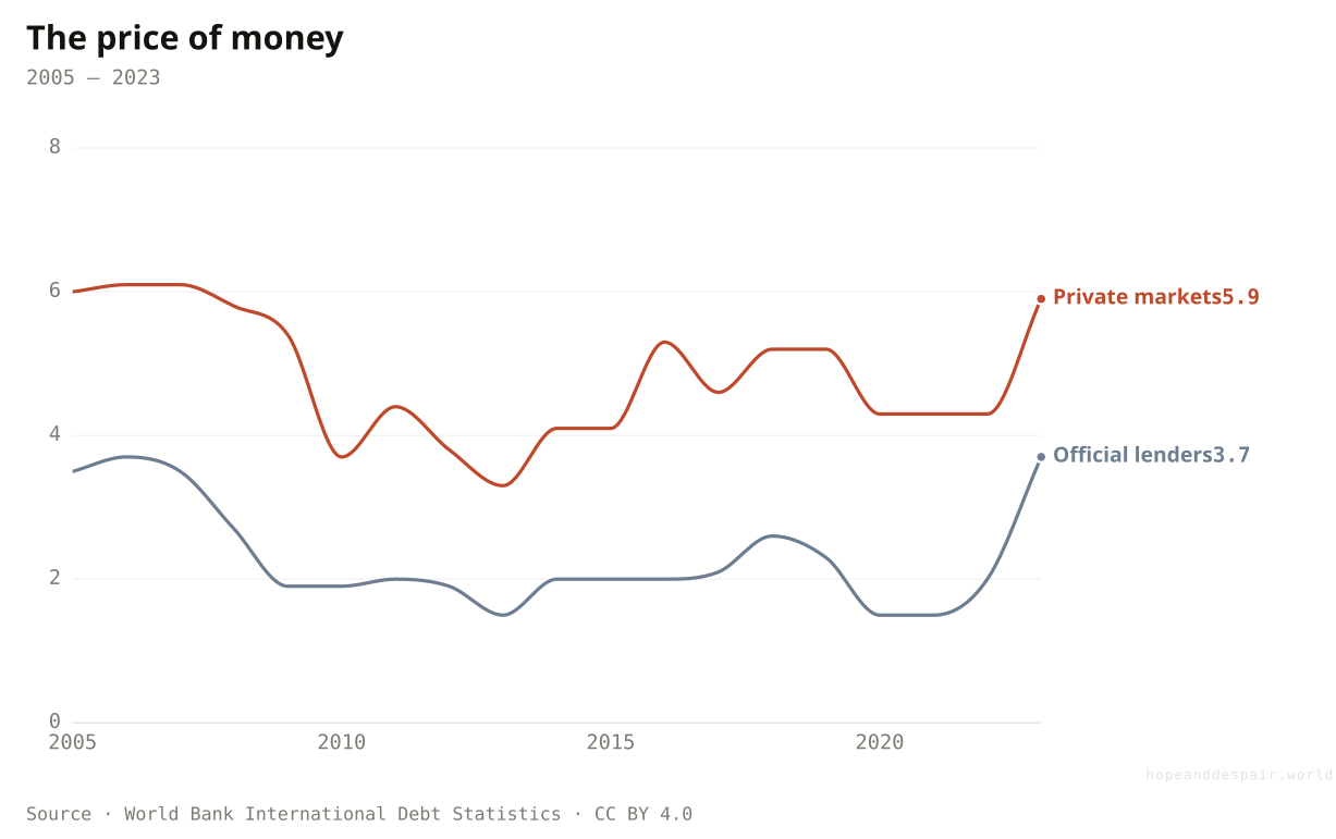
Index every government’s debt to its own 2010 level and the two worlds pull visibly apart. Developed-country debt, much the larger pile in dollars, rose by about two-thirds over fourteen years, a steady climb. Developing-country debt nearly quadrupled. The gap is not a story about China alone: strip China out and the developing line still more than doubles, far outrunning the rich world. Behind the divergence sits a simple asymmetry in the price of money. A poorer economy borrows dearer: tapping private bond markets it pays around six percent, against the two to four it pays on cheaper official loans, and well above what a wealthy government is charged. The same road or power line therefore leaves it a far bigger debt behind. Their share of all the world’s public debt has climbed from 16% in 2010 to 31% now, even though these countries hold 39% of global output and are home to 83% of its people. The debt is migrating toward the economies least equipped to carry it.
How this number was made
What it measures. Total public debt of developing countries, US$, indexed to 2010=100.
Calculation. Sum nominal public debt US$bn by development status, index to 2010=100.
The displayed line is monotone-cubic smoothed for legibility only — it never moves a data point.
Official lenders charge a low, concessional rate; private markets charge more, and both jumped in 2023 as global rates climbed. The poorest borrow mostly official and cheap; the premium bites the middle-income countries that lean on the bond market.
Borrowing is how a poorer country builds the roads, grids and schools a richer one already has.
Public debt is now accumulating fastest exactly where the capacity to repay it is thinnest.
A faster-rising debt can mean a country is investing in its future or sliding into a trap, and the index alone cannot say which.
Is a heavy debt a rich-country luxury, or does it come for everyone?
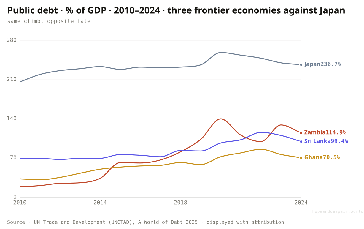
In fifteen years Zambia’s debt grew sixfold and it defaulted; Japan’s drifted higher and nothing happened.
Watch four countries climb the same hill over fifteen years. Zambia’s public debt ran from a fifth of its economy in 2010 to more than its entire output by 2024, and it stopped paying in 2020. Ghana more than doubled, then defaulted in 2022. Sri Lanka crept up and broke in that same year. Japan, meanwhile, drifted from about twice its output to two and a third times, the heaviest load on the chart, and never came near a default. The frontier economies had borrowed in dollars and euros from lenders who could turn and leave. Japan borrows in yen from its own savers, who stay. Same rising line, opposite ending.
How this number was made
What it measures. General government gross debt, % of GDP, Japan, 2010–2024.
Calculation. Japan public-debt %GDP time series.
The displayed line is monotone-cubic smoothed for legibility only — it never moves a data point.
Debt itself is not destiny: the country carrying the most is also the calmest.
The frontier economies that borrowed least are the ones that broke, because they borrowed in the wrong money.
Two debts can rise along nearly the same path and end in opposite places, which makes any single warning level misleading.
And what is a dangerous debt actually made of?
India owes almost nothing abroad; Ethiopia owes most of its debt to foreigners, in money it cannot print.
A debt owed at home, in your own currency, can be lived with: the central bank stands behind it and a falling exchange rate does not enlarge it. A debt owed abroad, in dollars or euros, cannot. This chart sorts countries by how much of their public debt is external. India and Brazil sit at the safe end, owing under a tenth of it to foreigners, because both built deep home markets that lend in rupees and reais. The frontier and Sub-Saharan economies sit at the other extreme. Ethiopia owes about three-fifths of its debt abroad; Ghana, Kenya and Sri Lanka roughly half. Economists call this original sin: a poor country cannot persuade foreigners to lend to it long-term in its own money, so it borrows in dollars and carries the currency risk itself. The danger is not the size of the debt but the money it is trapped in, and it falls hardest on the poorest. And because a foreign-currency debt does not shrink when the local currency weakens, a sliding exchange rate can swell the repayment bill overnight, turning a debt a country could comfortably afford into one it cannot, with nothing in its own budget able to stop it.
How this number was made
What it measures. External public debt as a share of total public debt, latest year. High = the government owes most of its debt to foreigners, in a currency it cannot print; low = it borrows at home in its own money. The real exposure to original sin and to a sudden stop.
Calculation. External public debt %GDP ÷ total public debt %GDP, latest year; colour = exposure band.
Countries that build deep domestic debt markets, as India and Brazil have, largely escape the trap.
The poorest economies owe most of their debt abroad, in currencies that grow more expensive exactly when they are in trouble.
External capital is both a lifeline for a poor economy and the fuse of most defaults, and which one shows depends on the year.
If the level isn’t the warning sign, what is?
Pakistan trips five of six classic danger lines; the countries already collapsed read deceptively calm.
Lenders watch a handful of tripwires that history says tend to come before a debt crisis. Reserves that cover less than three months of imports. Short-term foreign debt larger than the reserves on hand. Debt service eating more than a quarter of export earnings. The more of these a country trips, the closer it sits to the edge, and Pakistan trips five of the six, the most on the chart. The strange part is lower down. Venezuela crosses just one of the six lines, and Lebanon two, fewer even than India, though both rank among the biggest defaults of the past decade. Once a government stops paying, its interest bill vanishes from the books and the gauges built on it fall quiet. Lebanon, mid-collapse, no longer registers as spending too much on interest, for the plain reason that it has stopped. Yet not every defaulter reads low. Ghana, Sri Lanka and Zambia, still grinding through restructuring, each trip four. So read the dagger, not only the length: a short bar can mean safety, or a crisis that already burned through.
How this number was made
What it measures. Number of six named solvency/liquidity thresholds each country breaches (Guidotti-Greenspan ST-debt/reserves; reserves<3mo; debt-service>25% exports; debt>70% GDP; interest>20% revenue; interest>education). A count of cited red lines, not a weighted index.
Calculation. Count of six named cited thresholds; † = in default/restructuring → interest-based gauges read artificially low (the gauge lies; never ranked healthy).
The tripwires are well understood, and most countries cross none of them.
A cluster of nations sits four and five lines deep, with little room left before a forced default.
The measure quietly understates the very worst cases, so the ranking has to be read with the dagger in mind.
When a country can’t pay, who is it failing to pay?
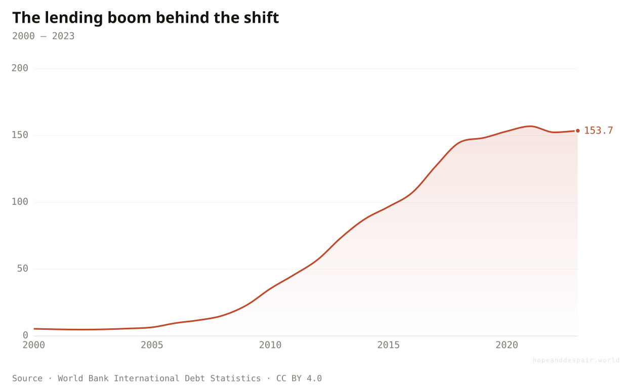
China’s lending to the developing world grew roughly thirtyfold in two decades, from five billion dollars to over 150 billion, remaking who a country in trouble must answer to.
For most of the last century, a government in trouble owed Western banks and the Paris Club of rich-world governments, who sorted it out together at a table in Paris. Then China started lending. The stock of developing-country debt owed to Beijing ran from about five billion dollars in 2000 to over a hundred and fifty billion by 2023, a thirtyfold climb that made China the developing world’s largest single government creditor. As some of those loans soured, the consequence shows up in the chart above: China’s share of the world’s defaulted debt rose from barely one percent in 1990 to close to a quarter, level with the entire Paris Club. The change matters because creditors who do not coordinate are far harder to bargain with. A restructuring that once needed a dozen rich governments to agree now waits on Beijing, private funds and the old club at once, each with its own rules and its own idea of patience.
How this number was made
What it measures. Composition of sovereign debt in default by creditor class, each year normalised to 100%. Shows the historical shift from private banks and the Paris Club toward multilaterals, then the rise of China.
Calculation. BoC–BoE World rows, creditor amounts by year, normalised to 100% share per year.
The displayed line is monotone-cubic smoothed for legibility only — it never moves a data point.
Developing-country debt owed to China ran from a rounding error in 2000 to over 150 billion dollars, much of it in Africa and the lowest-income borrowers. The bilateral loans came fast and cheap; restructuring them, when they sour, has proved slow.
Private bondholders, the hardest creditors to restructure, hold well under a fifth of the defaulted total.
With official lending split between Beijing and the West, the system for fixing a default is jammed.
Who holds the debt now decides how fast a crisis can be resolved, and the holders no longer agree.
How much of a government’s money does the debt eat, and what does it crowd out?
Pakistan spends about sixty cents of every tax dollar on interest; Nigeria pays six and a half times as much on interest as on its schools.
Before a government pays a nurse or fixes a road, it must first meet the interest on what it already owes. In Pakistan that first claim now takes about sixty cents of every dollar the state collects; Sri Lanka and Egypt hand over more than half. Lenders treat a fifth of revenue as the warning line, and sixty-one developing countries are already past a tenth. But the sharpest way to see the cost is to set interest against a single thing it displaces. UNCTAD divides interest payments by public spending on education: above one, a country pays its creditors more than its schools. Nigeria sits at six and a half. Sri Lanka is near five, Lebanon just above four. The debt was real and most of it bought real things, yet the bill is now paid in classrooms that were never built. Counting health alongside schools, 46 developing countries spend more on interest than on either, and about 3.4 billion people, more than two in five of humanity, live in one of them.
How this number was made
What it measures. UNCTAD ratio of public-debt interest payments to public education expenditure, latest year. Above 1× a government spends more servicing creditors than on schools.
Calculation. UNCTAD interest-to-education ratio, latest available year, sorted descending.
Most large economies stay well under the line, spending far more on people than on interest.
For the worst-hit, a generation’s schooling is being mortgaged to bondholders.
The same loans that built infrastructure now compete directly with the next generation’s education.
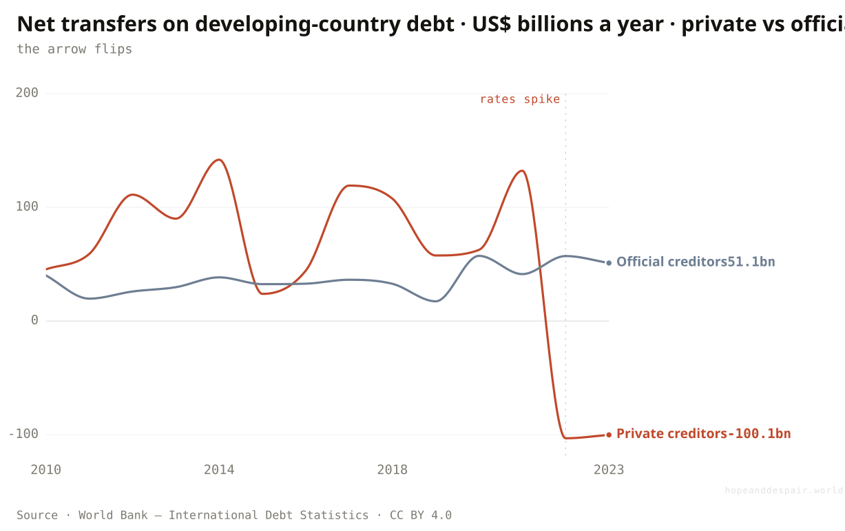
Is the money at least still flowing toward these countries?
After global rates rose, private creditors swung from financing developing countries to draining them, by more than 230 billion dollars a year.
Debt is supposed to move money toward a developing country: a loan arrives, a grid or a port gets built, the repayments come later out of the growth it paid for. Through the 2010s it did, and private money led the way, with bondholders and banks sending well over a hundred billion dollars a year, on net, into the developing world by 2014. Then global interest rates jumped. In 2022 the private line did not just shrink, it inverted. Private creditors took roughly a hundred billion dollars more out than they put in, and did the same again in 2023. Official lenders, the IMF, the World Bank and bilateral governments among them, kept their own flows positive and cushioned part of the blow, but not enough to stop the total turning negative for the first time since the debt-relief years. The capital a developing economy most needs to keep arriving has, for now, gone into reverse.
How this number was made
What it measures. Net transfers on external PPG debt from private creditors (bondholders, commercial banks) to low & middle income countries, US$ billions, by year.
Calculation. WB IDS DT.NTR.PRVT.CD, country=LMY, counterpart=World, US$ → US$bn.
The displayed line is monotone-cubic smoothed for legibility only — it never moves a data point.
Official lenders kept money flowing in even as private creditors fled, and a reversal driven by high rates can ease when rates fall.
Private capital is now flowing out of the developing world on net, draining the economies that most need it to keep arriving.
Money leaving a country can mean it is repaying past loans on schedule or being abandoned by its lenders, and the flow alone cannot say which.
And what new bills are landing on the countries least able to pay?
The countries most exposed to climate change are the same ones with the least room to borrow to adapt.
There is a cruel overlap buried in the data, if not a perfect one. Rank the world by exposure to climate change, using the ND-GAIN index of how much harm a warming planet will do and how poorly a country can cope, and the top of the list reads like a roll-call of the debt-distressed: Chad, Niger, Somalia, the Democratic Republic of Congo, Ethiopia. Ethiopia, among the most exposed on earth, already owes about three-fifths of its public debt abroad and has itself stopped paying; DR Congo is a recent defaulter too. These are the places that most need to spend on flood defences, drought-resistant seed and seawalls, at the very moment their debt forecloses the borrowing to build any of it. The overlap is not iron. India scores high on the same exposure index yet owes under a tenth of its debt abroad, and is largely spared. But for the poorest, the bill for a warming climate falls heaviest exactly where the means to meet it is thinnest.
How this number was made
What it measures. ND-GAIN vulnerability score (exposure + sensitivity + adaptive capacity across food, water, health, ecosystems, habitat, infrastructure), 2023, a curated spread sorted descending. Link-only: charted and cited, not re-hosted.
Calculation. 2023 vulnerability score, 12 curated countries sorted descending.
Debt-for-climate swaps and new adaptation funds are early attempts to break this overlap.
The places that did least to warm the planet must spend the most to survive it, with the least ability to borrow.
Adaptation is an investment that pays for itself over decades, which is exactly the horizon a debt crisis destroys.
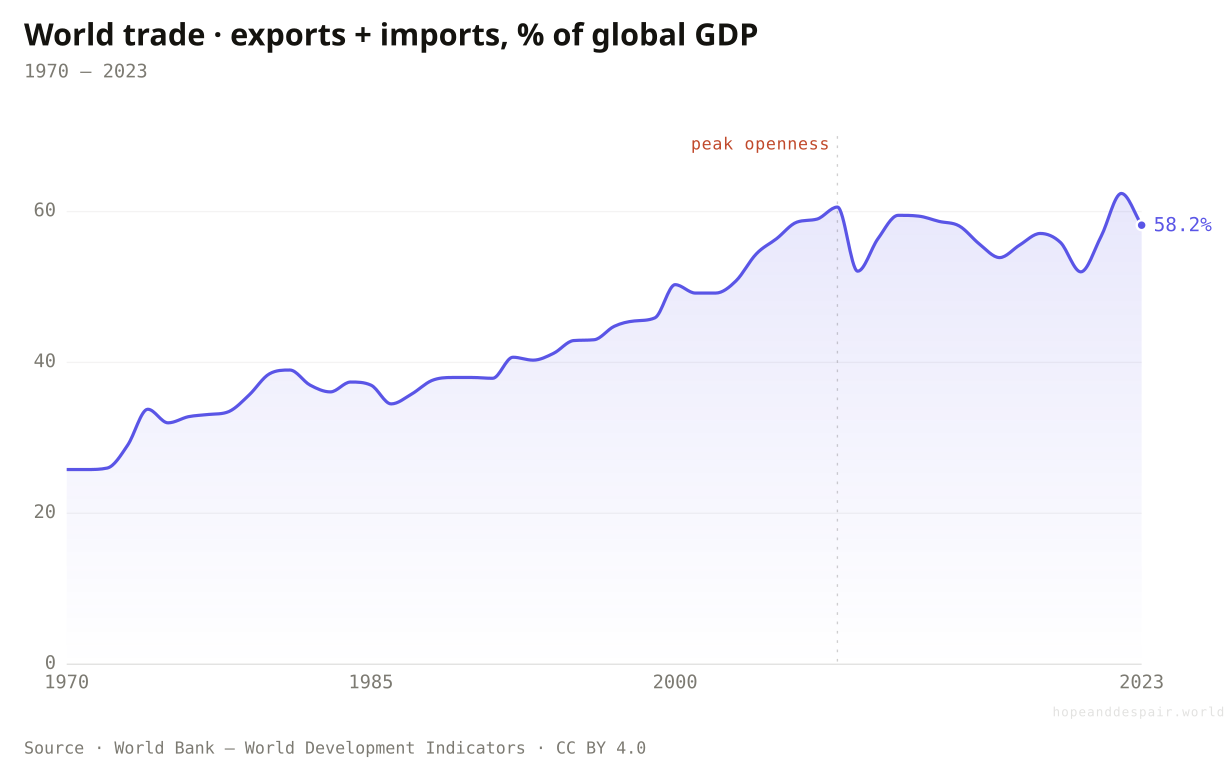
Can poor countries still grow their way out, the way earlier ones did?
World trade stopped opening around 2008, closing the export escalator that lifted Korea and China.
The standard cure for a debt problem is growth, and for sixty years the surest path to growth was selling into a steadily more open world. Trade climbed from a quarter of global output in 1970 to nearly sixty percent by 2008. Then it stalled. Supply chains began to shorten, tariffs crept back, and rich countries started reshoring and friend-shoring the production they had once scattered around the globe. Korea and China rode the open-trade escalator from poverty to wealth in a few decades. The frontier economies now carrying the heaviest debts have reached the bottom of that escalator just as it grinds to a stop. The exit that worked for earlier developers is quietly narrowing.
How this number was made
What it measures. Trade (exports plus imports of goods and services) as a share of world GDP — the standard openness measure.
Calculation. World trade openness, 1970–2023.
The displayed line is monotone-cubic smoothed for legibility only — it never moves a data point.
Services, digital trade and regional African markets may open new escalators the old map misses.
The one development model with a proven record is closing just as the poorest economies queue to use it.
Whether trade has truly peaked or merely paused is genuinely unsettled, and the answer changes everything.
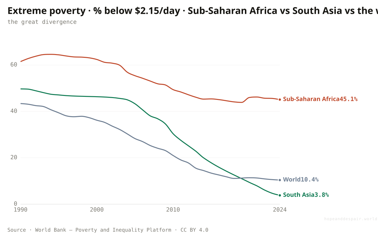
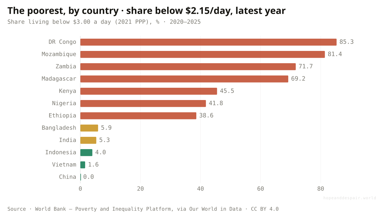
And where does all of this leave the world’s poorest?
Extreme poverty has all but vanished in Asia, yet in Sub-Saharan Africa it has barely moved and sits near 45%.
Two generations of progress against poverty happened mostly in Asia. South Asia drove extreme poverty from more than half its people in the early 1980s to under four percent today, and the world line followed it down. Sub-Saharan Africa did not follow. Its rate has fallen only from about two-thirds in 1990 to forty-five percent now, and the absolute number of poor people there has risen, because the population grew faster than poverty fell. Almost six in ten of the world’s extreme poor now live in the region. This is where debt does its quietest harm, taking the revenue that might have built the schools and clinics that turn growth into fewer poor.
How this number was made
What it measures. Poverty headcount ratio at $3.00 a day (2021 PPP) (% of population)
Calculation. Selected entity SSF.
The displayed line is monotone-cubic smoothed for legibility only — it never moves a data point.
The countries deepest in debt are the same ones deepest in poverty. DR Congo, Mozambique and Zambia, all recent defaulters, each leave most of their people below the line.
Africa’s poverty rate is still falling, and its young population could yet power a catch-up.
Where poverty is most stubborn, debt service is draining the budget that might have ended it.
A falling rate and a rising headcount are both true at once, so progress and failure share the same chart.
Add all of this up: how many countries are actually caught?
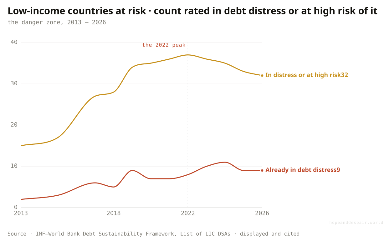
Half the world’s low-income countries are now in debt distress or close to it, twice the share of a decade ago.
Every pressure in this section, the climate bill, the closing trade exit, the interest crowding out schools, the money flowing back out, lands finally as a single count. The IMF and World Bank grade every low-income country on a four-rung scale of how likely it is to be overwhelmed by what it owes, refreshed each month; counting the top two rungs turns the red-lines diagnosis into a running tally. In 2013 fifteen of these countries, about one in five, were rated in distress or at high risk of it. By 2019 the figure had passed thirty, and it has hovered near half the group ever since, cresting at thirty-seven in 2022. The number actually in distress, no longer merely close to it, rose from two to around ten over the same span. The plateau since is the genuinely ambiguous part. It can be read as the wave finally breaking, or as a queue of unresolved cases held in place by emergency loans and paused payments that no one has yet worked through. Either way, a single decade doubled the share of the poorest economies living one shock from a debt they cannot manage.
How this number was made
What it measures. Number of PRGT-eligible low-income countries the IMF–World Bank DSF rates as in debt distress OR at high risk of debt distress, by year.
Calculation. Count of PRGT-eligible LICs by IMF risk-of-debt-distress rating, by year.
The displayed line is monotone-cubic smoothed for legibility only — it never moves a data point.
The count stopped climbing after 2022 and has edged down, a sign the worst of the wave may have passed.
About half of all low-income countries now sit one shock away from a debt they cannot service, twice the share of 2013.
Whether the plateau is recovery or a frozen backlog of cases no one has resolved is exactly what cannot yet be said.
And what does a default actually feel like to the people inside it?
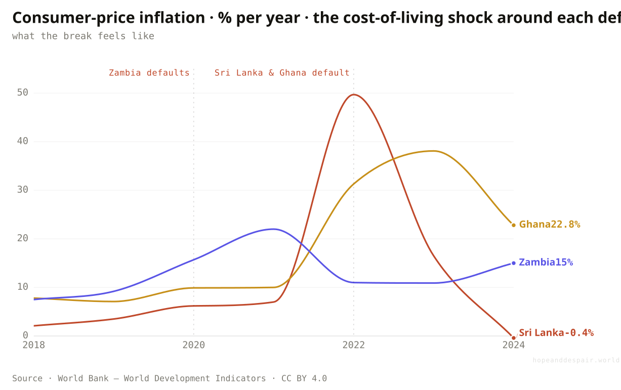
The year Sri Lanka defaulted, prices rose by half; a lifetime of savings lost a third of its worth in twelve months.
A default is an abstraction until you watch what it does to a shopping basket. When a government stops paying its foreign creditors, its currency falls, and the price of everything the country imports, fuel, medicine, cooking gas, rice, climbs almost overnight. These are the same three frontier economies from earlier, now traced through the cost of living around the year each one broke. Sri Lanka’s inflation ran from about 2% before the crisis to nearly 50% in 2022, the year it defaulted and queues for fuel and gas stretched around city blocks. Ghana’s reached almost 40%, Zambia’s past 20%. At fifty percent inflation a year, money set aside for a child’s schooling or an old age loses a third of its purchasing power in twelve months, while wages lag behind. The dollars in default are a small number on a balance sheet. The price of bread is not.
How this number was made
What it measures. Annual consumer-price inflation, Sri Lanka, 2018–2024; the cost-of-living shock around its sovereign default (2022).
Calculation. Sri Lanka CPI inflation, 2018–2024.
The displayed line is monotone-cubic smoothed for legibility only — it never moves a data point.
The worst spikes pass: Sri Lanka’s inflation fell back to near zero within two years of the break.
The damage lands on people who never borrowed a cent, as their savings and wages are quietly halved.
A default rescues a government’s balance sheet by wrecking its citizens’ cost of living first, so relief and ruin arrive together.
Do these mountains of debt ever actually get repaid?
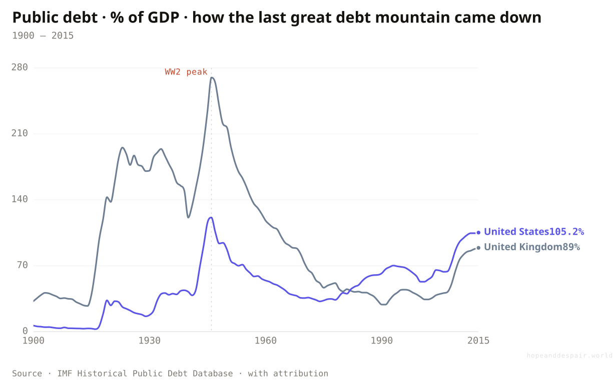
Britain owed 270% of its output after 1945 and never paid it back; growth and inflation melted it to a third of that by 1970.
The same force that gutted Sri Lankan savings has a second face. After 1945 Britain’s government owed about 270% of everything the country produced, a heavier load than any frontier economy carries today, and the United States owed 121%. Neither ran the brutal surpluses that paying it down would have demanded. The mountains shrank anyway. A generation of growth lifted the denominator while mild, steady inflation and interest rates held below it quietly taxed the people holding the bonds, a transfer from savers to the state that economists call financial repression and reckon ran to several percent of output a year. By 1970 Britain was near 73% and still falling, the United States near 36%. The catch is the whole argument of this piece in one line. That escape works only when the debt is long-dated, owed at home, and written in a currency you control. Borrow short, abroad, in dollars, and inflation does the opposite, swelling the debt instead of dissolving it. The rich world’s way out is bolted shut to the countries that need it most.
How this number was made
What it measures. General government gross debt as a share of GDP for United Kingdom, 1900–2015.
Calculation. DBnomics IMF/HPDD REF_AREA=GB, windowed 1900-2015.
The displayed line is monotone-cubic smoothed for legibility only — it never moves a data point.
The largest debt loads in modern history were carried, then dissolved, without default or collapse.
The mechanism was a quiet tax on savers, and it is unavailable to a country that borrows abroad in dollars.
Whether a debt melts away or hardens into a crisis turns on its currency and its holders, not its size, the same as ever.
Once a country falls into a debt crisis, does it ever climb out?
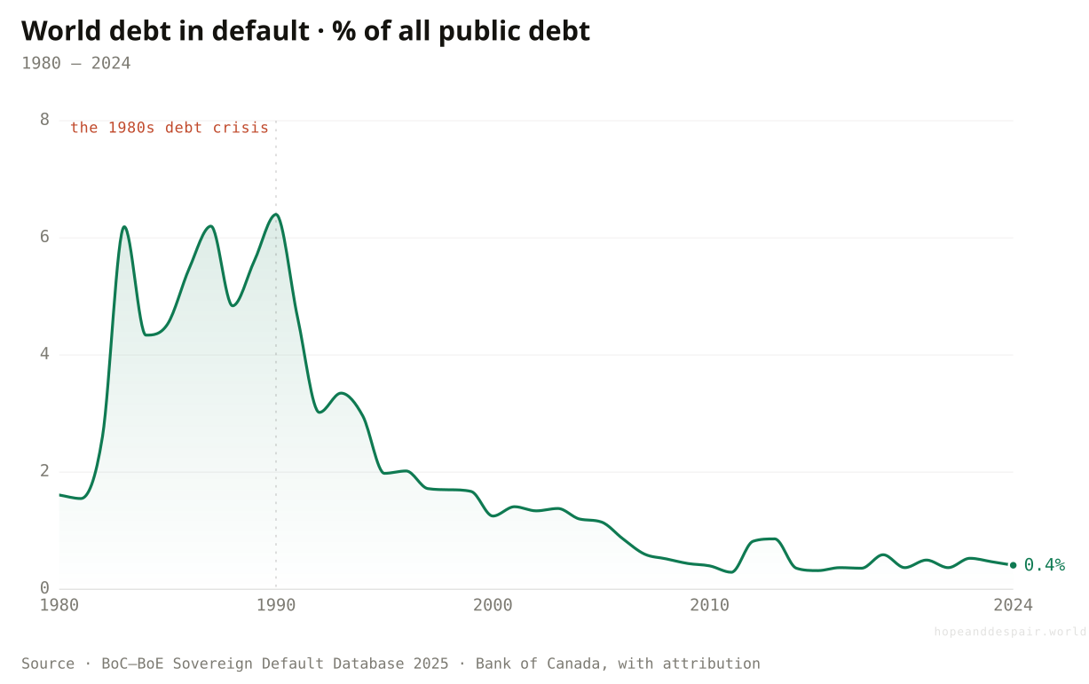
The share of world debt in default has fallen from 6.4% in 1990 to under half a percent today.
Debt crises feel permanent from inside them, and yet the record says most are survived. At the start of the 1990s, after a decade of Latin American and African defaults, more than six cents of every dollar of public debt on earth was not being paid. Then came a long run of restructurings, write-downs and the relief programmes that cleared the poorest countries’ books. By 2024 the figure had fallen below half a cent. The stock of broken debt did not vanish so much as get worked through, country by country, deal by deal. A default looks less like a death than a hard weather event. Painful, sometimes drawn out for years, but rarely the end of the story.
How this number was made
What it measures. Sovereign debt in default as a share of total world public debt, %.
Calculation. World rows, default rate vs world public debt.
The displayed line is monotone-cubic smoothed for legibility only — it never moves a data point.
The world is far better at resolving debt crises than it was a generation ago.
Resolution often means a lost decade first, paid for by the country’s poorest.
The tools work, but slowly, and a country can spend years in limbo before relief arrives.
When a country does stop paying, what happens to the money?
Across two centuries of defaults, creditors have lost about 45 cents on the dollar on average, almost never the whole of it.
When Argentina restructured in 2005, the investors holding its bonds were handed new ones worth about a quarter of the old, a loss of roughly seventy-seven cents on the dollar. Iraq’s creditors, after the 2003 war, lost closer to ninety. Greece’s, in 2012, about sixty-five. These sound like wipeouts, and for an individual lender they can be. Step back across two hundred years and 327 restructurings, though, and the average loss settles near forty-five cents on the dollar, a figure that has barely moved since 1815. Defaults are almost always partial. A government that stops paying is not refusing the debt so much as forcing a renegotiation of it, and creditors, knowing they will get most of it back, keep coming back to lend. The catch sits on the other side of the table. The size of the cut tracks power more than fairness. Uruguay, restructuring early and politely in 2003, gave up barely a tenth, while the deepest losses fell on the collapses with the least left to bargain with. And a deal that closes on paper can still take a lost decade to reach.
How this number was made
What it measures. Present-value creditor loss (1 − PV new / PV old) in selected sovereign-debt restructurings. Reference line is the ~45% average across 327 restructurings since 1815.
Calculation. Present-value haircuts from published Table 2 of each paper; ref line = GMRT 2024 200-year average.
Creditors recover most of their money and markets reopen, which is why lending survives every default.
How deep the loss cuts is decided by leverage, not justice, and the country still pays in lost years.
A successful restructuring still means someone lost half their money and a country lost a decade, so resolution and damage are the same event.
And who keeps coming back to the lender of last resort?
Ukraine has signed thirteen IMF arrangements since 1992; a string of poor countries have spent most of the years since under one programme or another.
The IMF is the institution a government turns to when no one else will lend. For some countries that turn has become a habit. Counting every financing arrangement since 1992, Ukraine leads with thirteen, Pakistan and Armenia with eleven apiece, and a long tail of small economies, Senegal, Rwanda, Mozambique, Burkina Faso, sits just behind, most having spent more of the period inside a Fund programme than outside one. The colour marks two different stories. The red bars are crisis bailouts, the emergency loans that follow a currency collapse. The grey bars are concessional programmes for low-income countries, cheaper and longer, that roll over almost without a break. One caveat sits under the count: it begins in 1992, as far back as the Fund’s public database reaches. Argentina’s famous tally of about twenty-one arrangements runs back to 1958; over the past three decades alone it sits at eight. Whether a repeat customer is being rescued or merely managed is the one thing the chart cannot settle.
How this number was made
What it measures. Number of distinct IMF financing arrangements (Stand-By, Extended Fund Facility, ECF/PRGF and other facilities) a country has had approved, 1992 onward, from the IMF Monitoring of Fund Arrangements database (historical 1992–2003 + current 2000–present, deduplicated). MONA does not extend before ~1992, so lifetime totals (e.g. Argentina from 1958) are larger. Red = mostly crisis bailouts; grey = mostly concessional low-income programmes.
Calculation. Merge MONA historical + current, dedupe by country + approval date, count arrangements per country, rank top 14; colour = dominant facility class.
A working lender of last resort means a country in crisis is rarely left entirely on its own.
For a string of poor economies the Fund has become less a rescue than a permanent supervisor of the books.
Going back to the IMF can mean the safety net is working or that nothing underneath it ever gets fixed.
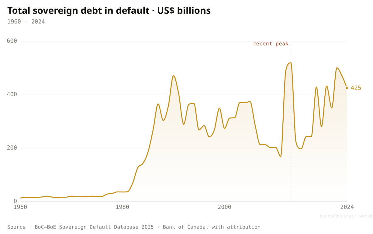
So is the world drowning in debt?
The pile is at record size, but only a small, concentrated tail is actually drowning.
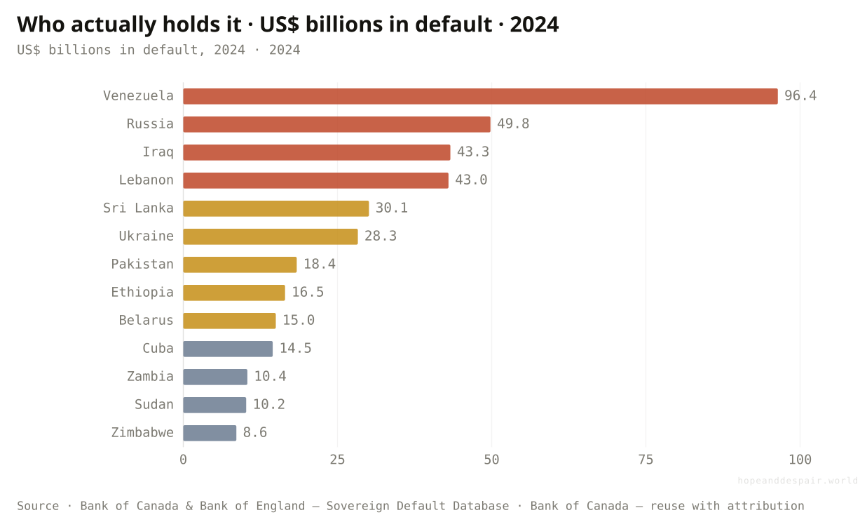
Two facts have to be held at once. The dollars in default come to about 425 billion, a rounding error against total public debt, under half of one percent. Yet they are owed by a great many countries: roughly 86 sovereigns carry some defaulted debt, down from over a hundred in the 1990s but still a large share of the developing world. Thirteen of them hold ninety percent of the dollars, named below, running from petrostate collapse in Venezuela through sanctioned Russia to the frontier defaulters. For most of the planet, a bigger debt bought roads, pensions and pandemic survival without any crisis. For that tail, the same instrument meant default and lost decades. Whether the world is drowning depends almost entirely on which group you happen to be born into.
How this number was made
What it measures. Total stock of sovereign government debt in default worldwide, US$ billions, year-end.
Calculation. World rows; US$ millions ÷ 1000 → billions.
The displayed line is monotone-cubic smoothed for legibility only — it never moves a data point.
Thirteen sovereigns hold about 92% of the world’s defaulted debt. The roster mixes petrostate collapse, sanctioned and conflict states, and frontier defaulters, which is why no single villain explains it.
Measured against the world’s total debt, the part actually in crisis is tiny and contained.
For the thirteen countries that are most of that total, the crisis is the whole of life.
A number this concentrated cannot be answered with a single global verdict, which is the honest finding.
The question is never how much a country owes. It is what the debt is made of, and who is born holding it.— the through-line of this piece
One question, read by the fields that actually study it. Each voice is given both its most hopeful and its darkest honest reading — with a note on how settled the evidence underneath is.
the hopeful readRestructuring frameworks exist, and the IMF door is open when the math stops working.
the darker readHalf my revenue can vanish into interest before a single road is built, and a creditor I cannot vote out sets my rate.
the hopeful readDefaults are rarer and better-resolved than the headlines suggest, and recovery values have held.
the darker readWhen official and Chinese lending will not coordinate, my restructuring can sit frozen for years.
the hopeful readDebt relief, when it finally lands, has reopened school doors before.
the darker readThe class sizes grew and the new school never came, while the interest line in the budget kept rising.
the hopeful readEven the hardest cases get worked through eventually; the record is one of resolution, not ruin.
the darker readThe old Paris Club logic is gone, and no one has built the thing that replaces it.
the hopeful readSovereign default is as old as sovereign debt, and the world keeps lending because the world keeps recovering.
the darker readEvery era believes its debts are different, and the tail of ruined countries is never empty.
Strongest case for hope
Step back far enough and the debt story bends toward competence. The share of world debt in default has fallen roughly fifteen-fold since 1990. The crisis tail is small and shrinking as a fraction of the whole, the tools to resolve a default are real, and for most countries a larger balance sheet has financed genuine progress without catastrophe. The largest debt the modern world ever carried, Britain’s after 1945, was not repaid but outgrown and gently inflated away. Even the defaults that do happen are partial: creditors lose less than half their money on average and keep lending, so the road back to markets rarely stays closed for long. Borrowing is how a poor country builds a school before it can afford one. Most of the time, it works.
Strongest case for despair
Step close and the same data turns grim. For a concentrated group of countries, debt has stopped being a tool and become a sentence. Interest now outranks education spending across dozens of governments. A currency slide can double the burden through no fault of the borrower, and the rate that triggers it is set abroad. The system for fixing a default has broken down just as the creditor base fragmented. Worse, the bills are growing: the cost of adapting to a changing climate, a green transition priced out of reach, a closing trade era, and a fight against poverty that has stalled across Sub-Saharan Africa, all landing on the balance sheets least able to bear them. For the people inside that tail, the lost decade is not a statistic.
Watch the tail, not the total. The number that matters is not global debt to GDP but how many countries cross four or more of the danger lines, and whether the interest-versus-schools ratio keeps climbing across the poorer world. A working successor to the Paris Club, one that includes China and private creditors, would speed resolution and shrink the lost decades. Debt contracts that absorb shocks on their own, with clauses that pause payments when a hurricane or a price collapse hits so a cash crunch never hardens into a default, would protect the most vulnerable borrowers before the crisis rather than after. Cheaper capital for clean energy in poor countries, and debt-for-climate swaps that trade relief for adaptation, would ease the tightening directly. Faster on all of these, and the hope case wins. If the tail instead widens as the new bills land, the verdict tilts.
Everything done to the numbers between the source and the chart, disclosed in full. Where a choice is editorial rather than measured, we say so.
- The composites are counts and positions, not scores
- The red-lines chart counts how many of six named, cited thresholds a country breaches (Guidotti-Greenspan short-term-debt-to-reserves; reserves under three months of imports; debt service over a quarter of exports; debt over 70% of GDP; interest over a fifth of revenue; interest above education spending). There is no weighting and no black-box index. You can see exactly which lines each country crosses.
- The gauges lie where a country has defaulted
- A country that has stopped paying posts an artificially low interest-to-revenue figure, because it is no longer paying that interest. Such countries are flagged with a dagger and are never read as healthy on the strength of a low score. The distortion is itself a finding about how debt data thins out exactly where crisis is deepest.
- Data availability and sourcing
- Public-debt and interest-to-spending figures are UNCTAD’s (A World of Debt 2025), displayed and cited under the publication’s terms rather than re-hosted. Liquidity gauges and the net-transfer flows are World Bank International Debt Statistics (CC BY 4.0). The default census is the BoC–BoE Sovereign Default Database, reused with attribution. The century-long debt arc is the IMF Historical Public Debt Database, reused with IMF attribution. Restructuring haircuts are transcribed from the published academic tables (Cruces–Trebesch and successors), displayed and cited but not re-hosted as a file.
- The distress count reads the IMF’s own list
- The count of low-income countries in debt distress or at high risk is the IMF–World Bank Debt Sustainability Framework rating, totalled across all PRGT-eligible countries. The IMF overwrites that list at a single web address each month, so the historical points here are read from dated Internet Archive captures of the list, one per year, using the IMF’s own summary count where it is printed. The as-of dates fall in different months, so the line is annual, not to-the-day.
- Prose and number audit
- Explanatory text was drafted with AI assistance and then checked line by line against the derived data series; every quantitative claim traces to a figure produced by the project’s pipeline. No outside numbers were introduced.
- UN Trade and Development (UNCTAD) — A World of Debt 2025 — unctad.org/publication/world-of-debt ↗ · UNCTAD publication terms (display + cite); underlying indicators UNCTAD Data Hub, CC BY 3.0 IGO · vintage 2025Public debt %GDP, interest-to-revenue, interest-to-education and interest-to-health ratios, creditor composition; 200 countries.
- World Bank — International Debt Statistics — databank.worldbank.org/source/international-debt-statistics ↗ · CC BY 4.0 · vintage 2024Short-term debt to reserves, reserves in months of imports, debt service as a share of exports; net transfers on external public debt by creditor type (the reversal chart), low & middle income.
- Bank for International Settlements — Total Credit Statistics — data.bis.org/topics/TOTAL_CREDIT ↗ · BIS terms — link-only · vintage 2025Credit to governments, non-financial corporations and households, % of GDP, all reporting countries; the world-debt-by-borrower composition.
- Notre Dame Global Adaptation Initiative — ND-GAIN Country Index — gain.nd.edu/our-work/country-index ↗ · ND-GAIN — link-only (licence unstated) · vintage 2026Climate vulnerability score (exposure, sensitivity, adaptive capacity); the climate double-bind chart.
- World Bank — World Development Indicators & Poverty and Inequality Platform — data.worldbank.org ↗ · CC BY 4.0 · vintage 2024Trade as a share of world GDP; extreme-poverty headcount ratios by region; consumer-price inflation around recent sovereign defaults.
- IMF–World Bank Debt Sustainability Framework — List of LIC DSAs — www.imf.org/external/pubs/ft/dsa/dsalist.pdf ↗ · IMF — published risk ratings (facts); displayed and cited, source PDF not re-hosted · vintage 2013–2026Count of PRGT-eligible low-income countries rated in debt distress or at high risk, read from the monthly DSA lists (Internet Archive captures, one per year).
- IMF — Monitoring of Fund Arrangements (MONA) — www.imf.org/external/np/fin/mona ↗ · IMF — arrangement records (facts); displayed and cited, source files not re-hosted · vintage 1992–2026Count of IMF financing arrangements per country, 1992 onward (historical + current MONA files merged and deduplicated); the serial-borrower ranking. Pre-1992 arrangements are not in MONA.
- Bank of Canada & Bank of England — Sovereign Default Database 2025 — www.bankofcanada.ca/2025/10/staff-analytical-note-2025-24 ↗ · Bank of Canada — reuse with attribution · vintage 2025Sovereign debt in default 1960–2024, by creditor and instrument; share of world public debt.
- IMF — Historical Public Debt Database — www.imf.org/external/datamapper/datasets/DEBT ↗ · IMF — data reuse with attribution · vintage 2015General government debt as a share of GDP, 1900–2015, for the United Kingdom and United States; the century-long debt arc (fetched via the DBnomics mirror).
- Sovereign-debt haircut studies (Cruces & Trebesch 2013; Graf von Luckner et al. 2024; Zettelmeyer et al. 2013) — www.nber.org/papers/w32599 ↗ · Academic datasets — link-only (displayed and cited, not re-hosted) · vintage 2013–2024Present-value creditor losses in selected sovereign restructurings, and the ~45% two-century average; the haircut chart.
Cite this page
Reference
Hope & Despair. “Is the world drowning in debt?.” Hope & Despair, 2026. https://hopeanddespair.world/questions/is-the-world-drowning-in-debt.
BibTeX
@misc{hopeanddespair:is-the-world-drowning-in-debt,
  author       = {{Hope & Despair}},
  title        = {{Is the world drowning in debt?}},
  year         = {2026},
  howpublished = {\url{https://hopeanddespair.world/questions/is-the-world-drowning-in-debt}},
  note         = {hopeanddespair.world, updated 2026-06-20}
}
Original prose, code, and chart designs are released under CC BY 4.0 ↗ — reuse freely with attribution. Source datasets keep their own licences, listed above. Add your access date when citing.
- Is the world drowning in debt: ship the article, deepened and fact-checked View diff →
Generated from the commit history — every edit to a number, a word, or a chart is tracked in the open. Browse the full history & diffs on GitHub →
in plain words
This article reads at one altitude after another, from the world’s total debt down to a single country’s budget, because that is the only level where the question becomes answerable. The data and methods are described in the panels and the methodology note above.