Question 15 · Work & Jobs
Is work getting better or worse?
More of the world’s workers can feed their families than at any point in history. Most of them still have no contract, no safety net, and no certainty about next month. The first fact transformed in a single generation; the second has barely budged in twenty years.
Ask whether work is getting better and you have to say which promise of work you mean. A job can promise to keep your children fed. It can promise a contract, a pension, a number to call when you are hurt. For most of history these arrived together or not at all. They have now come apart, and the gap between them is the whole story.
On the first promise, the news is extraordinary. In 2000 about a third of everyone with a job still could not earn their household out of extreme poverty. By 2025 that was under one in thirteen. No previous generation moved this fast. On the second promise, the news is that there is almost no news: most of the world’s work still happens with no contract behind it, and that has been true, stubbornly, for as long as the figure has been measured.
So the answer depends entirely on where you stand. Climb the ladder of national income and the working poor vanish a rung at a time, until at the top they are a rounding error. Stay on the bottom rung and half your neighbours still work and stay poor. This piece follows the working day down from the world to the income group to the country, then turns to the part of the bargain that did not improve — and to who pays for that first.
you read
- The world figure is the least honest number on this page. A job in Zurich and a job in Antananarivo are both 'employment’, and averaging them buries the only thing worth knowing. Wherever the data allows, this piece drops from the global line to the income group, the region, and the single country, because that is the altitude where 'work’ means something.
- Two different things are both called 'good work’ here, and they are improving at very different speeds. Working poverty asks whether a job pays enough to clear extreme poverty; it has collapsed. Informality asks whether a job carries a contract and a safety net; it has barely shifted. Most of the apparent disagreement in this piece is these two measures pulling apart.
- The labour numbers lean heavily on modelled estimates. The ILO observes wages and employment directly in rich countries with good surveys and infers them for much of the world from partial data. The shape of each trend is solid; the last decimal is not. Recent years (2024–2025) are nowcasts, not counts; informality, the labour income share and social-protection coverage are all modelled, and the social-protection series runs only to 2023.
- Unemployment is almost absent from this piece, and that is deliberate. In a country with no benefits, no one can afford to be unemployed — they take whatever work exists, however bad. A low jobless rate in a poor country measures desperation, not health. The honest questions are about the quality of work, not its mere presence.
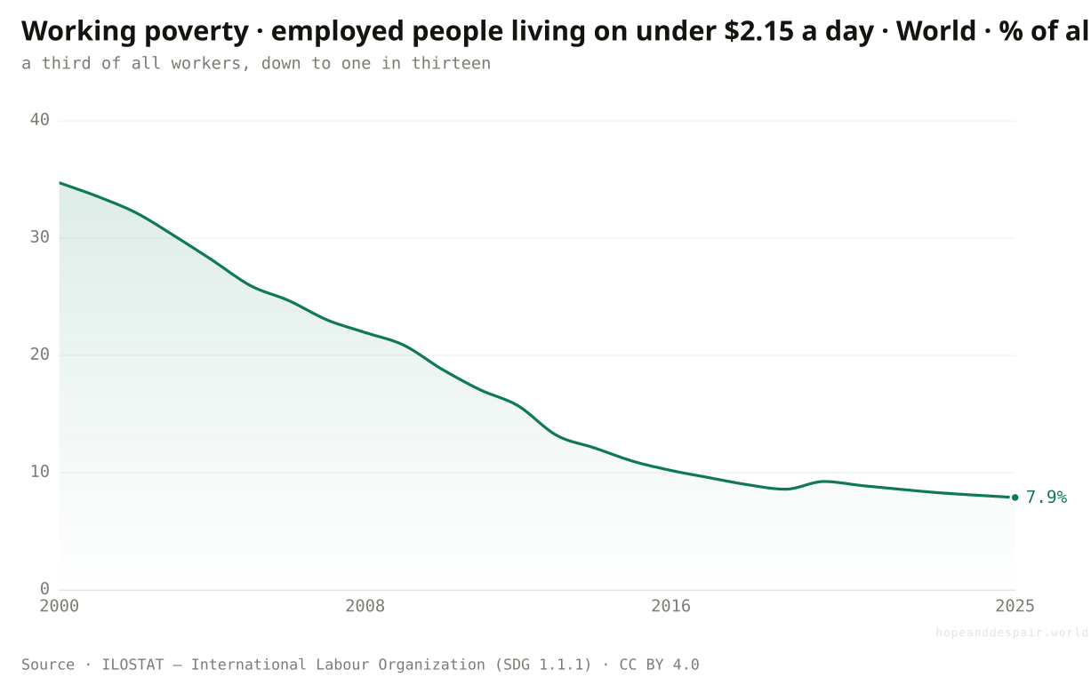
Has work gotten better at its most basic job — keeping a family out of poverty?
Yes, and faster than almost anything else in human development: the share of workers living in extreme poverty fell from about a third in 2000 to under a tenth today.
Strip work down to its first duty, whether a day’s labour buys a family out of destitution, and the last quarter-century is a landslide. In 2000 a third of the world’s workers lived in households scraping by below the extreme-poverty line; their problem was never idleness but that the jobs they had paid too little to clear it. By 2025 that share is under eight percent, roughly one worker in thirteen. The fall tracks the great Asian growth story underneath it: as factories, cities and farms grew more productive, the same hours bought more. This is the single most hopeful fact about modern work, and it is real. Hold onto it, because almost everything after this complicates it.
How this number was made
What it measures. Working poverty rate — employed living in extreme poverty (<$2.15/day), World
The defining misery of work for most of history, labouring full days and staying poor, has been cut by three-quarters inside one generation.
A line that falls this fast was always going to slow as it neared the floor, and the workers left behind it are the hardest to reach.
Beating poverty and being secure are not the same thing, and this chart only measures the first.
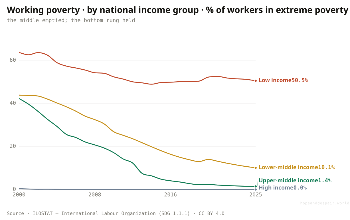
Did working poverty fall everywhere, or just where it was already on its way down?
The collapse is nearly complete on three rungs of the income ladder and barely begun on the fourth: in low-income countries half of all workers are still working poor.
The world line falls because the middle of the ladder emptied out. Sort countries by national income and the same statistic splits into four lives. In upper-middle-income economies — China, Brazil, much of Latin America — working poverty went from over forty percent in 2000 to near one percent; in high-income countries it was always a rounding error. Lower-middle-income countries cut theirs from forty-four percent to ten. But the bottom rung scarcely moved: in low-income countries half of everyone with a job, fifty percent, still cannot work their way past extreme poverty, down only from sixty-four. The gain was real on every rung, but its size depended entirely on where a country started, and the poorest places got the least of it. The world average is a blend of a finished race and one that has barely left the start.
How this number was made
What it measures. Share of employed people living in a household below the extreme-poverty line ($2.15/day, 2017 PPP). ILO SDG indicator 1.1.1. Low income economies.
Calculation. ILO aggregate area X02 (Low income).
The displayed line is monotone-cubic smoothed for legibility only — it never moves a data point.
Whole tiers of the world economy crossed from mass working poverty to near-zero in twenty-five years; the path plainly exists.
The one group that needed the gain most barely got it, and a worker’s odds now depend almost entirely on the accident of which country they were born into.
A falling world average can hide a rung that never moved: the headline dropped even as the poorest workers stayed put.
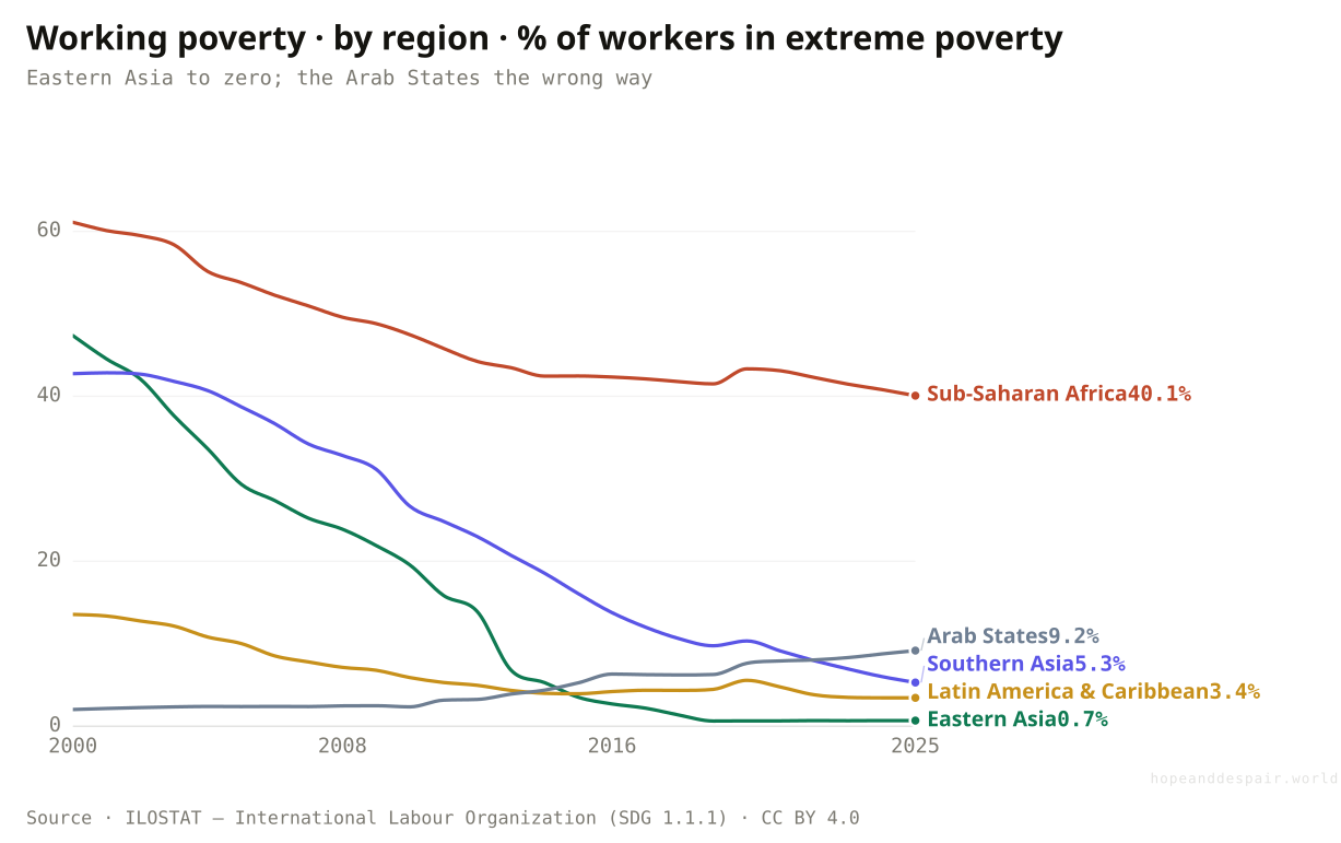
Which regions made the escape, and is anyone going backwards?
Eastern Asia all but erased working poverty, Sub-Saharan Africa only halved it from a far higher start, and the Arab States are the one region where it rose.
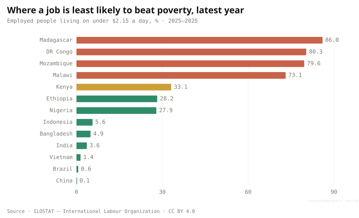
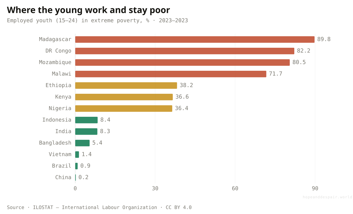
Region by region the single global line breaks into journeys that share almost nothing but a name. Eastern Asia began the century with nearly half its workers in poverty and ended it near zero, about one in a hundred and forty, the steepest economic descent in the record. Southern Asia made a similar trip from a high start, down to one worker in twenty. Latin America, starting lower, drifted toward the floor. Sub-Saharan Africa is the line that refuses to fall: three in five of its workers were working poor in 2000, and two in five still are. And the Arab States move the other way entirely: working poverty there more than quadrupled, from two percent to nine, as Syria and Yemen broke and took their labour markets down with them. There is no single global pace. There are regions that finished, a region that has scarcely begun, and a region in reverse. The country bars below show how far even that hides: in Madagascar more than six workers in seven are working poor.
How this number was made
What it measures. Share of employed people living in a household below the extreme-poverty line ($2.15/day, 2017 PPP). ILO SDG indicator 1.1.1. Eastern Asia.
Calculation. ILO aggregate area X45 (Eastern Asia).
The displayed line is monotone-cubic smoothed for legibility only — it never moves a data point.
Employed and still poor: Madagascar 86%, DR Congo 80% — against under 1% in China and Brazil. The same word, 'job’, covers both.
Two of the most populous regions on earth ended mass working poverty inside a generation, proof the floor can be reached.
The poverty that remains has concentrated in the region with the weakest growth, and at least one region is sliding backwards.
'Is work improving regionally?' has at least three answers right now, and they point in different directions.
If fewer workers are poor, are more of them secure?
No: nearly three in five jobs worldwide are informal — no contract, no social insurance — and in low-income countries it is nine in ten.
Earning enough to eat is one promise; having anything behind you is another, and the second barely improved. An informal job is one outside the reach of labour law and social insurance: no written contract, no pension contributions, no sick pay, no one to sue when the wage doesn’t come. Most of the planet works this way. The world rate has hovered near sixty percent for as long as it has been estimated, inching from about sixty-one percent in 2004 to fifty-eight today — a rounding error next to what happened to working poverty over the same years. And it follows the income ladder just as steeply, but it does not empty the bottom rung the way poverty did: in low-income countries informality is close to ninety percent, and even in upper-middle-income economies it is still over half. A worker there can have climbed out of poverty and still have nothing to fall back on. The destitution problem is being solved. The security problem is not.
How this number was made
What it measures. Share of total employment that is informal — no contract, no social-insurance coverage, outside the reach of labour law — by national income group, latest settled year. ILO modelled estimates.
Calculation. Latest-year informal employment rate per ILO income aggregate.
Informality is not all misery: for many it is the flexible, fast-entry work that a first rung up out of poverty is actually made of.
Most workers on earth have no contract and no safety net, and unlike poverty that has not budged in two decades.
A worker can be counted as 'no longer poor’ and still be one illness away from ruin; the two measures disagree on purpose.
If most jobs come with no protection, is anyone building one?
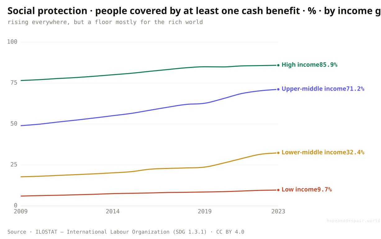
Slowly, yes: the share of people with even one social-protection benefit climbed from 39% in 2009 to 52% today — but in low-income countries it is still under one in ten.
The safety net informality leaves out is, finally, being built, just not everywhere and not fast. Social protection means any cash benefit a state stands behind: a pension, a child grant, unemployment pay, cover for disability or injury. In 2009 fewer than two in five people on earth had even one; by 2023 it was just over half. That is real institutional progress, the slow laying of a floor under the worst risks of a working life, and it is the clearest piece of good news on the security side of work. But read it by income and the floor is almost all in the rich world. In high-income countries 86 percent of people are covered; in low-income ones fewer than one in ten, and that bottom line has barely lifted. Even the headline flatters, because it counts anyone with a single benefit. Pensions reach about four in five of the world’s older people, but unemployment cover reaches just 17 percent of workers, and only 28 percent of the world’s children have any benefit at all. The net is being woven, and it is thickest exactly where work is already safest.
How this number was made
What it measures. Proportion of the population covered by at least one social protection cash benefit (SDG indicator 1.3.1). Low income economies.
Calculation. ILO aggregate area X02 (Low income).
The displayed line is monotone-cubic smoothed for legibility only — it never moves a data point.
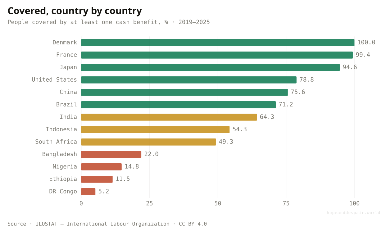
Denmark and France cover almost everyone; the United States 79 percent, India 64; Nigeria, Ethiopia and DR Congo under 15. The net thins exactly where work is hardest.
From under 40 to over 50 percent in fifteen years is among the fastest expansions of social protection ever — the institutions are being built where almost none stood.
Half the planet still has no protection of any kind, nearly all of the uncovered are in poorer countries, and unemployment cover barely exists anywhere.
Coverage is rising fast and is still pitifully low, and 'covered by one benefit’ can mean exposed to every other risk.
What kind of work is all this informal labour?
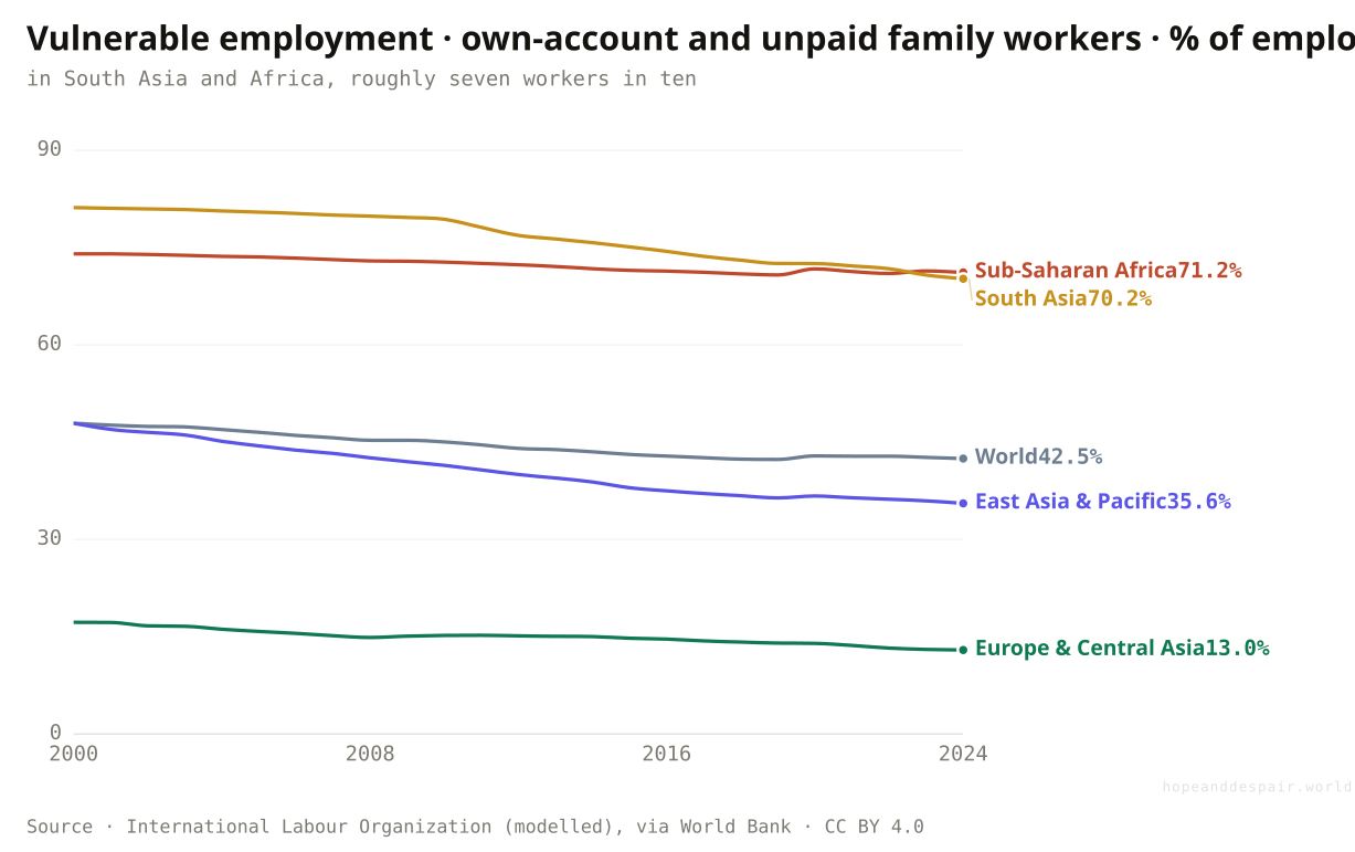
For more than two in five of the world’s workers, work means no employer at all — running a one-person stall or helping unpaid on the family plot.
Behind the informality figure sits a more basic fact about what the jobs actually are. A large share of the world has no real employer at all. They are own-account workers scratching a living from a single market stall, or family members working a farm or shop for no wage of their own. The ILO calls this vulnerable employment, and worldwide it covers more than two in five workers, a figure that has crept down only six points in three decades. Split it by region and the global South stands out hard: roughly seven in ten workers in both South Asia and Sub-Saharan Africa work this way, against one in eight in Europe and Central Asia. This is the substance under the informality rate. It is not that these people lack jobs. It is that the 'job’ is a person and a cart, with no firm above them to tax, to regulate, or to pay into a pension.
How this number was made
What it measures. Vulnerable employment, total (% of total employment) (modeled ILO estimate)
Calculation. Selected entity WLD.
The displayed line is monotone-cubic smoothed for legibility only — it never moves a data point.
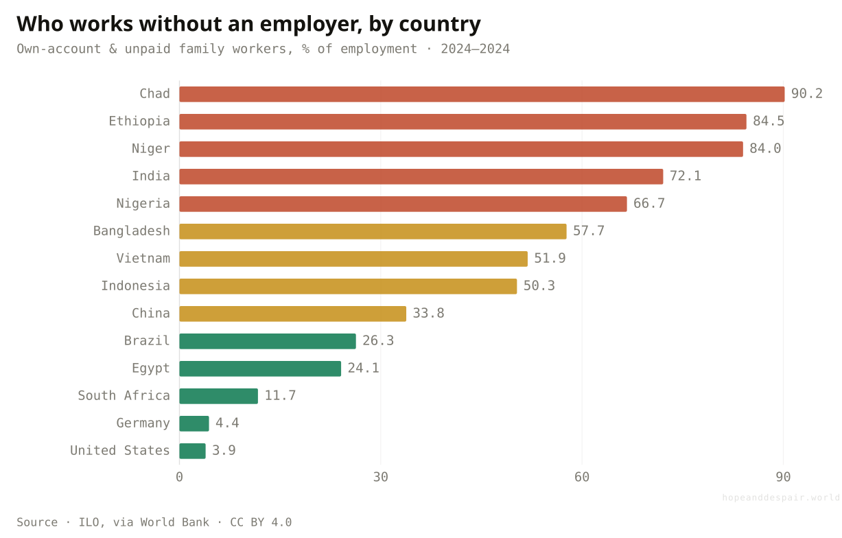
In Chad and Niger more than eight workers in ten are own-account or unpaid family labour; in the United States and Germany, fewer than one in twenty.
East Asia roughly halved its own-account and family labour as factory and service jobs replaced subsistence work — the structural change still has room to spread.
For most of the global South, work is still a solo hustle with no firm, no contract, and no institution standing behind it.
Whether self-employment is freedom or a trap depends on whether it was chosen, and the data can’t tell you which.
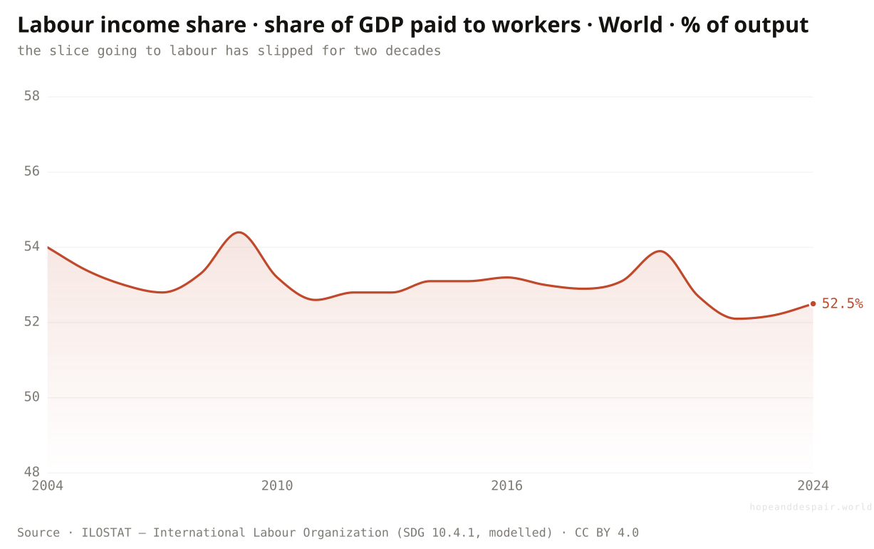
When work creates value, how much of it reaches the worker?
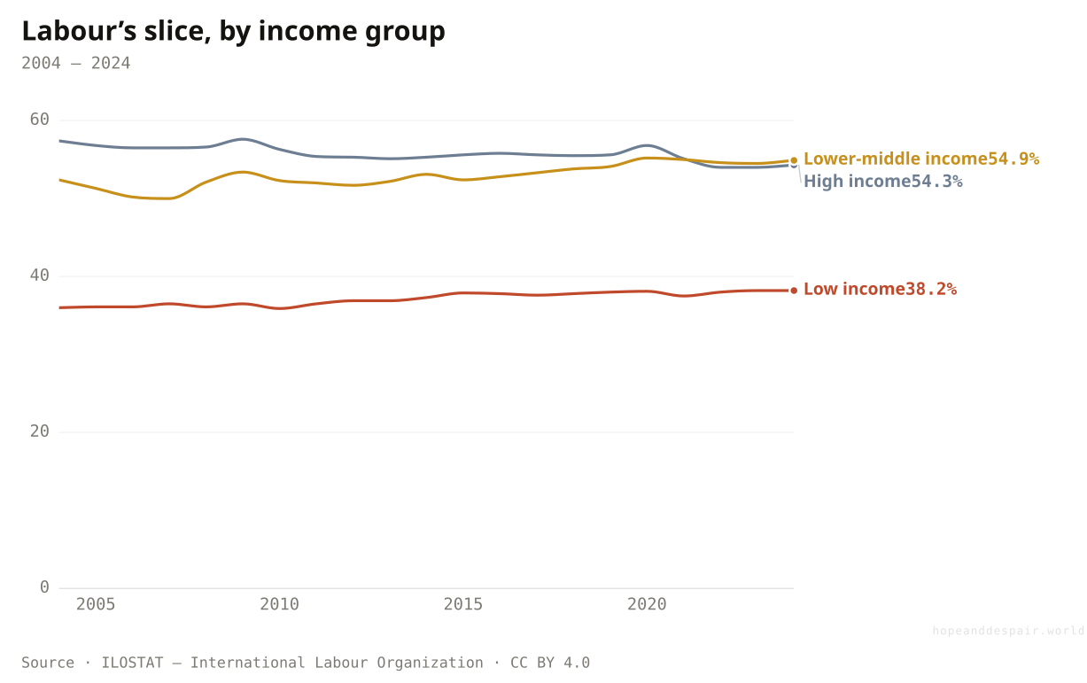
A shrinking share: labour’s slice of world output slipped from 54% in 2004 to under 53% today, and in low-income countries workers keep just 38% of what they produce.
Even where work pays, a quieter question is how much of what it produces the worker actually keeps. The labour income share is the part of a country’s output that goes to people who work (wages, plus the labour portion of what the self-employed earn) rather than to the owners of capital and land. Worldwide it has slipped, from about 54 percent in 2004 to under 53 today. A point or two of global output looks trivial, but across the entire world economy it moves a great deal, steadily, from labour to capital. The split also runs opposite to the obvious guess. It is not the poorest workers who keep the most of what they make: in low-income countries labour takes home just 38 percent of output, against 54 in rich ones, because so much of a poor economy’s value comes from capital-heavy mining, land and extraction rather than paid work. This reframes the whole hopeful story. The great fall in working poverty did not come from labour winning a larger share of the pie; its share fell. It came from the pie growing. When growth slows, that distinction will start to bite.
How this number was made
What it measures. Labour income share — the share of GDP paid to workers as wages plus the labour portion of self-employment income (SDG indicator 10.4.1). ILO modelled estimates. World.
Calculation. World, capped at 2024.
The displayed line is monotone-cubic smoothed for legibility only — it never moves a data point.
In low-income economies labour keeps about 38% of output; in rich ones, 54%. Much of that gap is the weight of oil, mining and land in poor economies, where the value comes more from capital than from paid work.
Labour still captures more than half of everything the world produces, and in the poorest economies its share has crept up, not down.
Labour’s slice of global output has fallen steadily for twenty years, and the workers who keep the least of what they make are the poorest.
Falling poverty and a falling labour share sit together: workers grew less poor without winning a bigger cut of what they produce.
When work stays bad, who carries it?
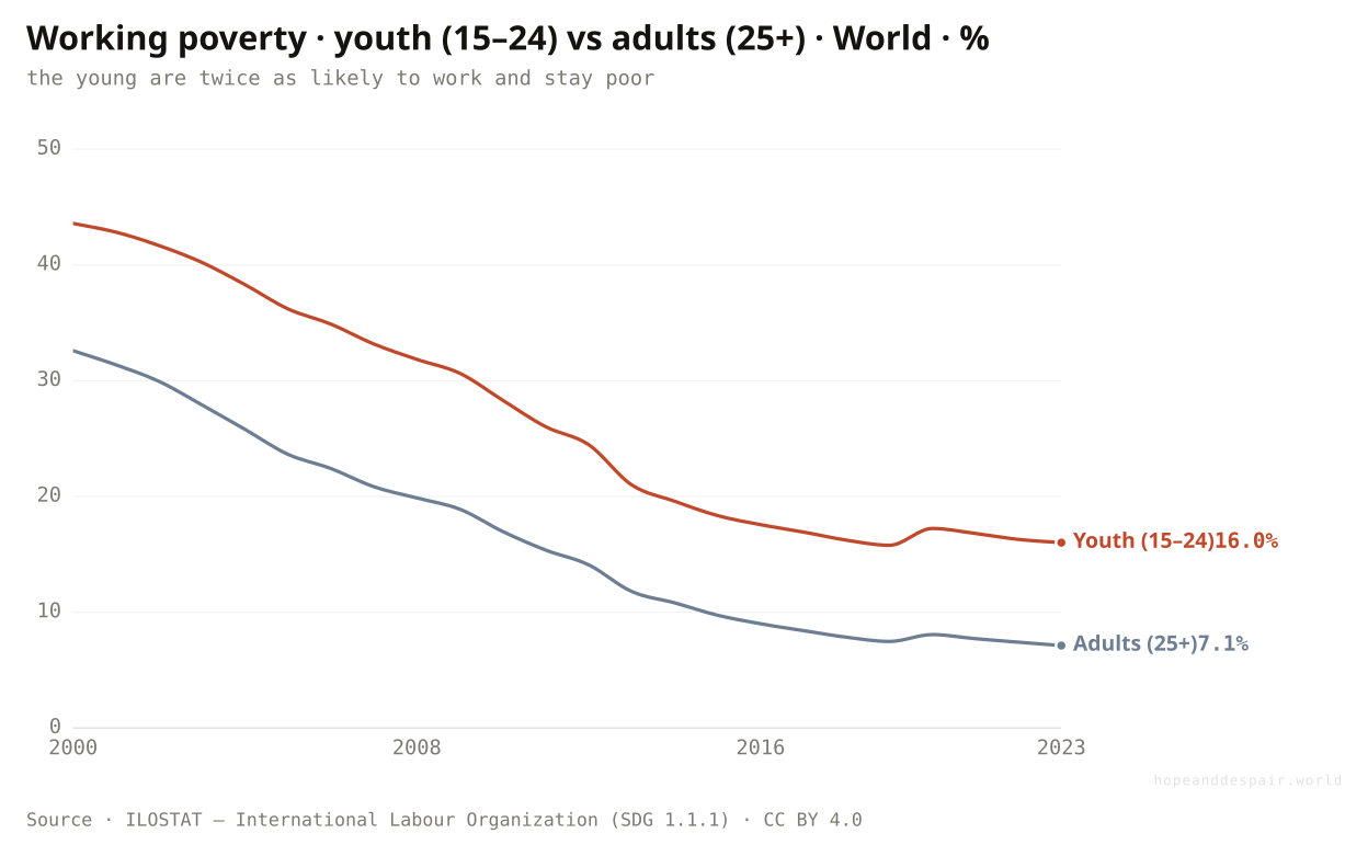
The young: a worker under 25 is more than twice as likely to be working poor as an older one, and youth unemployment has drifted up, not down.
Bad work is not shared evenly across a lifetime; it lands on the people just entering it. A young worker, aged 15 to 24, is more than twice as likely to be working poor as an adult over 25 — sixteen percent against seven. They get the most casual jobs and the weakest bargaining power, and they are first out the door when work dries up. And the one labour number that has genuinely worsened belongs to them: youth unemployment edged up over the last three decades, from around eleven and a half percent to over thirteen, even as the working-poverty rate fell underneath it. The two facts fit together. A young person in a poor country usually cannot afford to be unemployed and takes bad work instead, which is why their poverty rate is so high; a young person in a richer country can wait for a real job, which is why their unemployment rate is what climbs. Either way, the entry to working life got harder while its floor got higher.
How this number was made
What it measures. Share of employed people living in a household below the extreme-poverty line ($2.15/day, 2017 PPP). ILO SDG indicator 1.1.1. Employed youth aged 15–24, World.
Calculation. World, both sexes, ages 15–24.
The displayed line is monotone-cubic smoothed for legibility only — it never moves a data point.
Among employed 15-to-24-year-olds, nearly nine in ten are working poor in Madagascar; in China and Brazil, almost none.
Youth working poverty fell even faster than the adult rate — the gains reached the young, just from a worse starting point.
The young still carry the worst of it, and their unemployment is the rare labour number moving the wrong way.
A high youth poverty rate and a high youth unemployment rate mean opposite things in poor and rich countries.
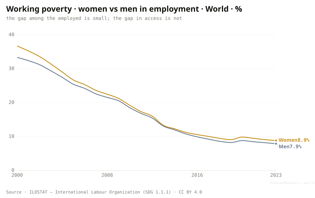
Is the rawest gender gap in how much women earn, or in whether they’re counted as working at all?
Women in work are only slightly more likely than men to be working poor; the deeper divide is that half the world’s women are not in the labour force, and that barely changed.
Look only at people who have jobs and the gender gap in working poverty is real but narrow: women at about nine percent, men at eight. The larger inequality comes earlier, in who gets counted as a worker at all. Just under half of the world’s women are in the labour force, against roughly three-quarters of men. That share has actually slipped over thirty years, from about fifty-one percent to forty-nine. A great deal of women’s work, the unpaid care and subsistence labour that holds households together, is not 'employment’ in the statistics, so it shows up nowhere on the page. The narrow earnings gap among the employed sits on top of a much wider gap in access to paid work, and the second one is not closing. The story of women and work is less about unequal pay for the same job than about never reaching the job that gets measured.
How this number was made
What it measures. Share of employed people living in a household below the extreme-poverty line ($2.15/day, 2017 PPP). ILO SDG indicator 1.1.1. Employed women aged 15+, World.
Calculation. World, women, ages 15+.
The displayed line is monotone-cubic smoothed for legibility only — it never moves a data point.
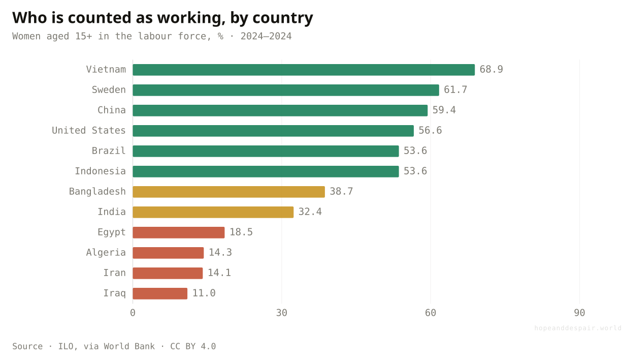
About two-thirds of women are in the labour force in Vietnam and Sweden, a third in India; in Egypt, Iran and Iraq, fewer than one in five.
Among people in paid work, women’s and men’s poverty rates fell together and now sit close — equal at least in this.
Half the world’s women remain outside measured work entirely, and that share has not improved in a generation.
The most consequential gender gap in work is in a number the labour statistics were never built to see.
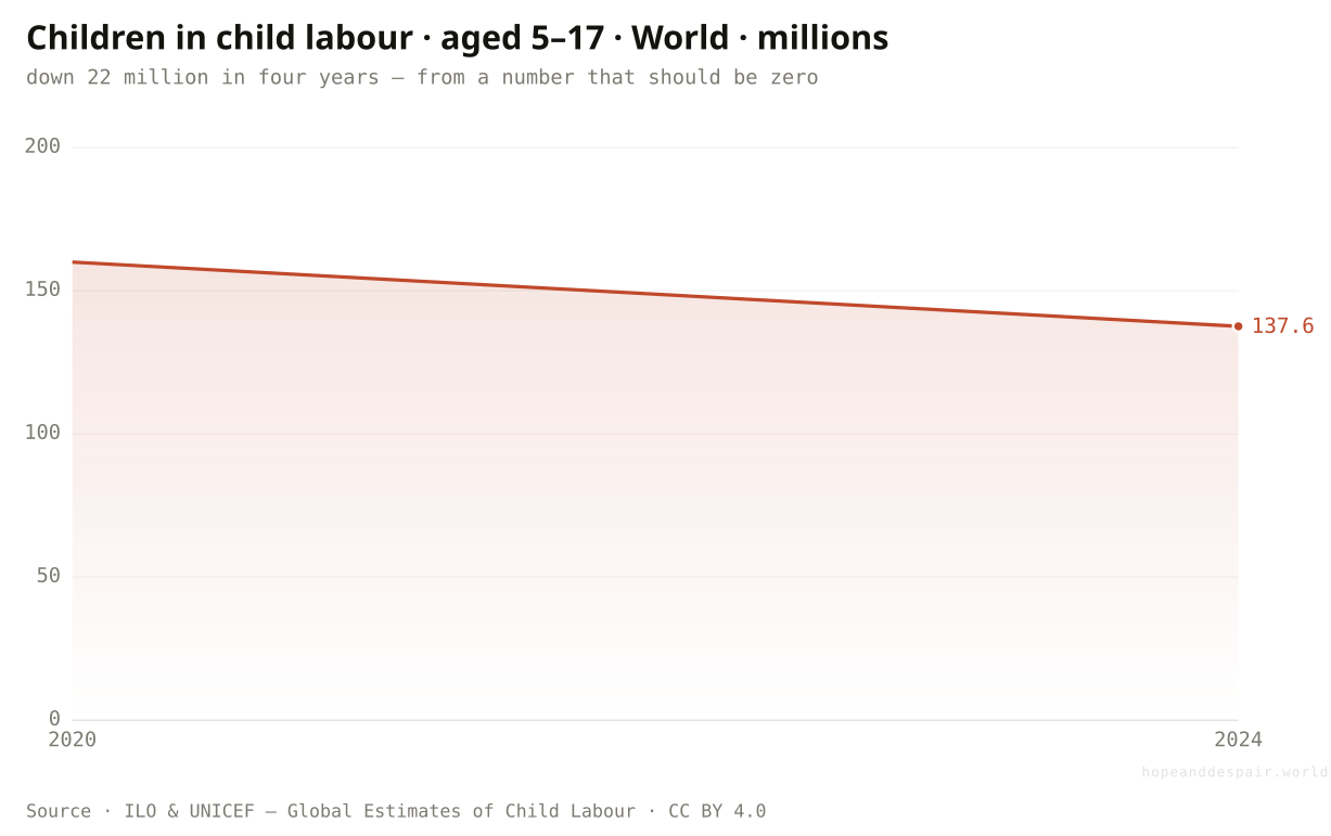
And the work no one should be doing at all — is there less of it?
Child labour fell by more than twenty million in four years, to 138 million children — progress, on top of a number that should be zero.
At the very bottom of the labour market are the workers who should not be in it. The ILO and UNICEF count about 138 million children aged 5 to 17 in child labour in 2024, down from 160 million in 2020, the first decline after years when the figure had been rising. Twenty-two million children leaving labour in four years is a genuine turn. It was driven by recovery from the pandemic shock that had pushed many back to work, and by the slow grind of schooling and income support. But the level is the point. 138 million is roughly one child in ten worldwide, most of them in agriculture, much of it hazardous, and many trying to hold onto school alongside the work. There are only two reliable global estimates so far, so this is a direction, not yet a trend, and a single drought or debt crisis has reversed it before. The floor under the world of work is rising, slowly, off a number that should not exist.
How this number was made
What it measures. Children aged 5–17 in child labour worldwide, in millions — the ILO & UNICEF Global Estimates (two rounds, 2020 and 2024).
Calculation. Child-labour-world count ÷ 1e6.
The displayed line is monotone-cubic smoothed for legibility only — it never moves a data point.
The pandemic-era rise in child labour has reversed, and 22 million children left work in four years.
One child in ten is still working, often in hazardous jobs, and two data points can’t promise the turn will hold.
Child labour is both falling and enormous, and a single bad year has undone its gains before.
Do the bad parts of work fall on the same people, or different ones?
They stack: poverty, informality and underemployment all concentrate on the same low-income workers, and all recede together up the income ladder.
Lay the three failures of work side by side across the income ladder and they line up like bars of the same colour. The workers most likely to be poor are also the most likely to lack a contract and the most likely to want more hours than they can get; climb to high-income countries and all three nearly vanish at once. This is the pattern under everything here. 'Is work getting better’ has no single answer because the answer is sorted by income: on the bottom rung almost every measure of bad work is still near its worst, and on the top rung almost none of them register. The good news is that the rungs are not fixed — whole regions climbed them in a generation. The hard news is that the gains arrive in the same order every time, security last and poorest last, so the places with the worst work are the ones that improve it slowest.
How this number was made
What it measures. Working poverty, informal employment and time-related underemployment for each national income group, latest settled year, shaded within each row from the worst group (red) to the best (green). No cross-row composite. Columns run poorest to richest.
Calculation. Per-row min–max of the latest income-group values; lower (less bad work) maps to green.
The displayed line is monotone-cubic smoothed for legibility only — it never moves a data point.
Because the failures move together, the same thing that cut poverty — productive growth and the formal jobs it brings — can carry the rest along behind it.
The worst work concentrates on the poorest workers across every dimension at once, which is what makes it so hard to shift.
There is no single 'state of work’ — there is a state of work for each income group, and they barely resemble each other.
A job is far more likely to beat poverty than it was a generation ago, and almost exactly as likely as ever to come with nothing behind it.— the through-line of this piece
One question, read by the fields that actually study it. Each voice is given both its most hopeful and its darkest honest reading — with a note on how settled the evidence underneath is.
the hopeful readThe fastest fall in working poverty ever recorded happened on our watch — whole regions crossed from mass poverty to near-zero in twenty-five years.
the darker readThe remaining working poverty has concentrated in the lowest-income countries with the weakest growth, so the cheap, fast gains are spent.
the hopeful readWhere formal jobs do arrive, they bring the whole package at once — and East Asia shows that transition can happen within a single career.
the darker readMost workers on earth still have no contract and no safety net, and that number has not moved in twenty years while profits and productivity did.
the hopeful readI earn more than my parents did and my children are in school, not on the stall beside me.
the darker readThere is no sick pay, no pension, no contract — if I stop working for a week, there is nothing, and the law does not see me at all.
the hopeful readThe direction of every series here is solid, and the best of them — working poverty — is one of the clearest improvements in our data.
the darker readHalf of all women’s labour and most of the informal economy sit at the edge of what surveys can see, so the hardest cases are the ones we measure worst.
Strongest case for hope
Read work by its oldest and harshest test — can a day’s labour keep a family fed — and the last twenty-five years are a triumph with few rivals. The share of workers trapped in extreme poverty fell by three-quarters, the steepest such decline ever recorded, and it was no accident: it rode the spread of more productive farms, factories and firms that paid the same hours more. Entire regions and income tiers crossed from mass working poverty to almost none, fast enough that a single worker could watch it happen across their own career. Child labour has turned back down. Youth poverty fell even faster than adult poverty. None of this was inevitable, and the path it took is visible and repeatable: where productive, formal work arrives, it brings higher pay, contracts and protection together. And the safety net that work has always lacked is, for the first time, being built at scale: social-protection coverage rose from under 40 to over half the world in fifteen years. The job is unfinished, but on the thing that matters most, work got dramatically better.
Strongest case for despair
Read work by whether it offers any security and the picture barely improved. Nearly three in five jobs on earth are informal, with no contract, no insurance and no recourse, and that number has scarcely moved in two decades, even as destitution fell around it. More than two in five workers have no employer at all, just a stall or a family plot. The remaining working poverty has pooled in the low-income countries least able to grow out of it, where half of all workers are still poor and informality runs near ninety percent; one region, the Arab States, is moving backwards outright. The people entering work carry the worst of it, with youth unemployment drifting up. Half the world’s women are not counted as working at all, a share that has fallen, not risen. Even the share of what they produce that workers keep has slipped for twenty years, and just over half the planet has any social protection at all, with barely one worker in six covered against losing their job. The gains were real but uneven, and the part of the bargain that protects a worker from a bad month, the contract, the pension, the safety net, is, for most of humanity, still not part of the deal.
Watch the bottom rung and the second promise. The number that matters most is whether working poverty in low-income countries, stuck near half, finally breaks downward, because that single group now holds most of the unfinished work. Watch informality, the measure that has refused to move: if the formal share of jobs starts rising in lower-middle-income countries the way poverty already fell, the security problem is following the destitution problem down, a decade behind. Watch whether the Arab States’ reversal spreads or stays a war-driven exception. And watch the young: if youth unemployment keeps climbing while their poverty falls, work is bifurcating into a protected core and a precarious entry that never ends. Faster formalisation and a falling low-income floor, and the hope case wins outright. A world where destitution keeps falling but security never arrives, and work settles into a permanent split between those it protects and those it merely occupies.
Everything done to the numbers between the source and the chart, disclosed in full. Where a choice is editorial rather than measured, we say so.
- Two measures, pulled apart on purpose
- The piece is built on the gap between two ILO measures. Working poverty (SDG indicator 1.1.1) is the share of employed people living in households below the $2.15-a-day extreme-poverty line — it asks whether work pays enough. Informal employment is the share of jobs outside labour law and social insurance — it asks whether work protects. They are different questions with different answers, and most of the apparent contradiction in this article is the two diverging.
- The two security measures
- Beyond informality, the piece reads work’s security two more ways. Social protection coverage (SDG indicator 1.3.1) is the share of people receiving at least one cash benefit — pension, child grant, unemployment, disability or injury cover; the headline counts anyone with one benefit, and the article breaks out the weakest branches (unemployment, children) separately. Labour income share (SDG indicator 10.4.1) is the slice of GDP paid to workers rather than to capital — the distribution question. Both are ILO modelled estimates.
- World, then income group, then region, then country
- Wherever the data allows, the same indicator is read at four altitudes rather than one, because the global average blends opposite trends. Working poverty carries the magnification because its definition is identical from the world down to the single country. The income groups, regions and the World aggregate are the ILO’s own published area aggregates (the SDMX 'X’ codes); the country bars are the same indicator, latest year, for a curated, recognisable spread.
- Modelled estimates, and what that means
- Most labour series here — informality, vulnerable employment, the modelled poverty figures — are ILO modelled estimates, not direct counts. Rich countries with good labour-force surveys are observed; much of the world is inferred from partial data and harmonised so countries can be compared. The trends are robust; precise levels and the most recent years (nowcast to 2024–2025) carry more uncertainty. This is stated rather than smoothed over.
- The income ladder uses the source’s own groups
- The four income tiers — low, lower-middle, upper-middle, high — are the World Bank income classifications as the ILO applies them to its aggregates. A country can move between tiers over time, so a tier’s trend reflects both genuine change within countries and the reclassification of countries as they grow. The direction of the story (poverty empties the top tiers first) is unaffected; the exact tier levels should be read as indicative.
- The closing grid is shaded row by row, not scored
- The final chart colours each income group on each measure from the worst group (red) to the best (green), but every row is scaled on its own. There is no overall index and no cell compares across rows, because a point of poverty and a point of informality do not share a scale. The columns are ordered by income, poorest to richest, so the eye can see whether the failures track income rather than a hidden ranking.
- Why unemployment is nearly absent
- The standard unemployment rate is a poor guide to the health of work in most of the world, because in the absence of benefits no one can afford to be jobless; they take bad work instead. A low unemployment rate in a poor country signals desperation, not strength. The piece therefore leans on measures of work’s quality — poverty, informality, vulnerability, underemployment — and uses unemployment only where it is informative, among the young.
- Prose and number audit
- Explanatory text was drafted with the help of a large language model and then checked line by line against the project’s derived data series; every quantitative claim traces to a figure produced by the pipeline (src/data/derived). No outside numbers were introduced. Where the writing is uncertain — modelled estimates, two-point trends — it says so.
- ILOSTAT — International Labour Organization (working poverty, SDG 1.1.1) — ilostat.ilo.org ↗ · CC BY 4.0 · vintage 2026-06Working poverty rate (DF_SDG_0111) — share of employed living below $2.15/day — for the World, four income groups, the ILO regions, and individual countries, by sex and age, via the SDMX 2.1 API.
- ILOSTAT — International Labour Organization (informal employment, modelled) — ilostat.ilo.org ↗ · CC BY 4.0 · vintage 2026-06Informal employment rate (DF_EMP_2IFL) and time-related underemployment (DF_EMP_2TRU), ILO modelled estimates, by income group — the security and underemployment measures.
- ILOSTAT — International Labour Organization (social protection & labour income share) — ilostat.ilo.org ↗ · CC BY 4.0 · vintage 2026-06Social protection coverage (DF_SDG_0131, SDG 1.3.1, by benefit type) and labour income share of GDP (DF_SDG_1041, SDG 10.4.1), ILO modelled estimates, World and by income group.
- ILO & UNICEF — Global Estimates of Child Labour — www.ilo.org/childlabour ↗ · CC BY 4.0 · vintage 2024Children aged 5–17 in child labour (DF_CLD_XCHL), the 2020 and 2024 global estimates, via ILOSTAT.
- International Labour Organization (modelled), via World Bank — data.worldbank.org/indicator/SL.EMP.VULN.ZS ↗ · CC BY 4.0 · vintage 2026Vulnerable employment, female labour-force participation and youth unemployment — ILO modelled estimates mirrored in the World Development Indicators, world and by region.
Cite this page
Reference
Hope & Despair. “Is work getting better or worse?.” Hope & Despair, 2026. https://hopeanddespair.world/questions/is-work-getting-better-or-worse.
BibTeX
@misc{hopeanddespair:is-work-getting-better-or-worse,
  author       = {{Hope & Despair}},
  title        = {{Is work getting better or worse?}},
  year         = {2026},
  howpublished = {\url{https://hopeanddespair.world/questions/is-work-getting-better-or-worse}},
  note         = {hopeanddespair.world, updated 2026-06-20}
}
Original prose, code, and chart designs are released under CC BY 4.0 ↗ — reuse freely with attribution. Source datasets keep their own licences, listed above. Add your access date when citing.
- Work & Jobs: ship "Is work getting better or worse?" (Q15) View diff →
Generated from the commit history — every edit to a number, a word, or a chart is tracked in the open. Browse the full history & diffs on GitHub →
in plain words