Question 14 · Environment
Is the air getting cleaner or deadlier?
The air over the rich world keeps clearing. The air over South Asia keeps thickening. The death toll keeps climbing. Every one of those is measured — and all three are true at once.
Two facts, both measured, both true. Air pollution has eased over the rich world and worsened over the global South — and the global average, after climbing for most of a generation, only lately began to fall. And it kills more people now than when the century began. This piece is about how all of that is a single answer.
We follow it the way the data honestly allows, and mostly country by country over time: from the global average down the income ladder to the South-Asian cities where it is still climbing and the long-cleaned economies that show what 'solved’ looks like; through the contested toll and the uncounted harm beneath it; to who breathes the worst, who it actually kills, who even measures it, and which yardstick we grade against. Where a figure is modelled rather than counted, or missing because no one measures it, we say so out loud.
you read
- Most burden estimates in this field are modelled from satellites, not measured at the ground — and the people worst affected live where the monitors aren’t. The headline toll is a range, not a point: published estimates for outdoor particulate alone span three to nine million deaths a year.
- The trends — exposure, clean cooking, the precursor-gas emissions, wildfire burned area — run on fully ingested, re-hostable ACAG, World Bank, CEDS and GWIS data. Several of the deadlier snapshots — the contested toll, lead, the smoke-death geography, the data deserts, the standards — are charted from named published figures (Ghosh, Xue, Chen, OpenAQ, the Illinois consumption dataset, the WHO guidelines); CC-BY tables are re-hosted with attribution, while GBD/IHME-derived figures are charted and cited but not offered for download. The toll and cause-of-death stay as single-year snapshots because the only open over-time series for them is non-redistributable. The remaining planned act — the satellite atlas — is mapped in docs/ARTICLE-airpollution-plan.md but not yet built.
Is the air actually getting cleaner?
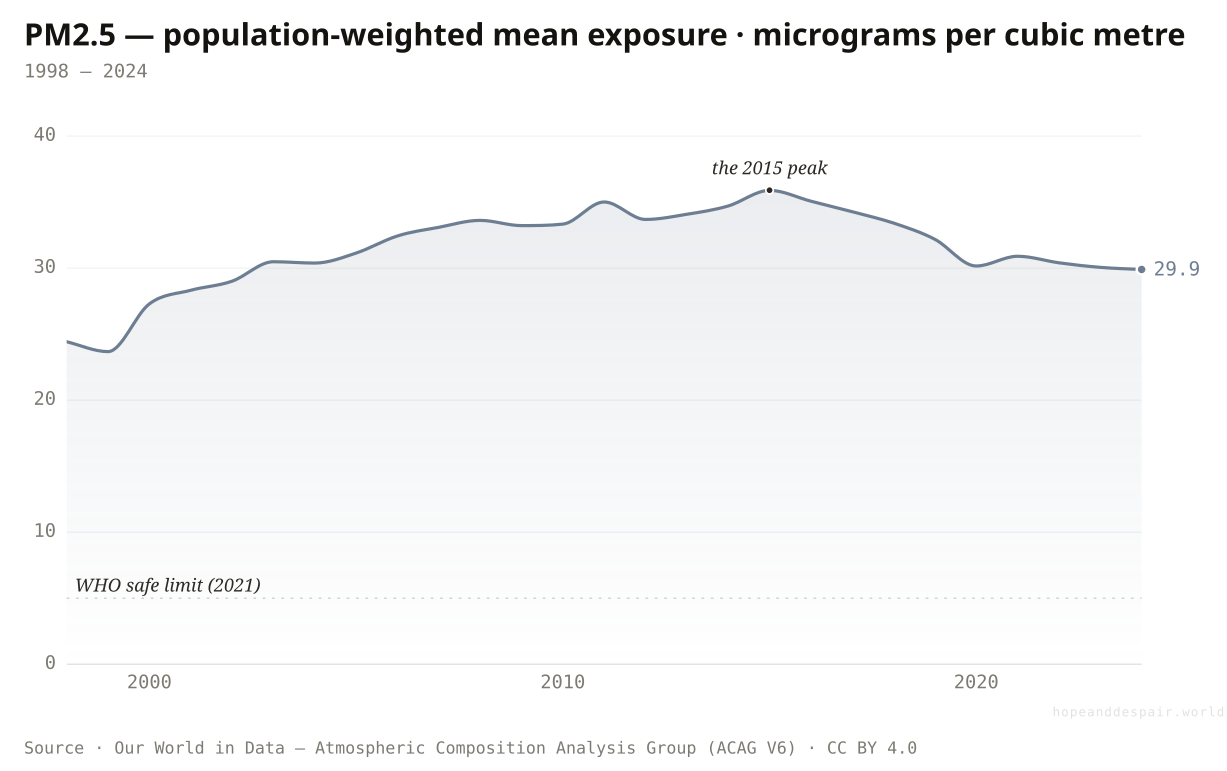
The world’s air got worse for a generation, crested around 2015, and has only just begun to clear — still six times the safe limit.
Population-weighted, the average lungful held 24 micrograms of fine particulate in 1998 and 30 in 2024 — but the line between them is a hump, not a slope. It climbed through the 2000s as Asia industrialised, crested near 36 around 2011 to 2015, and has eased for about a decade since, almost entirely on the back of China’s cleanup. So the honest answer to 'is it getting cleaner’ is: only lately, only partly, and from a worse place than where it started. Even now the average sits six times above the World Health Organization’s safe limit of five.
How this number was made
What it measures. Annual population-weighted average concentration of fine particulate matter (PM2.5) in the air, measured in micrograms per cubic meter (µg/m³). Fine particulate matter (PM2.5) are particles with a diameter of 2.5 micrometers or less, which can pose significant health risks.
Calculation. Selected entity OWID_WRL.
The displayed line is monotone-cubic smoothed for legibility only — it never moves a data point.
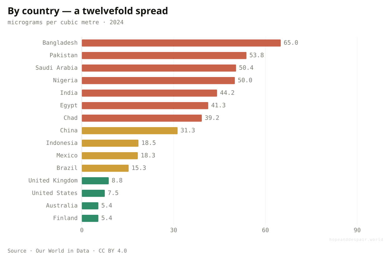
Bangladesh’s air carries twelve times the fine particulate of Finland’s (2024). The global average is a midpoint almost nobody actually breathes.
The last decade bends down, and China’s cleanup shows a big dirty economy can reverse fast.
The air got worse for a generation and still sits six times above safe — the recent dip barely undoes the climb.
'Is it getting better?' depends entirely on which decade you stand in — the 2000s say no, the 2010s say yes.
Has the cleaner air reached everyone?
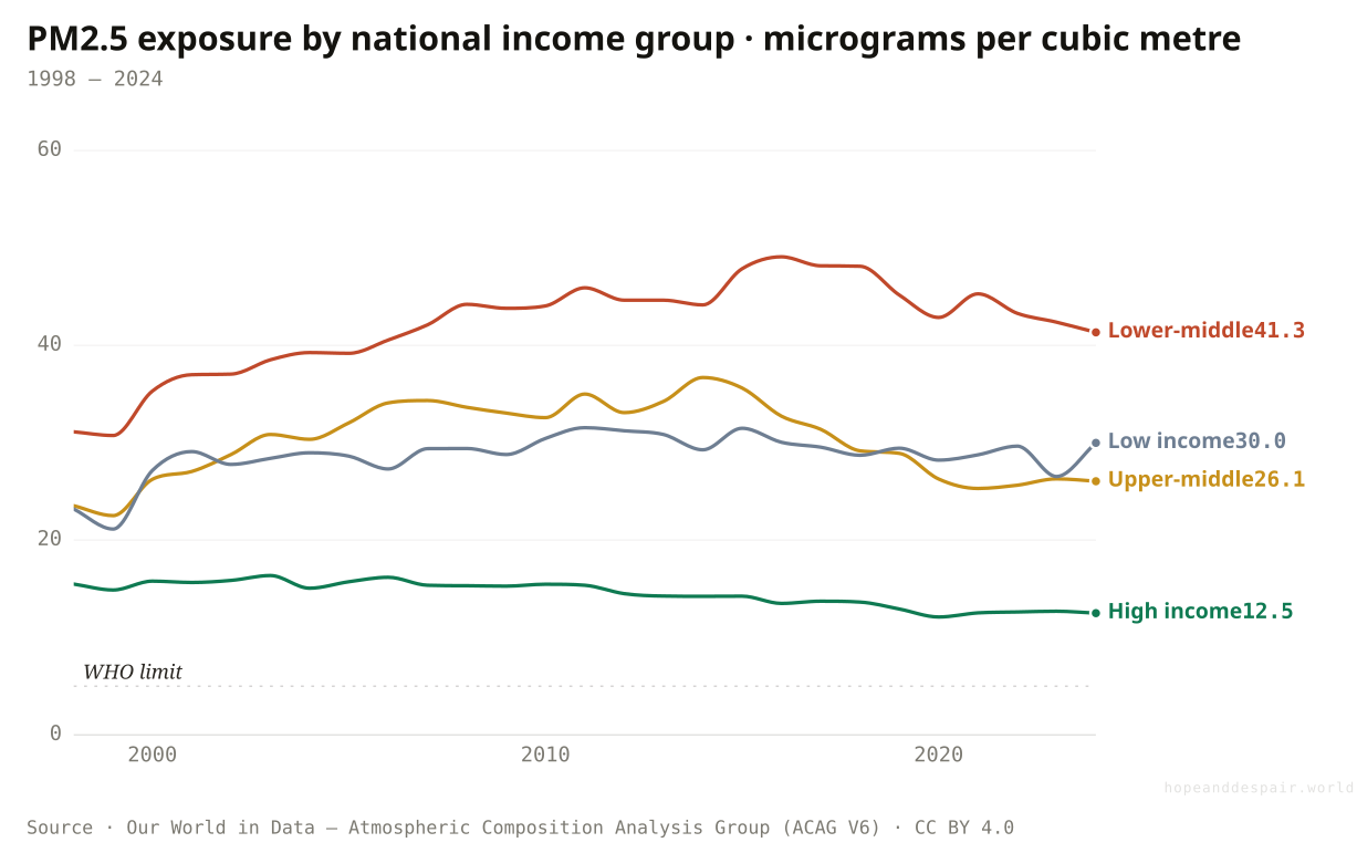
Rich-world air kept clearing while the poorer half’s got dirtier — the gap didn’t just hold, it widened.
Split the global hump by income and it splits into opposite stories. High-income countries drifted down from 16 micrograms to 12 across the period — a slow, steady clean. The lower-middle-income world, home to most of South Asia, went the other way: 31 up to a peak near 49, settling at 41, more than three times the rich-world level and eight times the safe limit. Low-income countries rose too. The world’s air did not get cleaner for everyone; it got cleaner for the people who already breathed the cleanest air.
How this number was made
What it measures. Annual population-weighted average concentration of fine particulate matter (PM2.5) in the air, measured in micrograms per cubic meter (µg/m³). Fine particulate matter (PM2.5) are particles with a diameter of 2.5 micrometers or less, which can pose significant health risks.
Calculation. Selected entity OWID_HIC.
The displayed line is monotone-cubic smoothed for legibility only — it never moves a data point.
The high-income line shows where the others could land — a steady glide down toward, if not to, safe.
The poorer half breathes dirtier air than it did in 1998, and the distance to the rich world grew, not shrank.
One global average, four income groups, two opposite directions inside it — the mean hides the divergence.
Did the big polluters bend the curve?
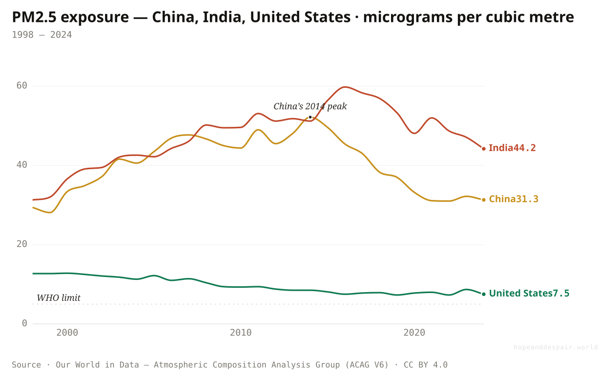
America kept clearing, China cleaned up fast after a brutal peak — and India just kept getting worse.
Three giants, three different curves. The United States, already the cleanest, drifted from 13 micrograms down to 7.5 in a quiet, decades-long decline. China is the dramatic one: it climbed to a punishing peak above 52 around 2014, then bent the curve hard after declaring a 'war on pollution,' falling back to 31. That was the fastest cleanup of a large economy on record. India did the opposite of all of it. No peak, no turn, just a steady climb from 31 to 44, until it passed China and became the dirtiest of the three. The cleanup was real. It simply wasn’t shared.
How this number was made
What it measures. Annual population-weighted average concentration of fine particulate matter (PM2.5) in the air, measured in micrograms per cubic meter (µg/m³). Fine particulate matter (PM2.5) are particles with a diameter of 2.5 micrometers or less, which can pose significant health risks.
Calculation. Selected entity CHN.
The displayed line is monotone-cubic smoothed for legibility only — it never moves a data point.
China proved a dirty giant can reverse course in a decade — the curve can bend when a government decides it must.
India never had a peak to fall from. Its line only climbs, and it now breathes the dirtiest air of the three.
China’s start and end points are almost identical — yet between them sits a peak and a cliff that the two-number summary erases entirely.
If China turned the corner, where did the crisis go?
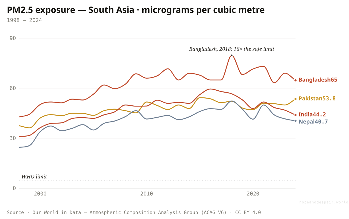
It moved to South Asia — where four countries’ air kept thickening for a quarter-century with no peak in sight.
The story the global average buries is a regional handover. As China bent its curve down after 2014, the centre of gravity of dirty air slid west and south, onto the Indo-Gangetic Plain. India climbed from 31 micrograms to 44. Bangladesh is the extreme case: its population-weighted exposure reached 80 in 2018 — sixteen times the safe limit, the dirtiest national air the satellite record has measured — before easing only slightly to 65. Pakistan rose from 38 to 54, Nepal from 25 to 41. These are not industrial relics cleaning up; they are countries still on the way up, with crop-burning seasons, growing vehicle fleets, and shared airsheds that no single government controls. The world’s worst air is no longer in China. It is here, and it is still getting worse.
How this number was made
What it measures. Annual population-weighted average concentration of fine particulate matter (PM2.5) in the air, measured in micrograms per cubic meter (µg/m³). Fine particulate matter (PM2.5) are particles with a diameter of 2.5 micrometers or less, which can pose significant health risks.
Calculation. Selected entity BGD.
The displayed line is monotone-cubic smoothed for legibility only — it never moves a data point.
China’s reversal proves the same airshed can turn — South Asia’s curve is not a law of nature, only a choice not yet made.
A fifth of humanity lives under air that has worsened for a generation, peaking dirtier than China ever did.
The 'global crisis is easing’ headline is true on average and false for the two billion people who matter most to it.
Has anyone actually solved this and made it stick?
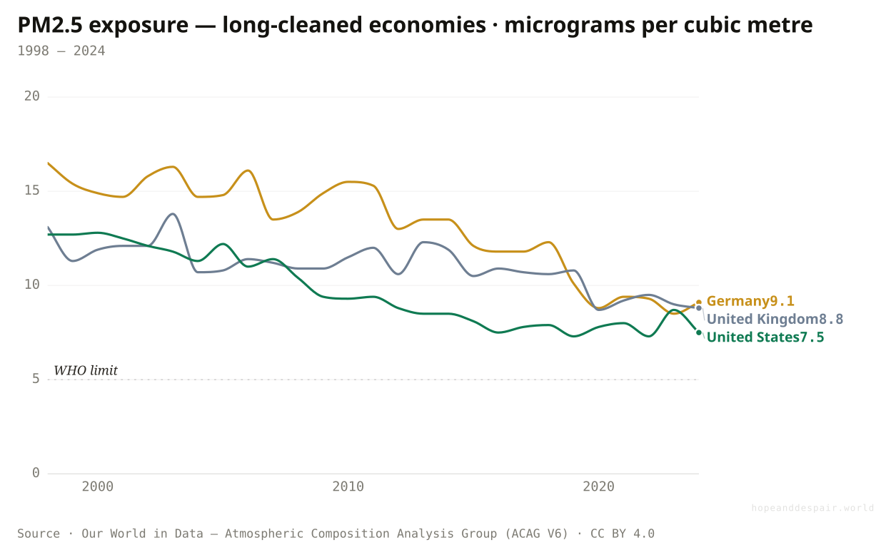
The rich world did — decades ago, and quietly. But even its 'clean’ air still breaks the safe limit.
Set the dirtiest air against the cleanest and a second lesson appears: this is a solved problem, where the will exists. The United States drifted from 13 micrograms to 7.5, the United Kingdom from 13 to 9, Germany from 16 to 9 — three industrial economies that scrubbed their air over decades through fuel standards, filters, and the slow death of coal, then held it there. That is the template South Asia hasn’t begun. But look where the lines settle, and the comfort curdles: every one of them still sits above the WHO’s safe limit of five. The rich world’s air is clean only by comparison. 'Solved’ here means twice as dirty as health advises, not safe.
How this number was made
What it measures. Annual population-weighted average concentration of fine particulate matter (PM2.5) in the air, measured in micrograms per cubic meter (µg/m³). Fine particulate matter (PM2.5) are particles with a diameter of 2.5 micrometers or less, which can pose significant health risks.
Calculation. Selected entity DEU.
The displayed line is monotone-cubic smoothed for legibility only — it never moves a data point.
Three big economies cut their particulate by a third to a half and kept it down — the cleanup is durable, not a blip.
Even the success stories never reached the safe line; decades of effort bought air that’s still officially unhealthy.
'Clean’ and 'safe’ are different countries — these nations are the first and still not the second.
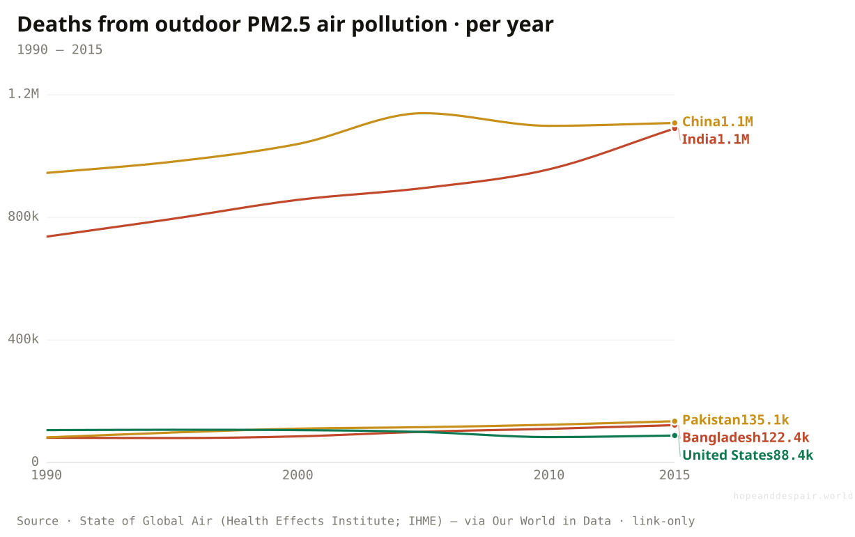
If the air thinned, why did the dying grow?
Even where the death rate per person fell, the body count climbed — more people, living longer, breathing it in.
Here is the cruel arithmetic in one chart. A death rate can fall while a death count rises, if the population grows and ages fast enough — and that is exactly what happened. India’s outdoor-air deaths rose 48 percent between 1990 and 2015, from 737,000 to 1.09 million, even as the risk to any single person eased, because there were far more people living long enough to die of heart disease instead of something else first. Pakistan’s toll rose 65 percent, Bangladesh’s 51, Indonesia’s 49. China rose even as it began to clean up. The exceptions prove the rule: the United States, already clean and barely growing, drifted down, and Nigeria’s count actually fell as other causes of death receded faster. A safer cigarette and a bigger crowd smoking it produce more funerals, not fewer.
How this number was made
What it measures. Deaths from ambient PM2.5 air pollution, India
Calculation. Selected entity IND.
The displayed line is monotone-cubic smoothed for legibility only — it never moves a data point.
Per person, the risk fell everywhere — the rate is winning even where the count is losing.
More people died of dirty air in 2015 than in 1990, full stop, in the places with the most people.
The single clearest proof that 'cleaner or deadlier’ has no scalar answer: this one chart is both.
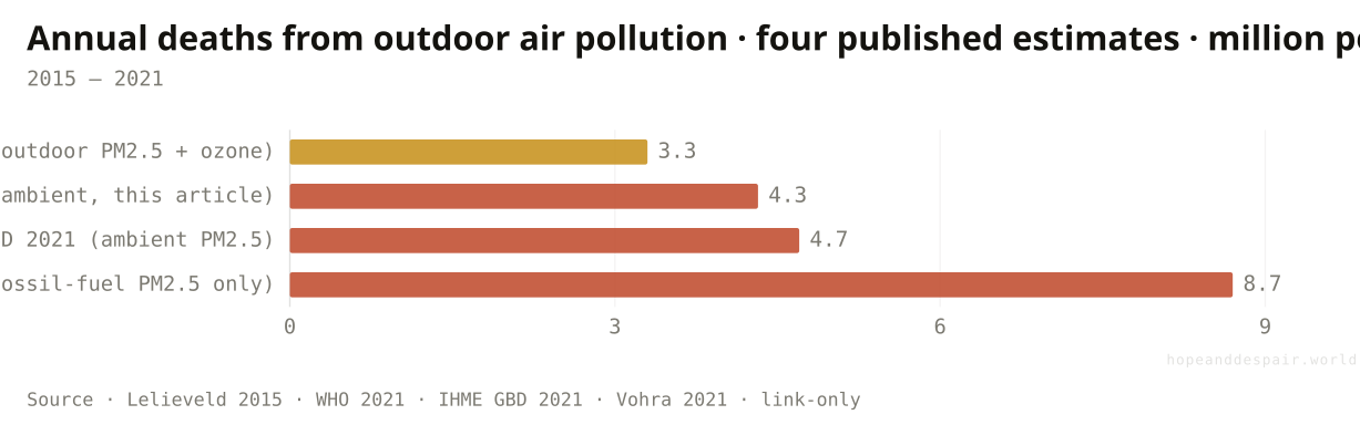
So how many does it actually kill?
Somewhere between three and nine million a year — and the disagreement is about science, not air.
Reach for a single death toll and the ground moves under you. For outdoor particulate alone, published estimates run from 3.3 million a year to 8.7 million, a near-threefold spread over the same planet in roughly the same years. The gap is not measurement error; it is method. No one counts these deaths the way you count road crashes. They are inferred: take how much particulate people breathe, multiply by how much each microgram raises the risk of a heart attack or stroke, and sum. Change the dose-response curve, making it steeper at high exposures or extending it to fossil-fuel particles specifically, as Vohra and colleagues did to reach 8.7 million, and the total swings by millions without a single new death. The honest figure is a range. Anyone who quotes you one number to the decimal is selling certainty that the data doesn’t contain.
How this number was made
What it measures. Published annual death estimates attributable to outdoor air pollution. Estimates diverge because they use different exposure-response functions and pollutant scopes — not because the air differs. Lelieveld et al. 2015 (PNAS); WHO Global Health Estimates 2021; GBD 2021 (IHME); Vohra et al. 2021 (Environmental Research, fossil-fuel combustion PM2.5).
Calculation. Four published outdoor-air-pollution death estimates, 2015–2021, shown as a spread to make the modelling uncertainty legible.
The wide band is science being honest about what it doesn’t know — better than a confident wrong number.
Even the lowest estimate is millions of avoidable deaths a year; the argument is only about how many millions.
A threefold range on the headline statistic — and every figure in this article inherits some of that uncertainty.
If the air is cleaner, why does it still kill millions?
Cleaner air, and still nearly seven million dead a year — the toll and the trend point opposite ways.
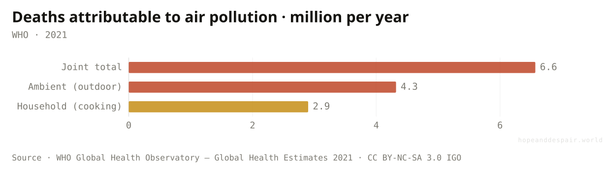
Concentration is how dirty the air is; the toll is how many it kills — and the two have come apart. The air thinned, but the world added people and added years to every life, and dirty air kills slowly, through heart disease that takes decades to mature. In 2021 the WHO counted 4.3 million deaths from outdoor air and 2.9 million from the smoke of indoor cooking fires; their joint total, after the overlap, is 6.6 million. That is more than HIV, tuberculosis and road crashes put together.
How this number was made
What it measures. Deaths attributable to ambient (outdoor) air pollution, household (indoor) air pollution, and their joint effect, World, 2021. Joint total is below the sum because the two exposures overlap.
Calculation. WHO GHO all-cause, both-sex, GLOBAL totals for 2021 — AIR_35 (joint), AIR_41 (ambient), AIR_11 (household), in millions.
Per person, the age-standardised death rate is falling — the world is slowly winning the ratio.
Nearly seven million people a year, and the raw count hasn’t fallen even as the air thinned.
Rate down, toll flat: the same phenomenon improves or worsens depending on the denominator you pick.
What does dirty air actually kill you with?
Not your lungs, mostly. Your heart.
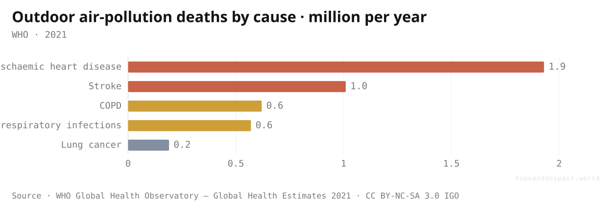
The mental image of air pollution is a wheezing chest, so the real anatomy of the harm tends to surprise people. Of the 4.3 million outdoor-air deaths in 2021, ischaemic heart disease took 1.9 million and stroke another 1.0 million — two-thirds of the toll is cardiovascular. Fine particles cross from the lung into the bloodstream, inflame the artery walls, and thicken the blood until a vessel closes. Lung cancer, the disease the public most associates with bad air, is the smallest slice on the chart.
How this number was made
What it measures. Deaths attributable to ambient (outdoor) air pollution by disease, World, 2021. Cardiovascular causes (ischaemic heart disease + stroke) dominate.
Calculation. WHO GHO AIR_41, both-sex, GLOBAL 2021, split by GHE cause (IHD, stroke, COPD, LRI, lung cancer), in millions.
Because the killer is cardiovascular, the drugs and habits that protect hearts also blunt the damage.
A 'lung’ problem is really a heart-attack-and-stroke problem — so it hides inside the world’s leading cause of death and goes uncredited.
Filed in the records as heart disease, air-pollution deaths are everywhere and nowhere in the statistics at once.
What about the metal we thought we’d dealt with?
We banned leaded petrol and filed lead under lost IQ points — while it was quietly stopping hearts.
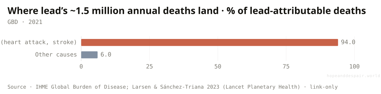
The end of leaded petrol in 2021 felt like a closed chapter, and the harm we still talk about is the one to children’s developing brains. But that is not where lead does most of its killing. Of the roughly 1.5 million deaths a year the Global Burden of Disease attributes to lead, about 94 percent are cardiovascular — the same mechanism as particulate air pollution, hardened arteries and stopped hearts. A 2023 re-analysis put the toll six times higher than the previous estimate, at a cost near six trillion dollars. And the exposure didn’t vanish with petrol; it moved into the cupboard, into metal cookware and ceramic glazes and spices. The hopeful coda: Bangladesh erased lead-chromate from turmeric with market testing and fines, cutting contaminated samples from 47 percent to zero and children’s blood-lead by a third in sixteen months — at about a dollar per year of healthy life saved.
How this number was made
What it measures. Of the ~1.5 million deaths the Global Burden of Disease attributes to lead exposure each year, roughly 94% are cardiovascular — not the lost-IQ story lead is usually filed under. A 2023 Lancet Planetary Health re-analysis put the toll ~6× higher than GBD-2019, at a US$6.0 trillion (6.9% of GDP) cost.
Calculation. Cardiovascular vs other share of lead-attributable deaths (GBD).
Turmeric proved a poison can be pulled from the food supply in months, for almost nothing, when someone tests and tells.
The deadliest thing about lead was never the IQ loss the headlines fixed on — it’s a heart-disease toll we still barely name.
Counted as cardiovascular deaths, lead’s toll hides inside the world’s biggest killer, just like particulate pollution does.
We regulated the smokestack gases — what did we miss?
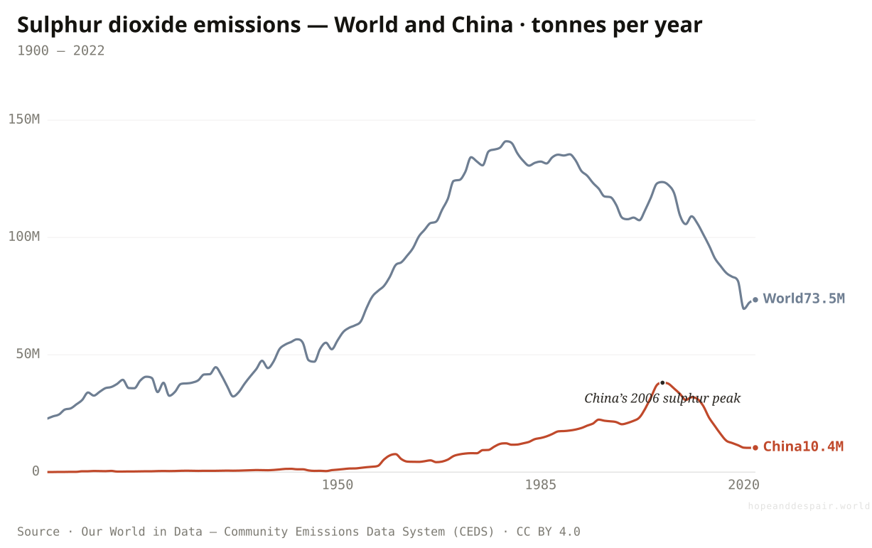
Two of the three big precursor gases have peaked and turned down. Ammonia just keeps climbing.
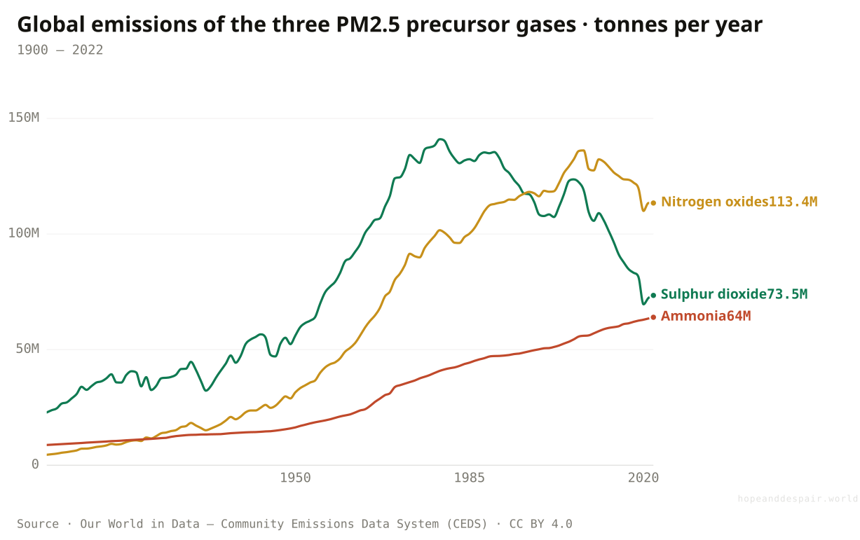
Particulate doesn’t only come out of chimneys as soot; much of it forms in the air when gases react. Three gases do most of that work, and their century-long histories have split apart. Sulphur dioxide, the classic smokestack poison, peaked worldwide around 1979 at 141 million tonnes and has fallen to 74 as the rich world scrubbed it and China turned hard after 2006. Nitrogen oxides, mostly from engines, crested around 2012 and have begun to ease. But ammonia — which comes almost entirely from agriculture, from fertiliser and livestock manure — answers to no clean-air law anywhere, and it has risen without pause, from 16 million tonnes in 1950 to 64 today, an all-time high. As the regulated gases retreat, ammonia becomes the limiting ingredient in the particulate that’s left: the next great source of dirty air is a farm, and almost no one is regulating it.
How this number was made
What it measures. Nitrogen oxides (NOₓ) are gases that are mainly formed during the burning of fossil fuels. Exposure to NOₓ gases can have negative impacts on respiratory health. NOₓ gases can also lead to the formation of ozone – another air pollutant.
Calculation. Selected entity OWID_WRL.
The displayed line is monotone-cubic smoothed for legibility only — it never moves a data point.
The two pollutants we chose to regulate both turned the corner — proof that regulation, applied, works.
The one we never regulated keeps rising, and it’s the future of fine-particle pollution.
Air-quality law fought the last war: it beat sulphur and is winning on nitrogen while the new front, agriculture, goes unguarded.
Who never makes it into the death toll at all?
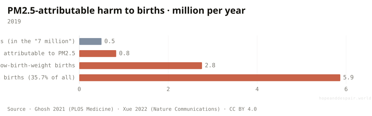
The body count is the tip. Beneath it: millions of babies born too soon, too small, or not alive at all.
Every toll in this article counts the dead. None of them counts the harm that doesn’t end in a death certificate — and for air pollution that submerged mass is enormous. In a single year, fine-particulate exposure was linked to 2.76 million low-birth-weight babies and 5.87 million preterm births — more than a third of every premature birth on Earth. Separately, dirty air is tied to some 830,000 stillbirths a year, about two in five of the global total, a category that falls outside under-five mortality and outside the 'seven million’ alike. Set beside roughly half a million newborn deaths, the visible number, the iceberg is mostly underwater. The genre counts bodies; the damaged-but-surviving and the never-born have no number, so they go missing from the story of how much air pollution costs.
How this number was made
What it measures. PM2.5-attributable adverse birth outcomes in a single year, set against the newborn deaths already counted in the headline toll. Preterm 5.87M (35.7% of all preterm births) and low-birth-weight 2.76M from Ghosh et al. 2021 (PLOS Medicine); stillbirths 0.83M (39.7% of the global total) from Xue et al. 2022 (Nature Communications).
Calculation. Visible newborn deaths vs the larger, uncounted strata of PM2.5-attributable birth harm.
Each of these is preventable harm, not death — clean a mother’s air and most of it simply doesn’t happen.
More than a third of the world’s premature births trace partly to the air, and not one of them is in the headline toll.
The most-quoted number for air pollution’s cost may understate the human damage by an order of magnitude — by definition.
Where does the dying actually happen?
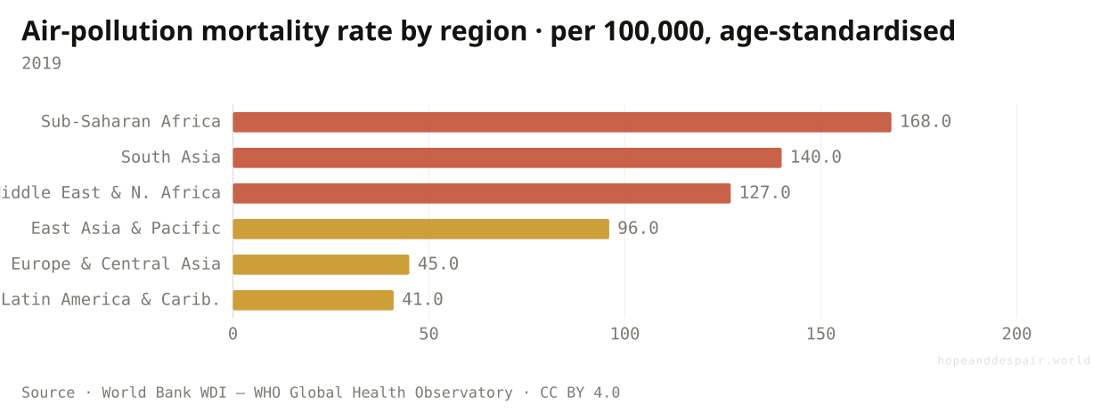
Where the air is least measured and the people pollute least — sub-Saharan Africa’s rate is four times Latin America’s.
Put the death rate on a map and it inverts the usual picture of pollution as a problem of smoggy industrial megacities. Age-standardised, sub-Saharan Africa loses 168 people per 100,000 to air pollution — about four times Latin America’s 41 — driven less by traffic than by cooking smoke and wind-blown desert dust, and concentrated exactly where there are almost no monitors to measure it. The places that did least to dirty the world’s air carry the heaviest share of its dying.
How this number was made
What it measures. Age-standardised mortality rate attributed to ambient + household air pollution, by World Bank region, 2019.
Calculation. Latest (2019) value per World Bank region from SH.STA.AIRP.P5, sorted descending.
East Asia’s rate fell hard after China’s cleanup — proof the number is movable, not fixed by geography.
The lightest polluters breathe the deadliest air, and they’re the least counted, so even this rate is an estimate.
A 'global’ crisis whose burden is wildly local — the world average hides a fourfold regional gap.
And the smoke we actually see on the news?
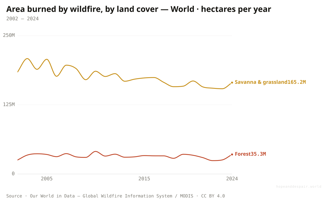
The planet burns less land every decade — yet the kind of fire that makes the deadliest smoke keeps growing.
Almost everything intuition tells you about wildfire is wrong, and the history proves it. The total area the world burns has been falling for two decades, because the great driver of fire is the seasonal burning of African and Australian savanna, and that has receded as grassland turns to farmland — from about 184 million hectares in 2002 to 165 million by 2024. But look at forests: their burned area climbed over the same span, from 25 to 35 million hectares, as hotter, drier seasons lengthen the fire window. Less fire, smokier fire. And the dying matches the smoke, not the flames: this smoke is tied to about 1.53 million deaths a year, more than nine in ten in low- and middle-income countries and nearly four in ten in sub-Saharan Africa. Smoke out-kills flame roughly ten to one — Australia’s Black Summer took 33 people by fire and an estimated 417 by the smoke. This is the seam where this question meets climate.
How this number was made
What it measures. Area of other land types burnt by wildfires each year, in hectares. Includes wetlands, urban areas, snow and ice, bare ground, and water bodies.
Calculation. Selected entity OWID_WRL.
The displayed line is monotone-cubic smoothed for legibility only — it never moves a data point.
The total area burned is shrinking — the planet is not, on the whole, catching fire faster.
The fires that reach the most lungs are the growing ones, and their smoke kills ten times more than the flames.
Less land burns and more people die from the smoke — the headline and the harm point opposite ways.
Could cleaning the air ever be bad?
We scrubbed the sulphur out of the sky to save lungs — and removed a haze that was quietly holding down the heat.
Here is the most uncomfortable twist in the whole story. Sulphur dioxide doesn’t just harm lungs; high in the atmosphere its particles reflect sunlight and seed brighter clouds, cooling the planet. For a century we pumped out more and more of it, peaking globally around 1979, and it masked some of the warming we were causing. Then we cleaned it up — the rich world first, China dramatically after its 2006 peak, and global shipping almost overnight when a 2020 rule cut marine-fuel sulphur by about 86 percent. Lungs benefited enormously. But as the haze thinned, the warming it had hidden surfaced: the shipping rule alone is estimated to have added a few hundredths of a degree, and China’s roughly three-quarters cut in sulphur since its 2006 peak may account for a meaningful share of the recent jump in global temperature. Cleaner air, hotter planet — both real, from the same act. (How much warming, exactly, is genuinely disputed; some studies argue it sits within natural variability.)
How this number was made
What it measures. Nitrogen oxides (NOₓ) are gases that are mainly formed during the burning of fossil fuels. Exposure to NOₓ gases can have negative impacts on respiratory health. NOₓ gases can also lead to the formation of ozone – another air pollutant.
Calculation. Selected entity OWID_WRL.
The displayed line is monotone-cubic smoothed for legibility only — it never moves a data point.
The sulphur cleanup is saving hundreds of thousands of lives a year — that benefit is immediate and certain.
We were leaning on a poison to shade the planet, and pulling it away reveals warming that was always in the bill.
The same chart is a public-health triumph and a climate setback, and honest scientists still argue over how big the second effect is.
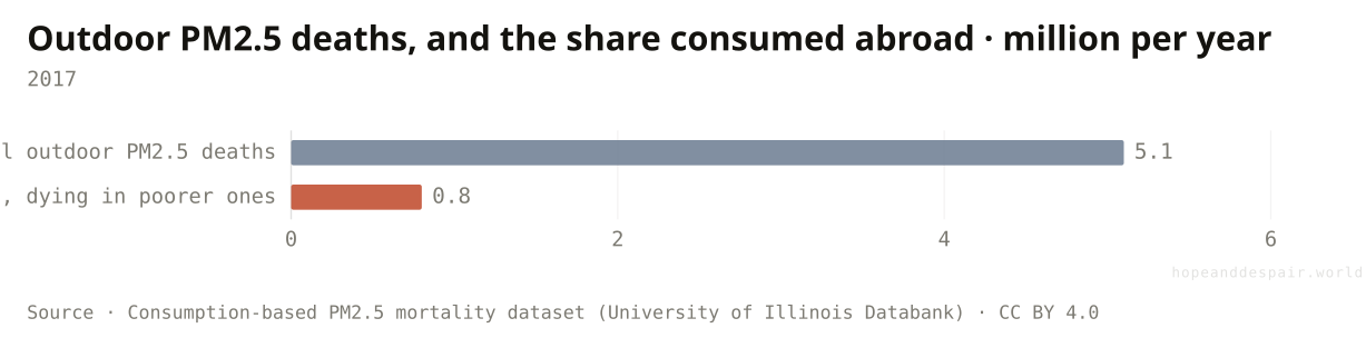
Whose air pays for whose stuff?
About one in six outdoor-pollution deaths happens so someone richer, somewhere cleaner, can buy the thing.
Pollution is usually pinned on the country where the smokestack stands. Switch the accounting to who consumes what the smokestack makes, and the moral geography shifts. Of roughly 5.1 million annual deaths from outdoor particulate, about 800,000, close to one in six, occur because a richer country, with at least half again the income per head, consumed goods produced in a poorer country’s air. The United States is the largest net importer of this embodied death; the gap widened by nearly a third between 2007 and 2017. And the machinery economists use to value lives, the Value of a Statistical Life, prices a death in a poor country far below one in a rich country, so the offshored toll, by construction, barely registers in the cost-benefit sums that set policy.
How this number was made
What it measures. Of roughly 5.1 million annual PM2.5 deaths, about 800,000 occur because a richer country (≥50% higher GDP per capita) consumed goods produced in a poorer country’s air. The United States is the largest net importer of this embodied mortality, and the gap widened 32% between 2007 and 2017. Standard Value-of-Statistical-Life accounting prices those lives toward zero by construction.
Calculation. PM2.5 deaths displaced from consumer to producer countries via trade.
Naming the flow is the first step to pricing it honestly — and the data to do so now exists, openly.
Hundreds of thousands die each year for consumption that happens somewhere they’ll never benefit from.
Blame the producer or the consumer and you get two different maps of the same deaths.
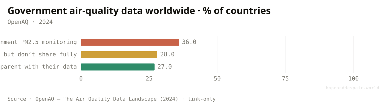
How much of this do we actually measure?
A third of the world’s countries don’t monitor their air at all — and most of the dying is in the dark.
Step back and the most unsettling fact is not a number but the absence of one. Roughly 36 percent of countries operate no public air-quality monitoring whatsoever; about a billion people, across seventy-one countries, live with no government measurement of the air they breathe, and nine in ten of them are in low- or lower-middle-income countries — the exact places where the death rates run highest. Of the countries that do monitor, only about a quarter share their data fully and openly. So the heaviest tolls in this article are precisely where the instruments aren’t: modelled from satellites, not read off the ground. In 2025 it got darker still, when the United States switched off the embassy monitors that were the only regulatory-grade source in more than a dozen countries. Where citizens and researchers fill the gap with low-cost sensors, they out-measure governments — but those cheap sensors over-read in humid, tropical air, so some of the most alarming numbers from the data deserts are part artifact. We are arguing about a crisis we can barely see.
How this number was made
What it measures. Government PM2.5 data availability worldwide. 36% of countries run no public monitoring (≈1 billion people across 71 countries unmonitored, 9 of 10 in low/lower-middle-income countries); of those that do, only 27% are fully transparent and only 54 share maximally-open station-level data.
Calculation. Three states of national air-quality data — none, hidden, open — from the OpenAQ 2024 landscape.
Citizen sensors and satellites are lighting up the deserts faster than governments ever wired them — the gap is closing from below and above.
The people dying most are the people measured least, and in 2025 a major source of measurement was switched off.
Every figure here rests on a map with holes — and the holes are not random, they’re where the worst air is.
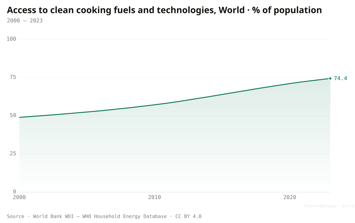
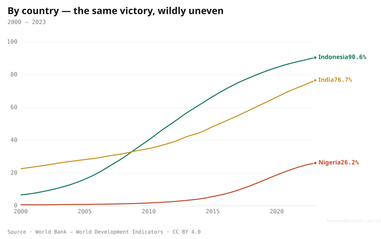
Is anything clearly, unambiguously getting better?
A billion more people cook with clean fuel than in 2000 — but the poorest region barely moved.
The deadliest air for most of human history was never outdoors. It was the smoke of a cooking fire in a closed room, and it still kills more newborns than urban smog does. That story is turning, and the country cuts show how unevenly. The share of humanity cooking with clean fuels and electricity climbed from 49 percent in 2000 to 74 in 2023. Indonesia is the standout — 7 percent to 91 in a single generation, on the back of a national push to swap kerosene for bottled gas. India went from 23 to 77 as it handed out LPG cylinders by the tens of millions; China is at 89. But Nigeria crawled from 1 percent to 26, and Bangladesh from 8 to 28 — and because their populations grew so fast, more people cook over open flame in those countries today than when the century began. The rate is a triumph; the headcount is not.
How this number was made
What it measures. Access to clean fuels and technologies for cooking (% of population)
Calculation. Selected entity WLD.
The displayed line is monotone-cubic smoothed for legibility only — it never moves a data point.
A billion people stopped breathing kitchen smoke in two decades — one of the great unheralded health gains.
In sub-Saharan Africa the share rose but the raw number of people exposed grew, because births outran connections.
Percent up, count up too — whether this is winning depends on whether you count rates or people.
So — cleaner, or deadlier?
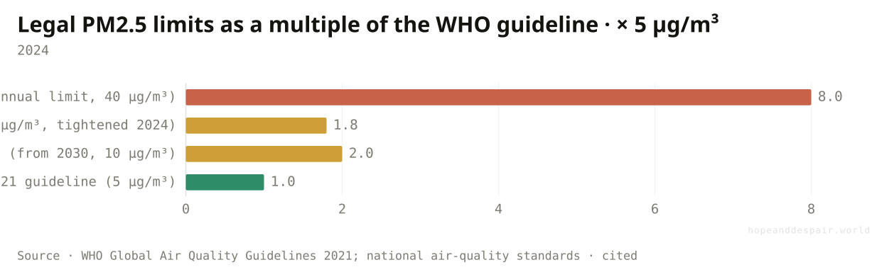
Both, and the yardstick is a choice. When the WHO halved its guideline in 2021, it made 99% of humanity non-compliant overnight without changing the air.
There is no single answer, and that is the answer. Concentrations are down where anyone measures them, and the total toll is up; the rich world’s air cleared while South Asia’s thickened; the wins are real but relocate the harm and, by unmasking warming, carry a sting. Even the line we grade against is a decision. In 2021 the World Health Organization halved its recommended limit to five micrograms — and with no change in the actual air, pushed about 99 percent of humanity into non-compliance. India’s legal limit is eight times the guideline. A hundred and fifty-eight countries have no particulate standard at all, and of the ninety-four that do, thirty-seven breach their own. 'Is the air getting cleaner or deadlier?' has no scalar answer. It depends on whether you count concentrations or bodies, rates or totals, where you live, and which yardstick you pick up.
How this number was made
What it measures. National legal PM2.5 limits expressed as a multiple of the WHO 2021 guideline of 5 µg/m³. When the WHO halved its guideline in 2021, it pushed ~99% of humanity into non-compliance overnight with no change in the air. India’s legal limit is 8× the guideline; the US tightened its annual standard to 9 µg/m³ in 2024; 158 countries have no PM2.5 standard at all, and of the 94 that do, 37 breach their own.
Calculation. Legal limits as a multiple of the WHO guideline — the yardstick as a policy choice.
Halving the guideline reset the ambition for everyone — most of the planet now has an honest target it can see it’s failing.
Most countries don’t even have a legal limit, and a third of those that do break it — the air is unregulated for most of humanity.
The same air can be 'compliant’ or 'dangerous’ depending only on which year’s guideline you grade it against.
- World Bank WDI — PM2.5 air pollution, mean annual exposure (EN.ATM.PM25.MC.M3) — data.worldbank.org/indicator/EN.ATM.PM25.MC.M3 ↗ · CC BY 4.0 · vintage 2026-06-26Sourced from the Atmospheric Composition Analysis Group (van Donkelaar et al.) satellite-derived surface PM2.5.
- World Bank WDI — Access to clean fuels and technologies for cooking (EG.CFT.ACCS.ZS) — data.worldbank.org/indicator/EG.CFT.ACCS.ZS ↗ · CC BY 4.0 · vintage 2026-06-26Sourced from the WHO Household Energy Database.
- Community Emissions Data System (CEDS) — long-run air-pollutant emissions — ourworldindata.org/grapher/long-run-air-pollution ↗ · CC BY 4.0 · vintage 2026-06-27SO₂, NOₓ and NH₃ emissions over time (Hoesly et al.), via Our World in Data — the precursor-gas and aerosol-paradox charts.
- Global Wildfire Information System (GWIS) / MODIS — burned area by land cover — ourworldindata.org/grapher/annual-burned-area-by-landcover ↗ · CC BY 4.0 · vintage 2026-06-27Annual area burned by savanna and forest, World, 2002–2024, via Our World in Data.
- WHO global air quality guidelines (2021) — www.who.int/publications/i/item/9789240034228 ↗ · Cited (CC BY-NC-SA 3.0 IGO) · vintage 2021The 5 µg/m³ annual PM2.5 guideline used as the reference line; also the basis for the legal-limit multiples.
- Outdoor-air-pollution death estimates — Lelieveld et al. 2015 (PNAS); IHME GBD 2021; Vohra et al. 2021 (Environmental Research) — ourworldindata.org/air-pollution ↗ · Link-only (GBD/IHME-derived) · vintage 2015–2021The range. GBD figures are charted and cited, not re-hosted.
- Ghosh et al. 2021 — Ambient and household PM2.5 and adverse birth outcomes (PLOS Medicine) — doi.org/10.1371/journal.pmed.1003718 ↗ · CC BY 4.0 · vintage 2021preterm (5.87M) and low-birth-weight (2.76M) births attributable to PM2.5.
- Xue et al. 2022 — Stillbirths attributable to ambient PM2.5 (Nature Communications) — doi.org/10.1038/s41467-022-34250-4 ↗ · CC BY 4.0 · vintage 2022~830,000 PM2.5-attributable stillbirths a year.
- IHME Global Burden of Disease — lead exposure; Larsen & Sánchez-Triana 2023 (Lancet Planetary Health) — ourworldindata.org/lead-pollution ↗ · Link-only (IHME) · vintage 2021–2023~1.5M annual lead deaths, ~94% cardiovascular. Charted and cited, not re-hosted.
- Chen et al. 2024 — Global mortality from landscape-fire smoke (The Lancet Planetary Health) — doi.org/10.1016/S2542-5196(24)00255-0 ↗ · Link-only · vintage 2024~1.53M annual smoke deaths and their income geography.
- OpenAQ — The Air Quality Data Landscape (2024) — openaq.org/reports/the-air-quality-data-landscape ↗ · Cited · vintage 2024monitoring and transparency figures (36% unmonitored, 27% fully transparent).
- Consumption-based PM2.5 mortality dataset (University of Illinois Databank, IDB-3251572) — databank.illinois.edu/datasets/IDB-3251572 ↗ · CC BY 4.0 · vintage 2017~800,000 deaths embodied in richer countries’ consumption.
Cite this page
Reference
Hope & Despair. “Is the air getting cleaner or deadlier?.” Hope & Despair, 2026. https://hopeanddespair.world/questions/is-the-air-getting-cleaner-or-deadlier.
BibTeX
@misc{hopeanddespair:is-the-air-getting-cleaner-or-deadlier,
  author       = {{Hope & Despair}},
  title        = {{Is the air getting cleaner or deadlier?}},
  year         = {2026},
  howpublished = {\url{https://hopeanddespair.world/questions/is-the-air-getting-cleaner-or-deadlier}},
  note         = {hopeanddespair.world, updated 2026-06-27}
}
Original prose, code, and chart designs are released under CC BY 4.0 ↗ — reuse freely with attribution. Source datasets keep their own licences, listed above. Add your access date when citing.
- Ship: Can the world create enough jobs? (Q16) + air-pollution and literacy articles View diff →
Generated from the commit history — every edit to a number, a word, or a chart is tracked in the open. Browse the full history & diffs on GitHub →
in plain words
Still lost? Read this.
PM2.5 is soot and chemical haze fine enough to slip past your body’s defences and into the bloodstream — particles smaller than a thirtieth the width of a hair. It is the pollutant that does most of the dying. The number on these charts is µg/m³: micrograms of it in a cubic metre of air, averaged over a year and weighted by where people actually live.
The whole article turns on one split the headlines blur. Concentration is how dirty the air is. Toll is how many it kills. Concentration is falling. The toll is not, because there are more of us, we live longer (long enough for dirty air to cause the heart disease it takes decades to cause), and the cleanup is slowest where the most people breathe. “Cleaner or deadlier?” isn’t a trick question — it’s two questions wearing one coat.